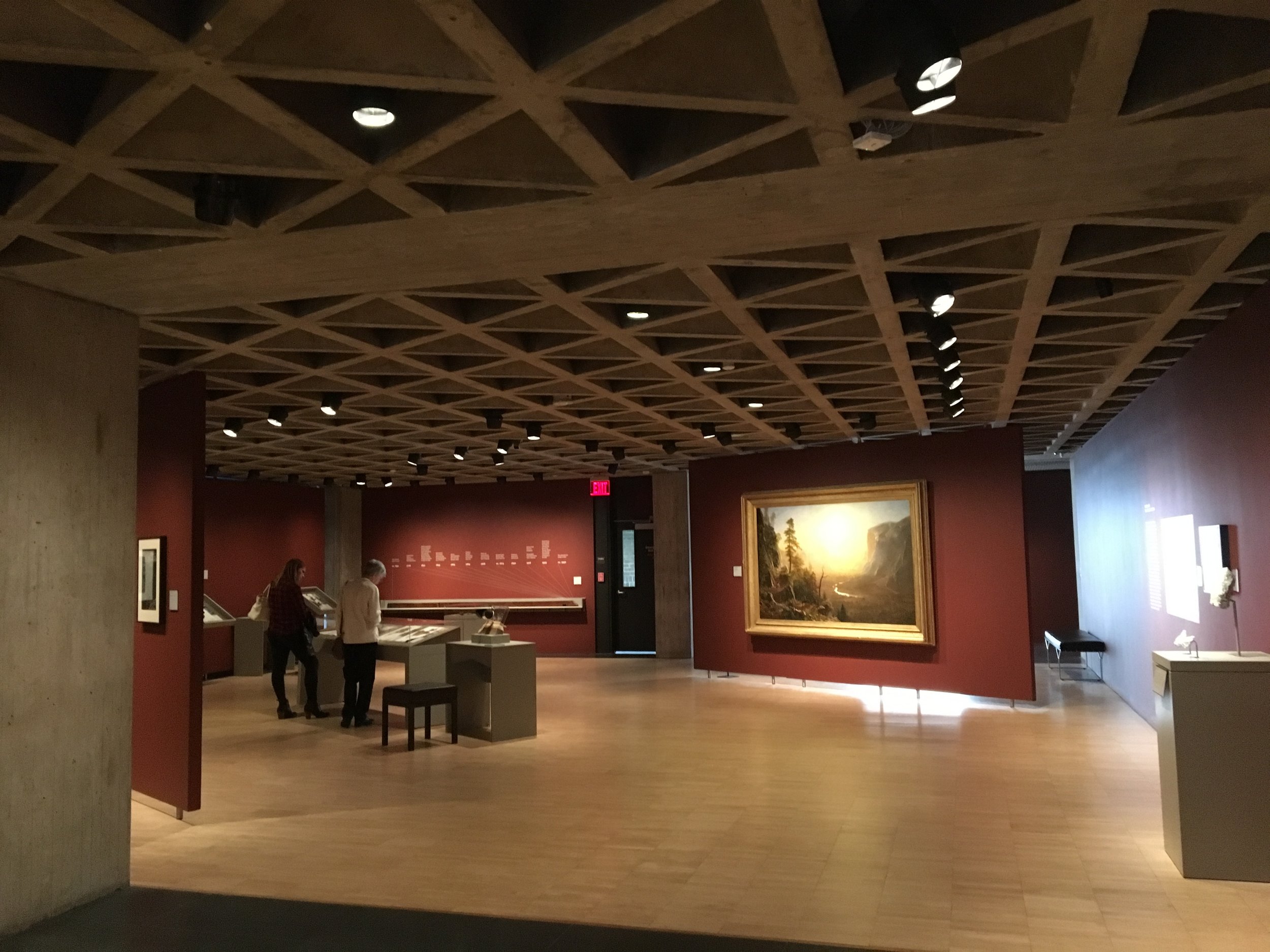
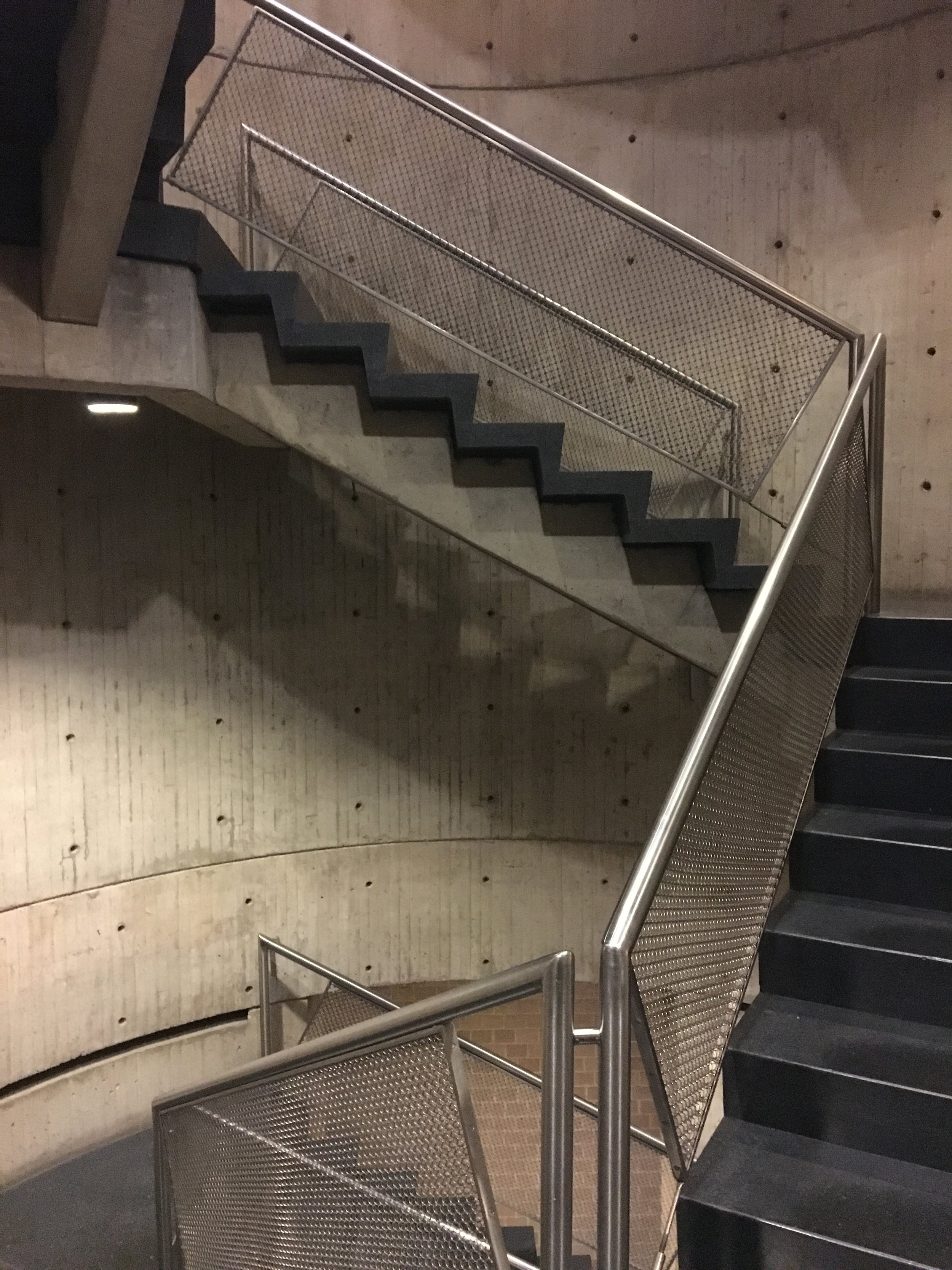
Louis Kahn, Yale Art Gallery
I was in New Haven last Fall and in an unusual fit of nostalgia, visited a number of buildings that were in my heavy rotation viewing in grad school. Louis Kahn's Yale Art Gallery was right across the street from my school and I viewed it so often that I realize now I took its deft expression for granted.
Kahn's first major commission, the Yale Art Gallery was designed in 1951 as an extension to the collegiate Gothic gallery and was to contain a number of different uses. Kahn responded by making a flexible space spanned with a tetrahedral waffle slab ceiling. The strict geometry of that construction not only allowed for changing uses, but established the taut, graceful and, planar expression that evokes a kind of timelessness in its simplicity.
The building's organization is straight-forward and deceptively simple - clustered service spaces supporting hierarchically dominant galleries and workspaces. Kahn's desire to instill a quiet monumentality is largely achieved in his explicit contrast of stark, windowless walls sitting adjacent to the fussiness of the faux Gothic campus.
At the end of his career, Kahn designed the magnificent British Art Center directly across the street from the Yale Art Gallery. The British Art Center is an architectural masterpiece, understated in its order and simplicity, form and materials. It further develops and resolves the same questions posed by the Yale Art Gallery twenty years beforehand. Perhaps the British Art Center's mastery led me to discount Kahn's work of years earlier. Perhaps at the time, familiarity breed complacency on my appreciation of the Art Gallery. I'm so very glad to have seen this building again after so many years and maybe I can now see it for its own grace and presence. Perhaps it took twenty or so years of my own architectural practice to really appreciate the power of what appears so simple and complete.
thank you, Mr. Kahn


