rhythm
I have been thinking alot about the rhythm of facades of buildings. Typically a commercial building has some rhythm of openings, windows and/or doors, that trace across its surface. This can be as simple as the modules of a curtain wall system or a structural system expressing itself on the outside of a building. This is so typical in fact, that we often fail to see it although it affects how we feel about a building.
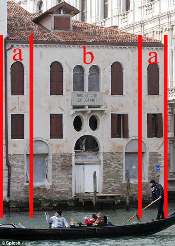
What I have been thinking over is a more sophisticated version of the usual street rhythm of a facade. Instead of the usual progression of bays and windows in an A-A-A pattern, traditional Venetian facades have a multiplicity of readings that makes them simultaneously complex and simple.
As an example, a typical Venetian facade can be read as A-B-A:
Or an alternate A-B-A pattern:
Or as A-A:
Or as A-A-B-A-A:
All of these readings are there at the same time and it lends a kind of tension to the facade while retaining an overall reposed resolution. Of course these are not simply different ways to read the facade, but they reflect an interior organization that can vary floor to floor while still maintaining uniformity and structural simplicity.
syncopated rhythm
This kind of syncopated rhythm is hard to find in typical American commercial architecture with its emphasis on designing generic leasable space. As a result we often get commercial streets that have boring buildings that shout for attention using graphics and awnings and banners instead of the simple, yet intriguing, quietude of architecture.


