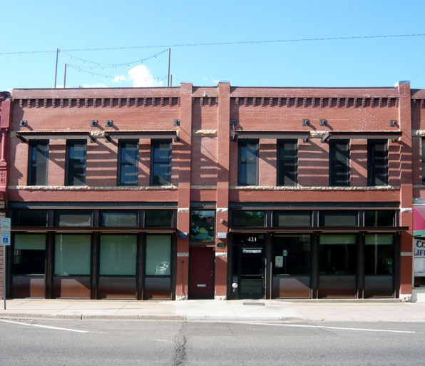
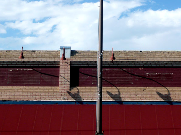
A bit north of Boulder is the lovely town of Loveland, Colorado. I have often driven through town heading to some local fishing rivers and have recently begun stopping off in town. The downtown area is a remarkable collection of small town commercial buildings, some renovated, some in bad shape, many empty. We all have some reliably American nostalgia for "small towns" and that knee-jerk romanticism often blinds us to the very really quality of design of these places. We tend to see the picture postcard version, with kids on bikes and the local ice cream shop. Rather than simply driving through and "admiring" but not engaging, I would encourage everyone to actually walk the streets and see and feel the simple design genius embedded in this places.

These commercial buildings are significantly more complex than they seem at first. The usual relationship of store front, with its lower panel, shop windows and transom windows are surmounted by heavy masonry with punched openings. But these openings lend an architectonic quality to the building with clearly delineated sills and lintels. The building is usually topped off with some kind of cornice, completing the building against the sky. Those simple relationships are so much richer and simultaneously simpler than so many modern commercial buildings or worse yet, the bad pastiche contemporary buildings that try to replicate this pattern without careful study.
Loveland is also home to the Feed & Grain building, which I wrote about in a previous post.


