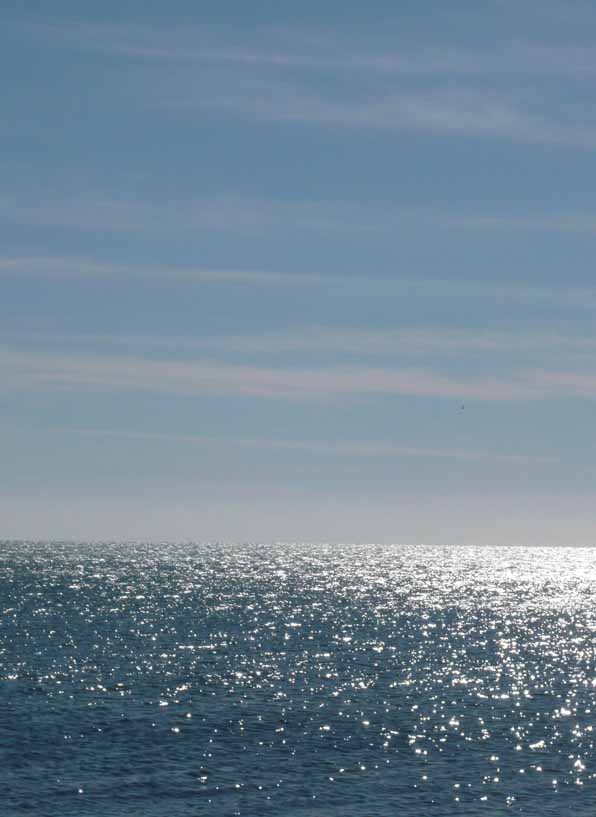
warmer climes

sky and sea

sky and sea

As the weather in Colorado is heading toward more much-needed snow, I am longing a bit for the sun and warmth of warmer climes.

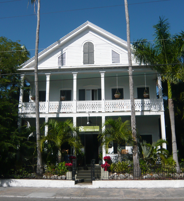
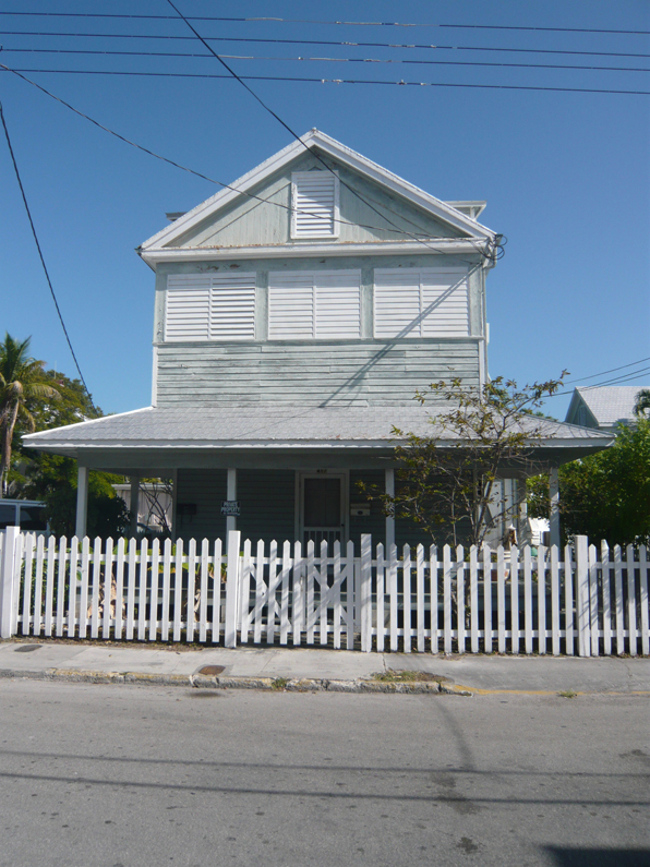
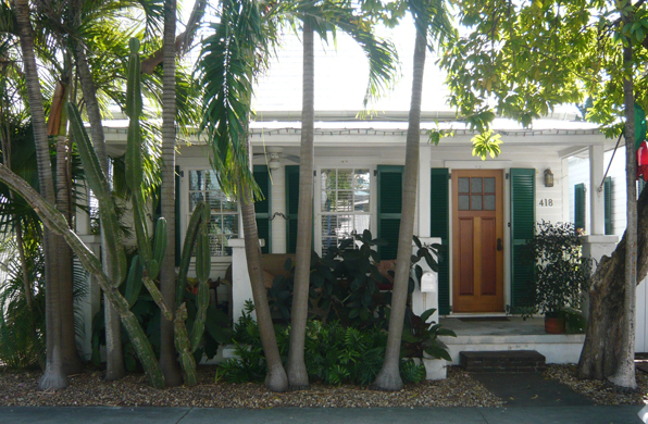
These photos were taken by me over the holidays in the Florida Keys.  The Keys are a stringy set of islands connected by the Overseas Highway, like so many necklace beads.  Each island is just barely over sea level and the buildings are predominantly one- and two-story piles.  Consequently it is a landscape dominated by the horizontal layers of sea and sky.

wall

wall

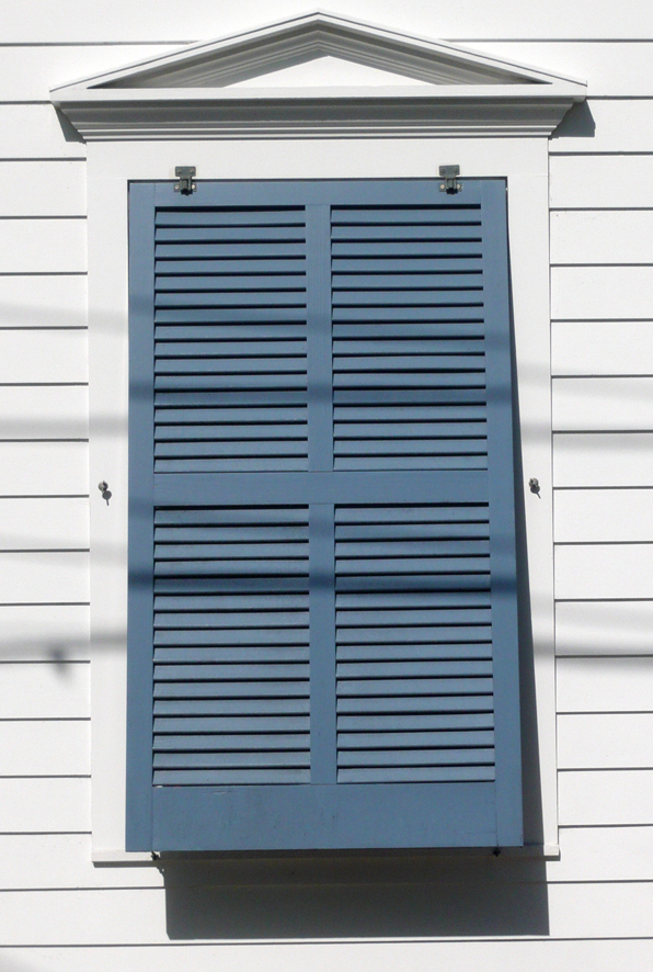
You might imagine that this would inspire similarly horizontal architecture, not just low and single-story stuff, but an architecture that celebrates the horizontal planes like the Prairie School work in the Midwest.  Alas, quality architecture has not really arrived in the Keys.  With the exception of the older parts of Key West, the built environment is uniformly cheap and composed largely of inexpensive variations of painted concrete block.

sea and sky

sea and sky

I'm sure there are architects and property owners down there trying to up the game a bit, but it will be a long task.  Unlike the almost limitless prairie, the potential of building down in the Keys would inevitably face the pressures of expensive and scarce land to build upon.  The dueling pressures of a relentless horizontality of the landscape and the efficiency of vertical building would be a rich conflict from which a quality architecture could grow forth.  As the old cliche' goes, difficult sites make for good architecture.

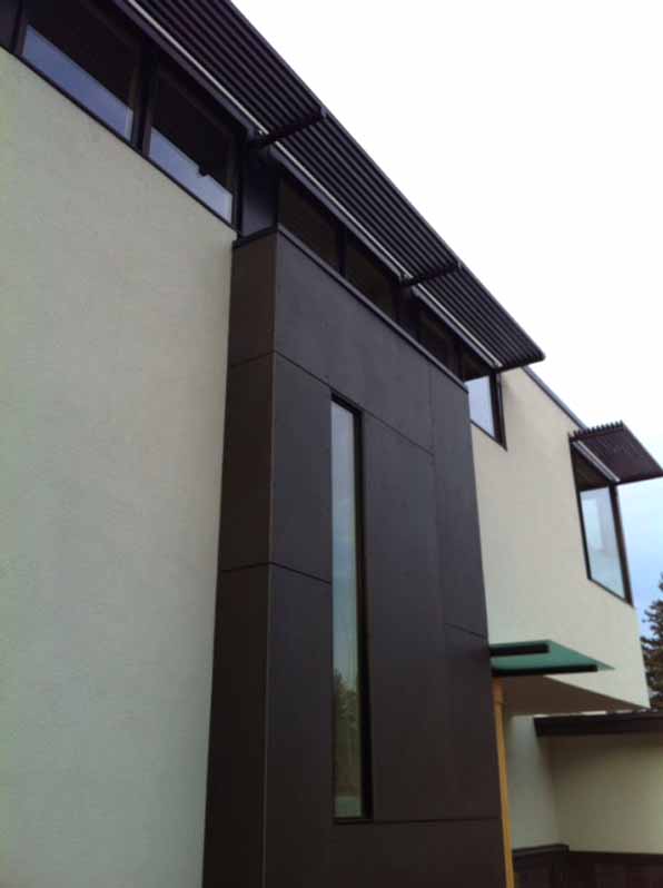
photos by Boulder architects M. Gerwing Architects

renovations - habitual patterns of use, by Boulder architects M. Gerwing Architects

We work on a lot of smaller projects that largely entail the internal reorganization of an existing house.  Most often these are houses that were built in the 1960's and the current homeowners are struggling with small, awkward kitchens and houses that are more formally arranged than currently lifestyles are well suited. New houses and restaurants are projects that allow for the most creative freedom, but it is these difficult spatial re-ordering projects that pose the greatest challenges and result in our greatest satisfaction.  Most of these projects are hemmed in with zoning constraints and building restrictions, but the single largest constraint is often in the minds of our clients.  Very often they have lived in the house for a number of years and although they are frustrated with it, it is very difficult for them to conceive of moving a critical function like the kitchen from one space to another.  They have developed habitual patterns of use that make seeing the forest through the trees extraordinarily difficult.

BL angled front

BL angled front

I found this to be true in my own home renovation.  Even as an architect, while living in the house it was difficult to imagine such a radical notion of demolishing and moving a kitchen across the house.  Sitting with the drawings in front of me it was clearly the right move to make, but standing in the house it seemed daunting.  And not just because of the associated cost and complexity that such a move would add to an already trying project, but because I had frankly become so used to getting my coffee and cooking so many meals there.

It is our habit that whenever we are faced with this kind of project we always run through a few exercises that test the possibilities of just these kinds of moves.  What if the dining room flipped positions with the living room?  How about if the entrance was on the other side of the house?  Or, as in a recent project, what if the kitchen moved into the master bedroom?

BL pres before and after plan

BL pres before and after plan

I make it a practice not to talk about the potential changes to a house when I visit the property for the first time.  For myself, it is the space and distance created while working in the studio that will most likely generate the most interesting solutions to a project, not walking around the house.  It seems a bit counterintuitive, but going to the actual site often makes the possibilities of a project less real, the potential of a project diminishes with the distance to the actual building.

In the end, it is a balanced attack on a project that provides the best answers and brings up the most interesting questions.  As an architect, you have to go to the building and study it, but you also have to go to your studio and take it apart in your head.  Architecture is practiced in the real world of walls and floors and dense materials, but it is best conceived in the imagination with paper and pencil, cardboard and glue.

by Boulder architects M. Gerwing Architects

Preservation of the Recent Past, by Boulder architects M. Gerwing Architects

Why do we preserve buildings? Why do we care about mute constructions, often old and unused, occasionally in the way or overlooked? We have all walked through great neighborhoods and parts of cities with magnificent old buildings and very few of us would show no concern at all if these places were simply ground down under the wheels of progress.  That doesn't mean we save every shack or old shed, but rather we recognize some value in mere continued existence of some portions of our collective past.  What is valuable about these old buildings is not necessarily what they look like or how they function, but what they are.  The preservation of some older buildings reminds us of what we are by holding on to some portion of who we have been.

Lloyd Wright_Scott Jarson

Lloyd Wright_Scott Jarson

All well enough said, but when the desire to preserve runs head long into private property rights, what is to be done?  And when the object of preservation is a building not very old, maybe not even as "old" as any one of us, then how do we view the cause for preservation.

Most folks don't readily appreciate the architecture of the recent past.  It seems a bit naive and slightly embarrassing, like looking at yourself in old high school yearbooks.  Any building that we can remember when it was new can not possibly be of a value akin to the great Architecture of past ages. And yet so many of us can lament the loss of truly great buildings, like Penn Station, that most of an earlier generation held in similar contempt that we place so many buildings constructed in the 1950's and 60's.

cyclorama2_Wikipedia Commons

cyclorama2_Wikipedia Commons

The buildings shown here aren't some obscure shacks threatened with demolition.  These are significant works by some of the greatest architects of a generation ago - Bertrand Goldberg, Richard Neutra, and Frank Lloyd Wright.  You might not like these buildings, but that is not the point. For God's sake, most communities in the US have fashioned a minor economic industry centered on tourism to Wright houses, not the financial benefits of their destruction.

Prentice_Landmarks Illinois

Prentice_Landmarks Illinois

It is disheartening to sit here in 2013, with over 50 years of preservation battles - successes and failures - behind us only to realize that years from now I will have to explain to my daughters why my generation tore down Neutra and Wright buildings.

The case to save Neutra's Cyclorama Building, Goldberg's Prentice Hospital and Wright's Lloyd Wright house can all be linked to here.

by Boulder architects M. Gerwing Architects

Regional architecture - Florida Keys, by Boulder architects M. Gerwing Architects

Keys5

Keys5

I have often written about my interest in regionally specific architecture, especially vernacular forms that derive from local climatic conditions or materials availability.  I recently spent some time in the Florida Keys and in my typically geeky architecture fashion, spent almost as much time looking at the local historic buildings as I did relaxing on the beach.

Keys4

Keys4

Like any relatively isolated region, the architecture of the Keys, and especially Key West, is dominated by its largest growth period, starting with the late Victorian era and extending to the Depression.  As a result, the typologies of houses you find are almost exclusively wood-framed, simply-gabled homes with painted lap siding and more-or-less overly wrought scroll details.  While there are plenty of houses from other periods, these basic vernacular houses became the standard that has been replicated, often less successfully.  The funky mid-century commercial architecture of the Keys, including the building-as-sign googly constructions date from the 1950's and 60's when the Overseas Highway surplanted the train and boat as the dominant mode of access to the Keys, are more often found at the beginning of the island chain, closer to Key Largo.

Keys1

Keys1

As in so many older sea-faring communities, the predominance of horizontal wood siding reminds one of the hulls of boats and the gable-fronted houses resemble so many upturned boats.  Of particular interest to me are the use of shutters and porches to mitigate the harsh Caribbean sun while still allowing ample breezes to move through the structures.  Unlike Italian house shutters, the Keys shutters are plantation style, often not individually operable but top-hung as a panel that can kick out at the bottom.

Keys2

Keys2

Of course here in the Keys, the shutters do not just provide sun control, but are necessary protections for the Gulf storms and occasional hurricane.  For that reason they can be found on doors and windows within porches, well beyond the areas where sun shading would be necessary.  These shutters provide a kind of vertical emphasis to the buildings that contrasts with the predominant horizontal siding and decorative rails.  The overall effect is of a lightly sprung craft, held in tension, that takes the kind of maintenance and attention that only a boat-owner could appreciate.

Keys3

Keys3

The older portions of Key West are also fairly urban and dense, with house fronts mere steps from public sidewalks.  The shutters are also used to create privacy while keeping doors and windows open.  As in the photo above, the subtle delineation of public and private spaces, from sidewalk to private walk to porch to interior, works in about ten feet of space, each layer carefully playing its role.

This kind of attention to the details of public and private space are often lumped into the concepts of New Urbanism.  But, as you can see, some good old fashioned urbanism is successfully at work, design solutions worked out over years of lived experience that architects would do well to study. And shutters that actually work, not just applique patterns, a fearful architect's pet peeve.

by Boulder architects M. Gerwing Architects

Clifford Still Museum, some thoughts by Boulder architects M. Gerwing Architects

cs7

cs7

Siting quietly amongst its more noisome arts neighbors, the relatively new Clifford Still Museum in Denver is a wholly different kind of museum. Designed by Allied Works Architecture, the museum was designed to house explicitly the work the abstract expressionist painter.  Instead of the generic and changeable nature of the galleries of a typical museum, the architects have crafted a design that directly responds to the work of the artist.

cs1

cs1

The entire first floor houses the administrative and educational functions as well as the main entrance located along the side of the building facing a small park space. The entry sequence this sets up - street to park to entry to lobby, up stairs to galleries - creates a pleasing rhythm from outdoor sunshine to darkened lobby to top-lit galleries.  Along the way, the predominantly horizontal emphasis of the overall building gives way to a pronounced vertical articulation in the materials and detailing.

cs3

cs3

This vertical emphasis, found in the interior rails and details as well as the vertically-ribbed concrete, echoes the vertical lines found in so many of Still's paintings.  This synthesis of building elements with the specific artworks is the sensitive study of an architect taking full advantage of designing for a specific artist and is a far cry from the more generic gallery space of most museums.

cs5

cs5

However, what is most striking about the gallery space is the slightly labyrinthine arrangement of spaces with wide diagonal views between rooms.  As the galleries offer a roughly chronological procession through Still's career, these openings allow you to view each period in the context of the preceding and future work.  This lends an overall dynamic spatial quality to what might be an otherwise boring, unilateral maze-like march.

cs4

cs4

The top-galleries pull this assembly all together and clearly concentrate the viewer on the works of art rather than the museum itself, a not-so-familiar trend in cultural institutions these days.

I highly recommend a visit, both for the artwork and the museum, a paired ensemble that like any great performance, makes it look easy.

by Boulder architects M. Gerwing Architects