I am not an advocate for building in a "style". Thinking of buildings as simply constructions that you can hang different style clothes on runs counter to my work as an architect. However, if you don't have an architect or don't want one, maybe the nineteenth century idea of pattern books is a good idea to help you avoid Style Abuse Disorder (SAD).
A Field Guide to Ugly Houses - Ugly by Design
another post in the ongoing series A Field Guide to Ugly Houses
UBD -Ugly By Design
Of the many types of ugly that inflict the American house, Ugly by Design, although not the most pervasive, it is certainly the most offensive. These houses clearly fall into the "what were they thinking" category of a design idea gone wrong. Sometimes Ugly by Design is the result of a once-interesting and innovative design idea that has past its shelf-date.
architecture - climate and region; some thoughts on southern mansions
I have been thinking a lot lately about vernacular architecture and indigenous responses to local climate. By that I mean how a building and design practice, over time, has found architectural solutions to solve some of the problems posed by heat and cold, sunlight and shadow, aridity and humidity. Reading through some older posts on my delving into the possibility of trying to define a Colorado vernacular, it strikes me that very few of those examples I identified tackled the issues of heat and solar gain. That might sound like a recent concern, more one of energy use and sustainability, but a few quick glances at traditional southern architecture reveals design/technological solutions that we have largely forgotten in the age of air-conditioning.
Boulder Modernists - Tician Papachristou
Another in a series of posts of some of the remarkable architects that were working in Boulder, Colorado in the 1960s. This was a particularly fruitful time for questioning the basis for especially residential design and Boulder's building boom allowed some of the more talented local architects to experiment with new forms, materials and most notably, new sets of relationships between the house and landscape
a short trip to Maine
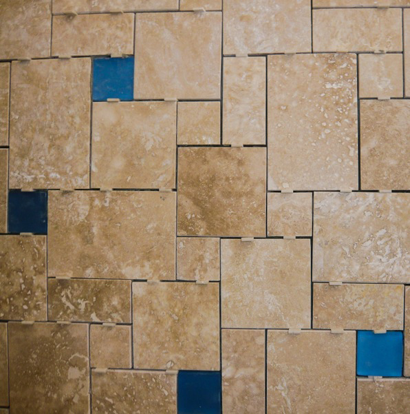
tile, pattern, geometry
As I have probably spoken about in previous posts, we draw no real distinction between architecture and interiors. They are all a part of crafting a series of spaces that are made of various materials that make up a building. To that extent, we spend as much time, and often considerably more, choosing interior materials.
Of particular pleasure for an architect may be the selection of tile materials, colors and patterns, as those selections are inherently tied up with geometry. Overall the selection of materials and colors in a space need to balance and most frequently this can result in creating fairly simple floor patterns with tile run in a conventional grid arrangement. However, I think it is a missed opportunity if we can not select a type of tile and a specific pattern of its installation that can reinforce the spatial and geometric ideas that are playing out in the rest of the space.
The photos here are all from a recent project of ours in Boulder, Colorado, that was almost entirely an interiors-only project. As a renovation of a conventional builder-type house, we avoided the costs of removing and changing a lot of interior walls by re-imagining the existing rooms and selecting materials and colors that would reinforce the nicer aspects of each space and draw one's attention away from the less-desirable parts. Floor tile patterns were crucial to this strategy and became a theme in the newly envisioned house.
I have written about my theory of the relative levels of abstraction of natural materials from their sources. More than consistent color or theme or pattern, I think this is the most intriguing way of creating harmony within a series of spaces without resorting to a slavish consistency or patronizing "style". Although the types and colors of the tiles used on the project were quite varied, they work together as a whole and are specific to each use and room to be functional and add to the overall feel of the house.
This project will conclude in the next few weeks and we will see the final results of the play of color and geometry to bring resolution to a house much in need of some character and order.


