museum

Jen Lewin exhibit, CU Art Museum

For a few more weeks there is an interactive light/movement/sound exhibit of some works by Boulder artist Jen Lewin at the CU Art Museum. Jen Lewin exhibit at CU Art Museum, blue field
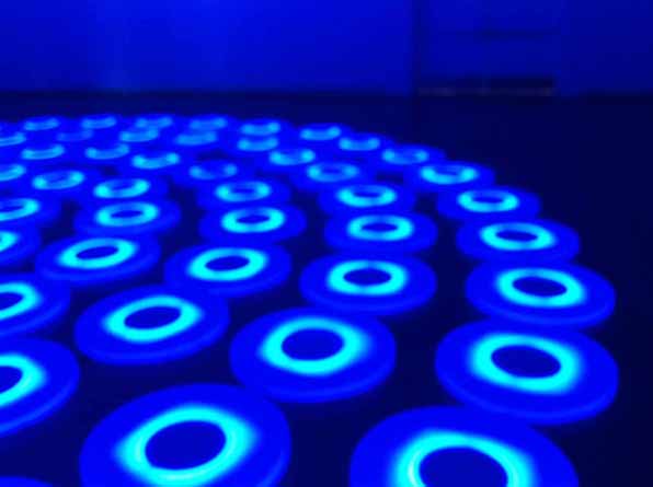
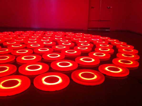
The exhibit "It's Electric", has a number of works, all of which beg for interaction from the public.  The largest, poorly photographed by myself above, is a large field of plastic lily pads that have various arrays of lighting colors and patterns.  Walking across the pads, they respond by changing colors and patterns, sometimes simply reacting to your movement, sometimes prompting you, Twister-like, to make the next move.

Another piece looks like a set of fancy pendant lights over a chaise lounge.  The lights dim in a tight pattern as you move around the piece, making your movement cast a kind of reverse shadow on the lights.  The chaise is ironically placed directly below the lights, a icon of placidity and the lack of movement.

Jen Lewin exhibit at CU Art Museum, motion activated lights over chaise

There are a few other works that surprise and are at once whimsical and poetic so I won't play the spoiler and describe them.

The CU campus is fairly sleepy as it is summer, but hopefully your visit will be accompanied by enough other visitors that you can see their interactions with the works from a distance.  These works are pleasurable in the most basic, sensory ways that you you can't help but be in wonder at the simple joy of color, light and shadow.  I highly recommend a visit and take a crowd, especially kids, and have fun at the museum.

Jen Lewin exhibit at CU Art Museum, red field

Clifford Still Museum, some thoughts by Boulder architects M. Gerwing Architects

cs7

cs7

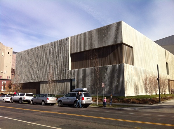
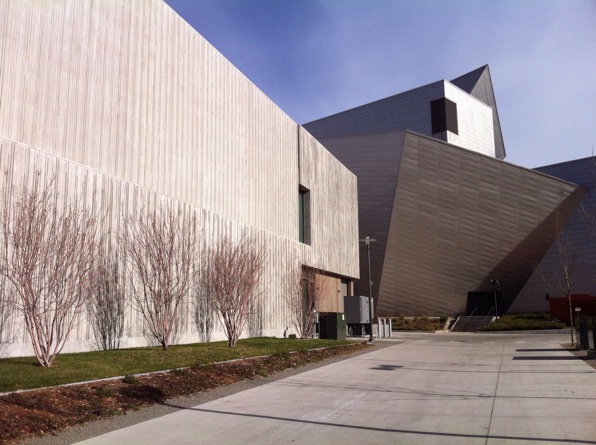
Siting quietly amongst its more noisome arts neighbors, the relatively new Clifford Still Museum in Denver is a wholly different kind of museum. Designed by Allied Works Architecture, the museum was designed to house explicitly the work the abstract expressionist painter.  Instead of the generic and changeable nature of the galleries of a typical museum, the architects have crafted a design that directly responds to the work of the artist.

cs1

cs1

The entire first floor houses the administrative and educational functions as well as the main entrance located along the side of the building facing a small park space. The entry sequence this sets up - street to park to entry to lobby, up stairs to galleries - creates a pleasing rhythm from outdoor sunshine to darkened lobby to top-lit galleries.  Along the way, the predominantly horizontal emphasis of the overall building gives way to a pronounced vertical articulation in the materials and detailing.

cs3

cs3

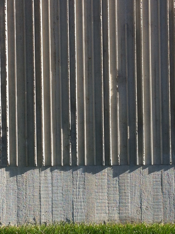
This vertical emphasis, found in the interior rails and details as well as the vertically-ribbed concrete, echoes the vertical lines found in so many of Still's paintings.  This synthesis of building elements with the specific artworks is the sensitive study of an architect taking full advantage of designing for a specific artist and is a far cry from the more generic gallery space of most museums.

cs5

cs5

However, what is most striking about the gallery space is the slightly labyrinthine arrangement of spaces with wide diagonal views between rooms.  As the galleries offer a roughly chronological procession through Still's career, these openings allow you to view each period in the context of the preceding and future work.  This lends an overall dynamic spatial quality to what might be an otherwise boring, unilateral maze-like march.

cs4

cs4

The top-galleries pull this assembly all together and clearly concentrate the viewer on the works of art rather than the museum itself, a not-so-familiar trend in cultural institutions these days.

I highly recommend a visit, both for the artwork and the museum, a paired ensemble that like any great performance, makes it look easy.

by Boulder architects M. Gerwing Architects

Mixed Taste

last Friday evening, I attended the Mixed Taste event at the Museum of Contemporary Art in Denver. http://www.mcadenver.org/index.php/programs/Mixed_Taste_Summer_Series

The idea of this is to attempt to ferret out the strange and serendipitous connections between two disparate topics.  Two short talks are presented on two completely different topics.  Last Friday that was Chef Jorel Pierce discussing his passion for the making of blood sausage, and Geoff Manaugh, of BldgBlog fame, talking about urban spelunking.

And what comes of this?  After the two presentations, a number of audience members asked questions, some specific to each talk, others trying to form connections between the topics.  As each presenter tried to address the questions, they were often a bit stretched to make parallels between the talks, but they were game to give it a shot in front of the approximately 60 folks in the audience.

I quite like this kind of event - a kind of intellectual and funny exquisite corpse project.  I certainly will not make it to all of the summer's offerings, but you can bet "Suburbia and American Gin" will be on my list.

Oh, and they have cocktails available as well.