architecture

small town movie theatres

movie theatre 01

movie theatre 01

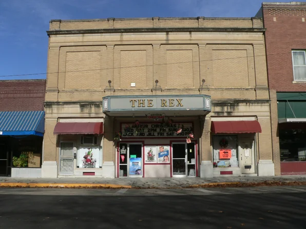
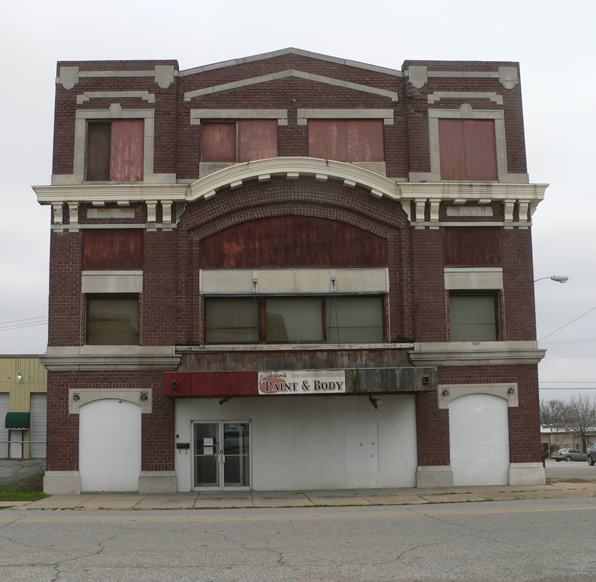
Most of the smaller towns that I passed through on a recent road trip had their version of the local movie palace.  And most were closed down along with the rest of the storefronts along the main street.   The emptiness of middle America is remarkable and so sad.  We all hear the statistics about the growth of the larger cities and the gradual emigration away from small towns.  But something about the desolate marque of the old movie theatre strikes me as the most melancholy of the all the main street ghosts.

movie theatre 03

movie theatre 03

You can almost see and hear the activity of the crowd out front, the ticket sellers booth and the couples lingering after the show.

movie theatre 02

movie theatre 02

These buildings were also the real stars of the main street.  They were fantastical and showy, brash and sometimes clownish in their attempts to draw our attention, and all the more so when standing next to the somber drugstore and barbershop.

movie theatre 04

movie theatre 04

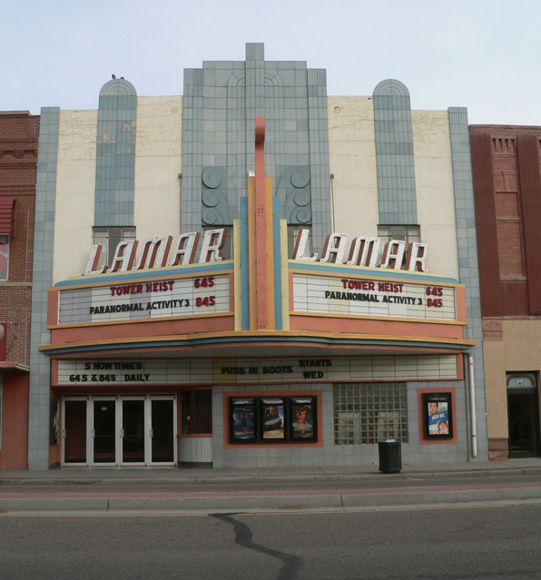
Some are still open of course.  I would have loved to have seen a show at the eponymous theater in Lamar, Colorado on the eastern plains.  Any movie in that place gets an extra star.

the Flyover

flyover01

flyover01

Over the recent Thanksgiving holiday break I took a roadtrip from Colorado to my native Kentucky.  This is the vast Flyover land of the center of the United States.  It is roughly the former vast inland sea from the Rocky Mountains to the Appalachian Mountains.  It is certainly the least densely populated one third to one half of the the US, and largely dominated by fields and pasture, sheds and barns, farmhouses and shacks of agricultural America.

This immense area - eastern Colorado, Oklahoma, Kansas, Missouri, Illinois, Indiana, Iowa, western Kentucky - is not the stuff of dramatic landscapes.  That is not to say that it is not beautiful, but it is a softer, more subtle set of relationships between land and sky that makes this area's initial uniformity peel away to reveal an intensely beautiful sense of place.  And in that flat, or gently rolling landscape, a building sticking up from the earth holds a kind of power that qualifies the space around it.  A sense of space aggregates around a building.  Here in the Rocky Mountains and in so many places along the eastern seaboard, there seems to be a natural space that buildings have been placed within.  But in these midwestern plains, a building makes a space, a small domesticated sphere that comes into being only by the nature of the building.

flyover02

flyover02

Frank Lloyd Wright knew this.  He clearly understood how a building sits on this flat earth and how a large, sheltering roof can make a space more profound than a series of walls.  On my recent trip I did not visit any of his iconic prairie-style houses, but rather the Price Tower in Oklahoma.  More about that in an upcoming post.

Driving for many hours is a great way to reflect on things, and for me this naturally falls to things architectural.  Over the next few weeks I will post some more photos and thoughts that bubbled up during this long drive.  Send me your thoughts.

First Christian Church, Boulder, Colorado

First Christian 01

First Christian 01

As almost anyone can attest to, one of the very first buildings that most people see on arriving in Boulder is the First Christian Church on CO 36/28th Street, in southeast Boulder.

Built in 1960 and designed by Nixon and Jones, it is an excellent introduction to Boulder's great collection of late Modernist architecture.

The main sanctuary is the west-projecting prow that mimics the angled flatirons on the horizon and is clad in long strips of blue glass with a decorative, multi-colored geometric motif.  The dropping site grade accentuates the projecting prow and the long, white horizontal balcony acts like a visual cantilevered beam simultaneously anchoring the building to the ground and allowing for it to soar upward.

First Christian 06

First Christian 06

Alongside the form of the sanctuary space is a stark brick "campanile", lozenge-shaped, standing just to the east of the main entry.  While I don't think this tower houses any bells, it does act as that typical vertical element of the traditional campanile, distinguishing the entry and providing a vertical counter to the horizontal impetus of the front of the building.

First Christian 03

First Christian 03

The east side of the building is a series of low, single-story structures, an office and school.  But the heart of the building clearly lies in the west sloping face.

First Christian 02

First Christian 02

The sanctuary portion of the building has been empty for quite a few years and is suffering from some much needed delayed maintenance.  The soffits are showing some damage and the brick, with its raked horizontal joints and flush vertical joints, so typical of Wright-inspired mid-century architecture, is in need of proper tuck-pointing.

First Christian 05

First Christian 05

There are development plans afoot for much of the site, including some demolition, but retaining the sanctuary and campanile.  As First Christian sits along the most-traveled entry into Boulder, thousands of folks travel past it everyday without much of a thought.  Certainly the sites around this church have sprouted many buildings of ever-increasing size and articulation, diminishing the impact of the work.  Nevertheless, it would be difficult to imagine Boulder without this iconic, welcoming edifice.

First Christian 04

First Christian 04

new construction in Dakota Ridge, north Boulder

MT colored west elevation

MT colored west elevation

We are just getting ready to start construction on a new house in the Dakota Ridge Village neighborhood of north Boulder.  The project is a design/build collaboration with Cottonwood Custom Builders with whom we have executed a number of past projects.

The house consists of an extensive main level which houses all the primary functions of the house as well as the master bedroom for a barrier-free design.  This necessary horizontal datum of the floor is offset by a series of interrelated vertical spaces linking the main level to the other floors of the house.  These vertical spaces generated a tall, narrow proportion that is reflected on the exterior of the building, creating dormers and projections that articulate the building while still adhering to the homeowners association's guidelines.

site plan

site plan

The property is an unusual corner situation with the corner spanning approximately 135 degrees instead of the usual right angle relationship.  This flaring of the site luckily corresponds with the view opening up from the rear of the property's densely populated alley condition to the west edge facing the rolling undulations of the Boulder foothills.  This span across the site from alley to street also has a fairly consistent slope, rising 10 feet from back to front.

MT model figure ground

MT model figure ground

Pending the receipt of our building permit, we are finalizing budgets and finishes and are looking forward to executing another project with the folks over at Cottonwood Custom Builders.  Designing buildings is fun and inspirational, but pales in comparison to the real event - making a building.

MT interior revised 04

MT interior revised 04

Author and illustrator's studio addition

JP front 02

JP front 02

We finally have some initial photos of the author and illustrator's studio we completed earlier this year.

The project consisted of the demolition of an older studio building - small and poorly constructed - and the creation of a new studio with an elevated reading loft.

JP interior 01

JP interior 01

One of our goals of the project was to open the studio to the rear yard, infusing the space with light and landscape.  The flood of reflected green light from the lush vegetation spills into the studio and manifests the nature-inspired children's books that are created within.

JP interior 02

JP interior 02

The reading loft is a bit of a refuge, a passive space connected to, but somewhat separate from, the more active space of the studio.  The cork flooring of the loft and spiral stair treads lends a delicate, warm atmosphere to the loft contrasting the radiant heated concrete floor of the studio.

JP interior 04

JP interior 04

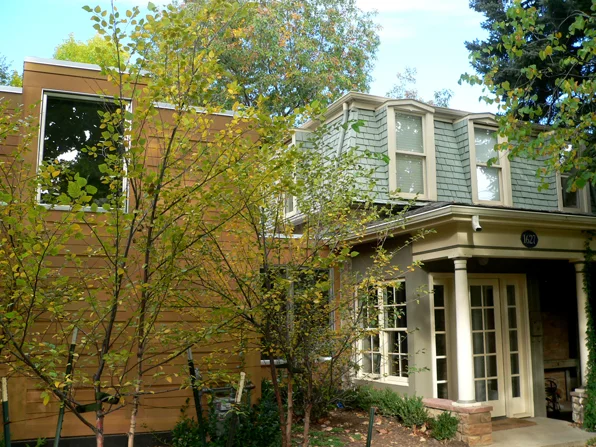
One of the challenges of the project was to make a largely blank wall against the street and express the studio as  distinct from the existing 1890's house.  The old house's porch was greatly compromised by the old studio and the new design pulls the studio away from the house, letting both the new and old construction establish a dialogue of equals.

JP front 03

JP front 03

The new studio has three large, high clerestory windows which act like dormers, articulating the mass of the studio and echoing the form of the mansard roof of the old house.  The new exterior siding delineates the new from the old, but subtly recognizes the dimension of the mansard shingles with the syncopated rhythm of the new siding.

JP exterior siding detail, square

JP exterior siding detail, square

The new connection to the old house was a peeling open of the existing plaster to reveal the massive stone exterior wall on the interior, re-emphasizing the transition between old and new, literally framing the new with the existing.

JP interior 06

JP interior 06

This studio is phase one of a multi-phase project that will include a new interior hall and kitchen/dining extension from the old house into the rear yard.  The completion of the second phase will result in a more compact and intimately scaled courtyard space between the studio and the house, realizing a more complex relationship of live-work that is the day-to-day life of this creative couple.

This project entails a lot of the complexity of issues that we are increasingly attracted to in our work - preservation and new construction, live/work environments, interior/exterior relationships.

Designed by M. Gerwing Architects

Mark Gerwing, Project Architect

General Contractor:  Cottonwood Custom Builders

Structural Engineering:  Gebau, Inc.

"Do I look fat in this house?" Hyper-Attenuated Building Syndrome

japan 01

japan 01

One of the sure-fire ways of designing a cool looking building in graduate school was to be infected with the Hyper-Attenuated Building Syndrome (HABS).  Any project can be made absurdly long and skinny and by violating any notion of “pleasant” golden-section-type proportions, it instantly propels a project from everyday to extraordinary.  Mind you, this was simply grad school students messing around.  However, the Hyper-Attenuated Building Syndrome is no laughing matter:

Japanese architects are particularly susceptible to HABS but it was not uncommon in nineteenth century Europe:

europe 01

europe 01

The most marked sympton is a building  exceeding a 10:1 length or height to width ratio.

In increasingly dense cities, every little sliver of available space is ripe for potential building.  These skinny buildings have room proportions that are a far cry from the typical American suburban house (14' wide rooms with 8' tall ceilings) or even Palladian villas (room ceiling heights equal room widths).  Rather, the HABS spaces are taller than wide - maybe more appropriate for a standing population, on the go.  Maybe not so good for an overweight generation.

I am currently working on a project with an available building envelope of 20' wide by 127' long on the main level and an incredible 9' wide by 127' long on the upper level.  These long, skinny spaces inevitably conjure up vaguely militaristic architectural terms like the shotgun house or enfilade. Or maybe a bowling alley or a house for an archer.