the whole unorganized thing

Boulder Modernists - Tician Papachristou

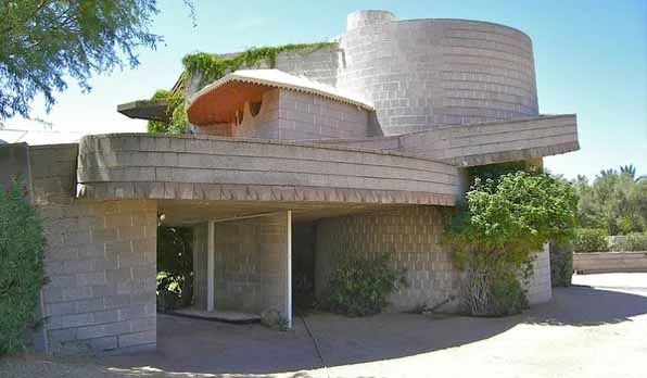
Sirotkin House, designed by Tician Papachristou, 1959, Boulder, Colorado

Sirotkin House, designed by Tician Papachristou, 1959, Boulder, Colorado

Another in a series of posts of some of the remarkable architects that were working in Boulder, Colorado in the 1960s.  This was a particularly fruitful time for questioning the basis for especially residential design and Boulder's building boom allowed some of the more talented local architects to experiment with new forms, materials and most notably, new sets of relationships between the house and landscape.

Tician Papachristou briefly taught at the University of Colorado, but his first experiences in Boulder were as a draughtsman for the prolific local architect James Hunter.  As Papachristou eventually opened his own office, his work became increasingly sculptural and his early collaborations with another young Boulder architect, Charles Haertling, were to be greatly influential on the latter's remarkable later career.

Sirotkin House, designed by Tician Papachristou, 1959, Boulder, Colorado

Sirotkin House, designed by Tician Papachristou, 1959, Boulder, Colorado

There are a pair of houses by Papachristou in the Hill neighborhood just west of the University that were designed as a duet.  The Sirotkin house sits higher to the west and looks out beyond the Jesser house.  The Sirotkin House is a fairly rigorous geometric design that features a series of curving landscape walls that run into the house, joining the interior and exterior.  Unlike the Palm Springs modernist houses which seamlessly flowed interior space with the exterior environment, here in Boulder the weather, although sunny, is quite cold and snowy in the winter.  The melding of architecture and landscape by Papachristou is accomplished by creating walls that start out as landscape retaining walls and at some point turning into house walls.

Jesser House, designed by Tician Papachristou, 1959, Boulder, Colorado

Jesser House, designed by Tician Papachristou, 1959, Boulder, Colorado

Jesser House, designed by Tician Papachristou, 1959, Boulder, Colorado

Jesser House, designed by Tician Papachristou, 1959, Boulder, Colorado

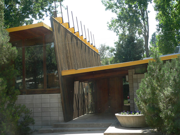
The curvilinear forms of the Jesser House are in stark contrast to the strict orthagonal geometry of the Sampson House designed by Papachristou in 1958.  This long, low house shares the same strategies for integration between landscape and building as the paired Jesser and Sirotkin houses - walls freely move from within the house to across the landscape.  In this case these walls are severely straight, setting up a marked hierarchy with the tilted entry plane that cuts through the house.  The roof forms are all executed as planes and their liminal extension is emphasized by extended rafters and the oddly projecting posts of the tilted wall plane.  This house strikes me as still freshly modern, maybe more so than the previous two houses.

Sampson House, designed by Tician Papachristou, 1958, Boulder, Colorado

Sampson House, designed by Tician Papachristou, 1958, Boulder, Colorado

Sampson House, designed by Tician Papachristou, 1958, Boulder, Colorado

Sampson House, designed by Tician Papachristou, 1958, Boulder, Colorado

A final biographical note about Papachristou:  he was the local architect consulted when the various site locations for the NCAR labs were proposed.  His suggestion of locating them atop the mesa served as the inspiration to the architect of the project, I.M. Pei.  It is hard to imagine that these buildings would have been at all successful but for their dramatic setting.  Pei was suitable impressed with Papachristou and recommended him to the famous Modernist architect Marcel Breuer in New York.  Papachristou went to work for Breuer, leaving Colorado behind - a good move for him albeit a loss for Boulder.

Evil Lairs - the architecture of imaginary bad guys

Strombergs Atlantis The Spy Who Loved Me

Strombergs Atlantis The Spy Who Loved Me

Modernism has a mixed reception in the United States.  Especially in residential design, it is equally despised and beloved.  There are loads of historical reasons for this, filling volumes of treatises and endless hand-wringing by architects. I have always felt that it was corporate America's embrace of the industrial aesthetic of Modernism that most distinctly became the focus of opposition for most folks image of  "home".

elrod1

elrod1

However, as I have been watching the Tour de France coverage recently, one of the oft-repeated commercials depicts Alex Baldwin within the lair of some arch-villain.  Although brief and glimpsing, I am pretty sure the surround, the lair itself, is the recently renovated (but not yet open) TWA Terminal originally designed in all its swooping mid-century elegance by Eero Saarinen in 1956.  And such it is for most evil-genius hideouts - they are triumphantly, arrogantly Modern.

death star bridge

death star bridge

The movie-face of evil chooses Modern digs.  The James Bond movies are the prime example for this, but certainly not the only one.

Building the Paranal Residencia — From Turbulence to Tranquility

Building the Paranal Residencia — From Turbulence to Tranquility

Ken Adams, the supremely-talented, architecture-educated set designer for most of the Bond movies placed almost all of Bond's foes in ostentatious Modern environments.

Even deep within Goldfinger's Kentucky horse farm, a kind of Modernist  swinging-bachelor pad lounge houses the villains and mafia cohorts.

Goldfingers lounge

Goldfingers lounge

It is not just their high-tech control rooms, but their living spaces as well that baddies like kickin it with their henchmen.

In the end, Bond will inevitably blow up all of these evil lairs as killing the villain is clearly not sufficient to extinguish his evil. The architecture itself, as a co-conspirator to attempted high-tech tyranny, must also be destroyed.  Bond is indeed is Her Majesty's Service, the Arch-Angel Michael, avenging Great Britain and the order of the old world against the nouveau riche excesses of technology and "progress".  Maybe Bond's campaign against Spectre is merely a thinly-veiled attack on Modernism itself, with Prince Charles and Bond extinguishing the consistently foreign, and Modern, foes.

Blofelds lounge You Only Live Twice

Blofelds lounge You Only Live Twice

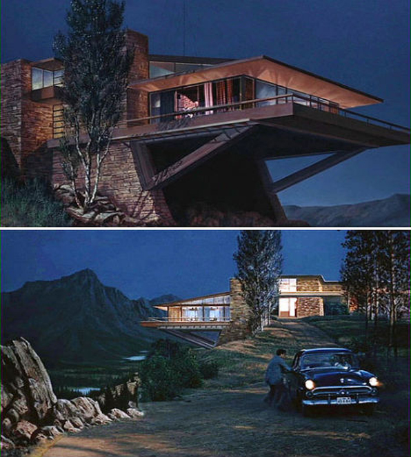
The popular culture attack on Modernism is not solely attributable to Bond movies alone.  Hitchcock's 1959 North By Northwest famously serves up another evil lair, Vandamm's Usonian inspired Modernist house.  Is this another attack on Modernism, this depiction clearly the American version, by a Brit?

movie-houses-north-by-northwest-vandamm

movie-houses-north-by-northwest-vandamm

The dramatically Modern hideout of villains has of course now become part of the genre and an easy target of some quite funny renditions.

Dr. Evils lair in Austin Powers in Austin Powers Goldmember

Dr. Evils lair in Austin Powers in Austin Powers Goldmember

Not much to be said of these except that no indications of traditional domesticity are allowed for evil to prosper.

I have grown up with these Bond movies and must admit there is something profoundly satisfying in the inevitably outcome of the total destruction of these environments, the complete erasure of a singular vision of money and power and hubris.

Willard Whites lounge Diamonds are Forever

Willard Whites lounge Diamonds are Forever

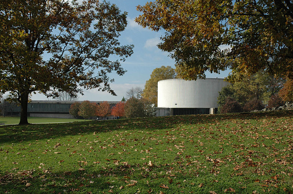
As a final note, I have long felt that the best evil lair for a bibliophile villain must be Yale's Beinecke Library.  Designed by Gordon Bunshaft, it has all the trappings of that singular, Modernist vision, even to point of allowing no windows to display the less-than-perfect and frankly untidy and traditional, outside world.  You can almost hear the crazed classical organ fugues reverberating through the space.  For as much as the buildings, furniture and fittings of Modernism became the sign of evil genius run amok, the music associated with these movie madmen never strayed to Sinatra or Martin Denny's space age bachelor pad lounge music.  I guess if you need the drama to wipe out much of the human race, you prefer Bach to Herb Alpert's Tijuana Brass.

beinecke-2

beinecke-2

Yale_University's_Beinecke_Rare_Book_and_Manuscript_Library by Gordon Bunshaft

Yale_University's_Beinecke_Rare_Book_and_Manuscript_Library by Gordon Bunshaft

Up next: the architecture of heros - Goodness, Nature and Vengeance.

New Urbanism, 19th century style, Old Louisville

house in Old Louisville, Belgravia court

house in Old Louisville, Belgravia court

"New" urbanism has been criticized enough for its slightly ridiculous and myopic name.  It seems that New Urbanism has now transitioned  from an innovative design process to make walkable, more sustainable cities, to a buzz word bandied about by developers to pack more units and more density into even smaller acreage.  I live in a New Urbanist kind of neighborhood that I quite enjoy even if the mix of residential and retail is a bit light on the shops and restaurants.

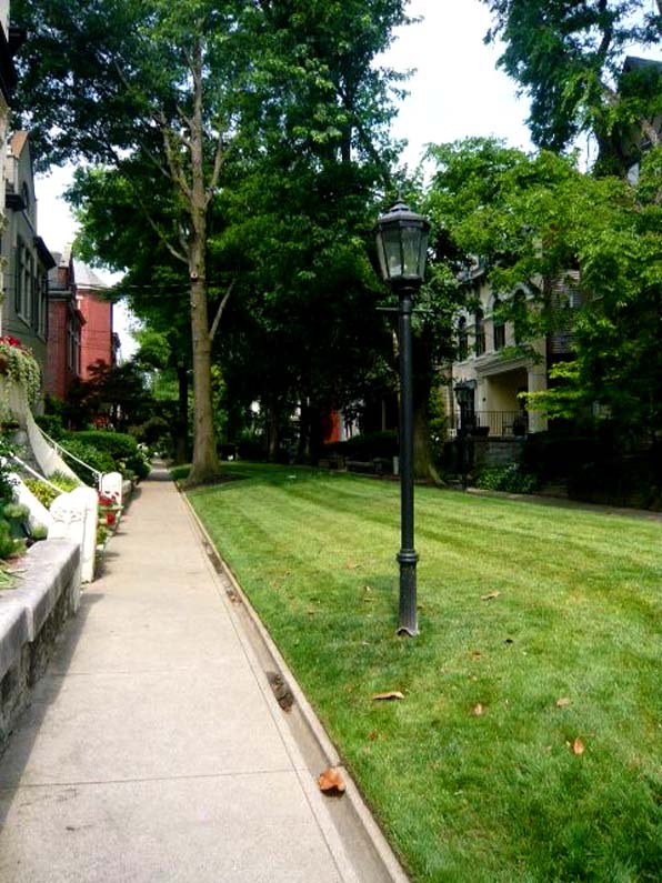
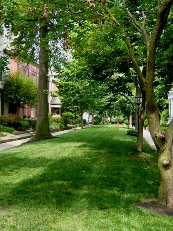
On a recent trip to my hometown of Louisville, Kentucky, I took an opportunity to head downtown to the Old Louisville section of town.  I wrote about this previously in terms of its formation and history, but what really struck me this time were the small pedestrian-access only areas - a series of green lanes and squares which fronted the houses.  And what impressed me the most was how gracious and carefully delineated each of these areas have become.  Certainly the passage of time - these areas are now 100 years old - have eased and softened some edges lending a composed, relaxed air to the formality of the building designs.  But it is the apparently simple things, like the distance between houses, the width of the lanes, the slightly veiled gates to gardens beyond, that are so impressive, carefully handled and now governed with a loving stewardship.

access to fronts of houses, pedestrian walk, Old Louisville

access to fronts of houses, pedestrian walk, Old Louisville

There was a time when all of Old Louisville, and certainly these pedestrian access lanes, was not so nice or well-loved.  Like most of the U.S., urban flight abandoned downtown residential districts and many of the suffered.  These houses which did not sit facing normative streets paid a particularly steep price, being cut up into so many apartments because the auto-centric culture did not value the density or access.

OL house 01

OL house 01

Luckily these well-built structures survived that time, both due to the quality of the architecture and planning, and most likely, because no developer or urban renewal agency had their eye on this part of town.  This district, the Old Louisville Historic District was quickly formed in the 1970's to fend off some of those early demolishing threats and because of those efforts we not only have a section of beautiful, delightful residential housing, but a remarkable demonstration of old New Urbanism.

lawn1

lawn1

renovations - habitual patterns of use, by Boulder architects M. Gerwing Architects

We work on a lot of smaller projects that largely entail the internal reorganization of an existing house.  Most often these are houses that were built in the 1960's and the current homeowners are struggling with small, awkward kitchens and houses that are more formally arranged than currently lifestyles are well suited. New houses and restaurants are projects that allow for the most creative freedom, but it is these difficult spatial re-ordering projects that pose the greatest challenges and result in our greatest satisfaction.  Most of these projects are hemmed in with zoning constraints and building restrictions, but the single largest constraint is often in the minds of our clients.  Very often they have lived in the house for a number of years and although they are frustrated with it, it is very difficult for them to conceive of moving a critical function like the kitchen from one space to another.  They have developed habitual patterns of use that make seeing the forest through the trees extraordinarily difficult.

BL angled front

BL angled front

I found this to be true in my own home renovation.  Even as an architect, while living in the house it was difficult to imagine such a radical notion of demolishing and moving a kitchen across the house.  Sitting with the drawings in front of me it was clearly the right move to make, but standing in the house it seemed daunting.  And not just because of the associated cost and complexity that such a move would add to an already trying project, but because I had frankly become so used to getting my coffee and cooking so many meals there.

It is our habit that whenever we are faced with this kind of project we always run through a few exercises that test the possibilities of just these kinds of moves.  What if the dining room flipped positions with the living room?  How about if the entrance was on the other side of the house?  Or, as in a recent project, what if the kitchen moved into the master bedroom?

BL pres before and after plan

BL pres before and after plan

I make it a practice not to talk about the potential changes to a house when I visit the property for the first time.  For myself, it is the space and distance created while working in the studio that will most likely generate the most interesting solutions to a project, not walking around the house.  It seems a bit counterintuitive, but going to the actual site often makes the possibilities of a project less real, the potential of a project diminishes with the distance to the actual building.

In the end, it is a balanced attack on a project that provides the best answers and brings up the most interesting questions.  As an architect, you have to go to the building and study it, but you also have to go to your studio and take it apart in your head.  Architecture is practiced in the real world of walls and floors and dense materials, but it is best conceived in the imagination with paper and pencil, cardboard and glue.

by Boulder architects M. Gerwing Architects

Preservation of the Recent Past, by Boulder architects M. Gerwing Architects

Why do we preserve buildings? Why do we care about mute constructions, often old and unused, occasionally in the way or overlooked? We have all walked through great neighborhoods and parts of cities with magnificent old buildings and very few of us would show no concern at all if these places were simply ground down under the wheels of progress.  That doesn't mean we save every shack or old shed, but rather we recognize some value in mere continued existence of some portions of our collective past.  What is valuable about these old buildings is not necessarily what they look like or how they function, but what they are.  The preservation of some older buildings reminds us of what we are by holding on to some portion of who we have been.

Lloyd Wright_Scott Jarson

Lloyd Wright_Scott Jarson

All well enough said, but when the desire to preserve runs head long into private property rights, what is to be done?  And when the object of preservation is a building not very old, maybe not even as "old" as any one of us, then how do we view the cause for preservation.

Most folks don't readily appreciate the architecture of the recent past.  It seems a bit naive and slightly embarrassing, like looking at yourself in old high school yearbooks.  Any building that we can remember when it was new can not possibly be of a value akin to the great Architecture of past ages. And yet so many of us can lament the loss of truly great buildings, like Penn Station, that most of an earlier generation held in similar contempt that we place so many buildings constructed in the 1950's and 60's.

cyclorama2_Wikipedia Commons

cyclorama2_Wikipedia Commons

The buildings shown here aren't some obscure shacks threatened with demolition.  These are significant works by some of the greatest architects of a generation ago - Bertrand Goldberg, Richard Neutra, and Frank Lloyd Wright.  You might not like these buildings, but that is not the point. For God's sake, most communities in the US have fashioned a minor economic industry centered on tourism to Wright houses, not the financial benefits of their destruction.

Prentice_Landmarks Illinois

Prentice_Landmarks Illinois

It is disheartening to sit here in 2013, with over 50 years of preservation battles - successes and failures - behind us only to realize that years from now I will have to explain to my daughters why my generation tore down Neutra and Wright buildings.

The case to save Neutra's Cyclorama Building, Goldberg's Prentice Hospital and Wright's Lloyd Wright house can all be linked to here.

by Boulder architects M. Gerwing Architects

Regional architecture - Florida Keys, by Boulder architects M. Gerwing Architects

Keys5

Keys5

I have often written about my interest in regionally specific architecture, especially vernacular forms that derive from local climatic conditions or materials availability.  I recently spent some time in the Florida Keys and in my typically geeky architecture fashion, spent almost as much time looking at the local historic buildings as I did relaxing on the beach.

Keys4

Keys4

Like any relatively isolated region, the architecture of the Keys, and especially Key West, is dominated by its largest growth period, starting with the late Victorian era and extending to the Depression.  As a result, the typologies of houses you find are almost exclusively wood-framed, simply-gabled homes with painted lap siding and more-or-less overly wrought scroll details.  While there are plenty of houses from other periods, these basic vernacular houses became the standard that has been replicated, often less successfully.  The funky mid-century commercial architecture of the Keys, including the building-as-sign googly constructions date from the 1950's and 60's when the Overseas Highway surplanted the train and boat as the dominant mode of access to the Keys, are more often found at the beginning of the island chain, closer to Key Largo.

Keys1

Keys1

As in so many older sea-faring communities, the predominance of horizontal wood siding reminds one of the hulls of boats and the gable-fronted houses resemble so many upturned boats.  Of particular interest to me are the use of shutters and porches to mitigate the harsh Caribbean sun while still allowing ample breezes to move through the structures.  Unlike Italian house shutters, the Keys shutters are plantation style, often not individually operable but top-hung as a panel that can kick out at the bottom.

Keys2

Keys2

Of course here in the Keys, the shutters do not just provide sun control, but are necessary protections for the Gulf storms and occasional hurricane.  For that reason they can be found on doors and windows within porches, well beyond the areas where sun shading would be necessary.  These shutters provide a kind of vertical emphasis to the buildings that contrasts with the predominant horizontal siding and decorative rails.  The overall effect is of a lightly sprung craft, held in tension, that takes the kind of maintenance and attention that only a boat-owner could appreciate.

Keys3

Keys3

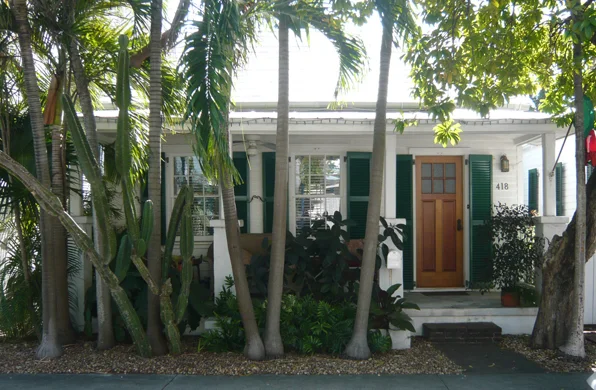
The older portions of Key West are also fairly urban and dense, with house fronts mere steps from public sidewalks.  The shutters are also used to create privacy while keeping doors and windows open.  As in the photo above, the subtle delineation of public and private spaces, from sidewalk to private walk to porch to interior, works in about ten feet of space, each layer carefully playing its role.

This kind of attention to the details of public and private space are often lumped into the concepts of New Urbanism.  But, as you can see, some good old fashioned urbanism is successfully at work, design solutions worked out over years of lived experience that architects would do well to study. And shutters that actually work, not just applique patterns, a fearful architect's pet peeve.

by Boulder architects M. Gerwing Architects