architecture - climate and region; some thoughts on southern mansions

I have been thinking  a lot lately about vernacular architecture and indigenous responses to local climate.  By that I mean how a building and design practice, over time, has found architectural solutions to solve some of the problems posed by heat and cold, sunlight and shadow, aridity and humidity.  Reading through some older posts on my delving into the possibility of trying to define a Colorado vernacular, it strikes me that very few of those examples I identified tackled the issues of heat and solar gain.  That might sound like a recent concern, more one of energy use and sustainability, but a few quick glances at traditional southern architecture reveals design/technological solutions that we have largely forgotten in the age of air-conditioning.

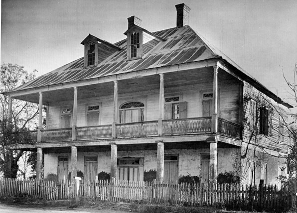
These are images of traditional southern plantation houses in Louisiana from the book Ghosts Along The Mississippi by Clarence John Laughlin.  The book's oddities aside, it is a great document of these traditional houses many of whom are no longer standing.

The large wrapping porches and porticos of all these houses block the direct sun from hitting windows and exterior walls and create  a deeply shadowed interstitial space between interior and exterior.  The "technology" of the deep overhang results in a new kind of spatial experience, partly interior, partly exterior, which radically breaks down the stark privacy of the Georgian forms from which these models take much of their architectural character. It is maybe tragically ironic that these houses where slaves were an essential part of the culture and economy have in a sense a more casual relationship between public and private than their English precedents where servants were equally present but interior and exterior were sharply delineated.

Of course some of these houses owe more of their architectural lineage to Greek antecedents, but in ancient Greece's equally slave-owning culture, emphasis is directed inward to courtyards, not outward as in these southern Tara-like mansions.  Certainly the veranda was a convenient place for a plantation owner to survey his fields and from which to greet visitors, but the impetus for the porches was more climate-driven than programmatic.

More than echoing their Georgian and ancient Greek architectural origins, maybe these southern mansions, with their large, single roof forms owe more to that other model of agricultural manor house, the Palladian villa.  Although those villas of central Italy and the Veneto do not sport large, overhanging  porticos, like their southern mansion  cousins, they are singular buildings in the landscape, dominating the perspective in a single large architectural form.

The southern mansion prototype has become such a stark visual cliche that it is difficult to look beyond the ridiculous bad copies that it has inspired and look a little more carefully at the architecture.  And of course its association with slavery forever banishes the southern traditional mansion into a dusty drawer of architectural history.  However, a closer examination of its form and materials in response to climate and its adaptation and transformation of formal architectural modes grafted onto vernacular practice is a worthwhile study.  I am not suggesting that we adopt the form and replicate, South Fork ranch-like, a hybridized bastard McMansion morphology, but let's not throw the architectural baby out with the cultural bathwater.

(images by Clarence John Laughlin from Ghosts Along The Mississippi)

why are so many modern houses such bad neighbors?

In the last few days, I have received, along with the usual breathless announcements from the architectural press, images of a number of new, modern houses that share a disturbing characteristic.  What so many of these houses have in common is their disdain or outright contempt for their more mundane neighbors.

I am a strong believer that contemporary buildings should reflect contemporary times.  That doesn't always mean that I design "modernist" buildings, but certainly the language of modernism - spatial as much as material - is always at play in my work.  I am also almost daily fending off criticisms of modernism by non-architects.  There are a number of reasons I think that most folks dislike modernist designs, some of them a bit knee-jerk, many of them based on only having experience with bad modernist designs, but some of them very well deserved.

Why are so many modern houses such bad neighbors?  Modernism owes much of its appeal to its boldness and often stark articulation.  When placed is what is otherwise a fairly traditional neighborhood, this is often strikingly harsh and confrontational.  Let me try to outline why I think this has come to pass:

1. First, modernism is born in the crucible of individual liberty and an outright denial and contempt for previous historical forms.   A modernist building is a work of art and is often likewise as non-contextual.  It doesn't matter who or what your neighboring buildings might look like, the architect is genius and the work is a masterpiece and owes no debt to its philistine neighbors.

2.  Second, traditional houses were proud manifestations of the homeowners wealth and status and most importantly, their public role as citizens.  Windows were not only to let in light and air, they were also a part of the forthright facade of the building, looking out at their fellow neighbors and asserting a public role.  Modernism's championing of functionalism over formalism has in a sense reduced the window into a technological device for the passage of sunlight and possibly the movement of air.  Windows are placed based on views and light and privacy, not as the public face of the private life of the homeowners.  This is symptomatic of,

3.  Traditional houses were public buildings of a sort.  Even though the private lives of the residents might roil within, the house was the public face of that family and projected their status, taste and prejudices out to the neighborhood and the city beyond.  By contrast, most homes over the last 50 years or so, are not built to project out in to the world, but rather to be a retreat from it.  Homeowners consistently respond that they view their house as a refuge, oasis or retreat from the world.  Modernism responds in kind - functionalism demands that if the house is to be a retreat, then privacy trumps any public role that a house might display.  Our ambivalence or outright fear of the world at large directs us to make houses that turn their backs on the street, hiding and protecting the inhabitants.  This is maybe not that different from medieval towns who faced the outside world with large defensive walls, not the light and airy facades of Enlightenment villas.

It is my practice to always study the context of a building with as much care and rigor as the program of the building.  In my mind, the "function" of the neighborhood, its faces on the street, the proximity of other buildings, the rythym of the openings along the street, are all as much a part of the problem of the project as the location of a kitchen or the drama of a stair.  For buildings in remote, rural settings the shape of the land and the context of trees and native plants along with the seasonal variations of light and views, make up the "neighborhood" of the building.  However, in a more densely populated suburban or urban situation, the design of the building should reflect and respect some aspects of the scale, size, proportion and "openness" of the surrounding buildings.  This does not mean that we typically mimic the style of the buildings around us, rather we look to some aspects of these buildings to see if there are some elements that might both reinforce the internal functions of the house as well as help relate the house to its context.  That may mean we reflect the relative amount of window-to-wall proportion of the neighborhood or the base-shaft-capital vertical arrangement of a set of facades.  Even when the new building is significantly larger than its older and more traditional neighbors, we make efforts to mitigate this scale contrast by various means - entering the building on a lower level, downplaying the colors and material, breaking down the scale of the new to reduce its visual scale.

So where do so many architects get off complaining that the public just doesn't get it and that anyone who doesn't like modernism is a dolt?  When architects finally stop making bad corporate shit-box buildings and masterpieces to their own ego (and sometimes those of their clients) instead of recognizing the value of being a participating part of a larger whole then maybe modernism can regain its claims to humanism.  Until then, if you want to design a masterpiece unhindered by neighbors and their mundane houses, feel free to buy a large chunk of land up in the mountains or out on the plains and let's go for it.  But if you want to live in a neighborhood, then be a good neighbor.

New technology and the richness of history

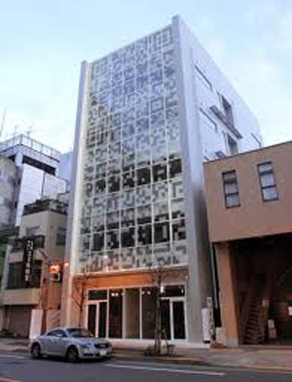
I have been thinking a lot about how to better harness new technology and new media resources to bolster interest in historic preservation and the changing architectural faces of our cities.  I have written before about the potential of posting QR codes that allow visitors to easily access a rich and deep array of information that a typical sign can not accommodate.  This has now been taken into the real world application of a building in Tokyo that displays QR codes on its facade that can be read by a smartphone and that accesses the building users Twitter feeds in  real-time.

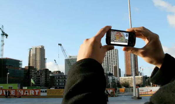
I have been very impressed with some recent augmented reality apps, like Sara,  that allow you to use your smartphone and its camera and gps technologies to envision a proposed building on a site.  By downloading the app you can simply point your smartphone like a camera at a specific location and along with the actual building or site that you are seeing, an image of a future project from the same vantage point will appear on your phone's screen.

I have yet to find someone that has applied this technology to envisioning the history of a city.  You may have seen the history slider in Google Earth's satellite imagery that lets you scroll through historical aerial images of a city and gives a great understanding of the incremental development of a given place.  If the 3D buildings in Google Earth were tagged with their date of construction, you could do the same with the 3d imagery, scrolling through the decades, watching buildings rise and fall and new construction rise again.  I think this would be an amazing resource and break the veil of history that often impedes our understanding of time and place.  It is so very difficult for folks to believe that the buildings and spaces around them have not always been that way.  We all know this intellectually, but without visible evidence of previous eras it is impossible to really inhabit the city through time.

Beyond this capability in Google Earth, I would like a developed app that would integrate all those freely sourced 3D buildings built online and place them within an augmented reality app.  Anywhere you walk through the city you could enable the app and hold up the phone and from the same vantage point, be able to scroll through hundreds of years of urban growth and transformation.  The perspective on current projects that that kind of a technology would engender would radically change both architects and the public view of what our places have been and will be.

Locally there are two programs that begin to approach this kind of real time/place historical understanding using current tools.  Historic Denver's Denver Story Trek allows people to choose from a range of designed tours or the ability to create your own.  As you walk, bike or drive around the city, a text message prompts you to information about a given site, both its architecture and social history.  Free audio files can accompany your tour and help bring to life each site.

Another program, run by the Denver Public Library's Western History & Genealogy folks, called Creating Communities, harnesses a vast digitized archive of images and information to map neighborhood histories.  Their work consists of a Google map containing building histories and an iPhone app, Creating Communities, that allow you to search your neighborhood and access information about its city while also on the move.

Can we expect to see my proposed app some time soon?  Well, there's not much money to be made in preservation, so unless there's so nice grant out there for a pilot project, probably not.  If you know of such a thing, let me know.  If you have further thoughts on how to apply this technology to architecture and preservation issues, I would love to hear that as well.

Frank Lloyd Wright's Meyer May House, Grand Rapids, Michigan

This last summer I had the opportunity to be in Grand Rapids, Michigan, home of Steelcase furniture, and the magnificently restored Meyer May house.  Designed by Frank Lloyd Wright in 1909, the house was designed and built just as Wright's marriage was falling apart and he was soon to depart to Europe to escape the scandal and notoriety.

Like the Robie House, designed in Chicago just a year or two earlier, this house sits on a residential corner lot and shares with as well Wright's signature hidden entryway and layered horizontal composition.  Even though the Robie House is more dramatic, being more decidedly long and narrow, the Meyer May house actually does a better job of addressing the spatial situation of the corner lot.  However, this does lead to a fairly complex interior with spaces driving in two directions, maybe anticipating the more pinwheeling designs of later houses.

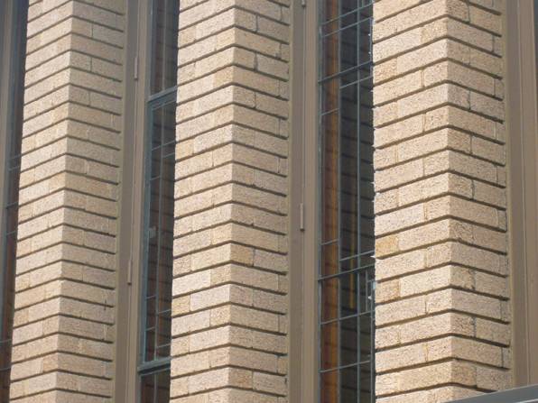
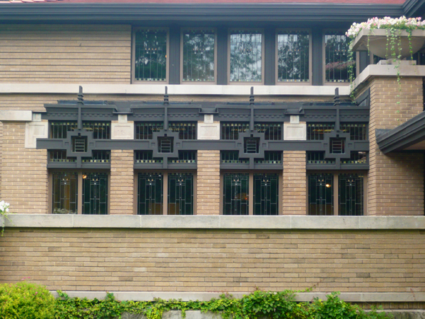
You can see many of the typical Wright details here - the flush vertical joints and deeply scored horizontal joints of the masonry, the wide cantilevered, hovering roof planes, the delicate leaded windows.

And, like in some many of Wright's houses built during this phase of his career, a complex and devoted attention to some rather fussy details like these Living Room windows.  One can't help but speculate that this heavy grille work on street-facing windows was as much defensive as decorative, a spill-over from Wright's domestic troubles, keeping the world at bay as much as providing light and views.  I have often thought that his growing predilection for the increasingly hidden and obscured entries of houses of his from this period are also an echo of the growing demand for privacy and avoidance of the public gaze that eventually surfaces in Wright's full retreat from Oak Park and Chicago to rural Spring Green, Wisconsin.

In any case, the Meyer May house is not only an excellent and under-appreciated work of Wright's from this period, it is also one of the very best examples of a period restoration that feels complete and careful without feeling like a museum (even though it is of sorts).  Steelcase purchased the home in 1985 and painstakingly restored the entire structure including sourcing many Wright-designed furniture and textile pieces to fill it.  And best of all and a great testament to the new owners, the house is fully available for tours for FREE, no reservations needed.  Thank you Steelcase for the great renovation and most importantly for allowing it to be viewed by anyone.