Whether vertical or horizontal, the spare extension of space in one direction is fascinating in its simplicity but also its frightening drama.
brick and sustainability - some places I've lived
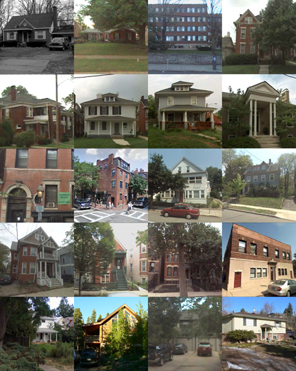
Below is a series of photos of some of the places I have lived. (Thanks to Google streetview for most of these). Not everyplace is there – a house in Louisville when we first moved there, an apartment in Venice, a couple of places in Lexington, Kentucky – are missing. A question came up regarding masonry houses and the West. Most everything built here in Colorado for single-family residential work is wood frame construction with wood siding, even though the environment out here is not kind to wood (too much high-altitude sun and snow). I was wondering how common that was in other places and decided to take an albeit bias survey of a least the places I have lived.
Of the 20 places shown here, there are a couple of brick suburban houses in Louisville, KY; a brick dorm and some brick apartments in Lexington, KY; a couple of brick townhouses in Boston and a couple of brick houses in New Haven; some brick apartments and a converted storefront in Chicago. The lower images are from Colorado: a small frame house in Boulder, a log cabin in the mountains above Boulder, a wood-framed townhouse and then a partial brick suburban house in Boulder.
Maybe because I was obviously drawn to apartments in old, brick houses as a young adult, they’re heavily represented. But overall, I think my experience is probably not that different from many others, moving from suburbs to cities and back to suburbs again. It may be a regional expression or possibly a recognition of the age of building stock, but the paucity of masonry in the West is striking. The number of older, quality buildings in Colorado is pretty thin, but this may not be the region as much as the relative youth of most of the buildings here. I’m afraid in an society with increasing demands to make short-term capital, the idea of creating a building to last generations has simply died away. Even the older, brick suburban houses that I grew up in Louisville have a solidity and permanence that a wood-frame and sided house can not invoke. So I think looking at these images, it is not the region nor the suburban/urban/rural nature of the structure, but rather its date of construction that has most influenced the use of materials. Hopefully with a renewed interest in the environment, we can recognize that the most sustainable building is one that lasts the longest
on the boards, February 2011
Our workload has started off with a bang compared to the last couple of years. We are working on a number of really great projects - a couple of new houses, a couple of renovation/additions, a couple of master plans and a few other things.

As I mentioned in a previous post, a number of our new projects incorporate universal design principals for clients who are either current wheelchair users or anticipate reduced mobility over the next decade or so.
In light of the massive downturn in architectural services that we have all experienced over the last few years, it is thrilling to have the office full of drawings and models of ongoing work. Along with our office picking up the pace, a number of previously unemployed architect-friends of mine are working again and contractors are no longer singing the blues as fervently as in past months.
It is quite a luxury to be selective about projects again, to engage in projects that are interesting and challenging and not necessarily all about paying the bills and keeping busy. The recent upswing in inquiries has focused my desire to choose projects based on the site and the client, not the size or cost. We'll see how they develop ... stay tuned.
parti diagrams, part one
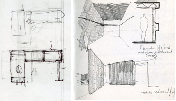
a parti diagram is an idea sketch, an initial response to a site, a client’s program or some other conditions that begin to determine the order for designing a project. They don’t really represent what the project will look like in plan or elevation, but are a road map of the ideas of the project. Ideas of ‘threshold’, ‘tension v. repose’, ‘horizon and center’, or ‘territory and enclosure’ all can be simply diagrammed in the parti as an initial response to the problem posed by a new project.
At Home by Bill Bryson
After waiting a number of weeks for a copy of At Home by Bill Bryson to make its way off the Holdshelf and into general circulation at the local library, I finally purchased a copy the other day. I can fully admit to being completely fascinated by opinions, history and thoughts on what we all take for granted as a "house" as expressed by non-architects. I can't seem to stop buying books that give a thoughtful point of view on the cultural edifice that is a house that are not written by architects, their magazines and especially the architectural academy. Bryson has written a number of books, most of whom I would classify as armchair travel lit. In this case, the territory to be navigated is the house as conceived and formulated in Western Civilization over the last few hundred years. The book's chapters are based on the rooms of a typical house - kitchen, dining room, etc. - and plumb the often odd history of the use of the room and its accompanying embellishments. This kind of gentle deconstruction of the house, room by room, through history, is interesting even if it does, in its own form, reinforce the functionalist view of the house.
The most interesting section so far has been only a brief mention of an aspect of "house" design that I keep finding myself pondering over and is a subtext in a current project of mine. In Renaissance villas and houses, the drawings rarely define rooms by their function. Rather than labeling and defining a room for dining or a room for studying, a house is a collection of larger and smaller spaces. The Italian word for furniture, mobili, gives us a clue about this lack of functional definition - furniture was meant to be mobile and so was one's occupation of the house. Rooms were used for reading or sleeping or eating depending on the season and the time of day and the house was not a series of defined stage sets but rather a landscape to be traversed throughout the day and year.
"People moved around the house looking for shade or sunlight and often took their furniture with them, so rooms, when they were labeled at all, were generally marked mattina (for morning use) or sera (for afternoon)."
I admit that I have not yet finished the book, but I think I can recommend it to any one interested in what we mean by a house and how our patterns of using houses are embedded with a fascinating history. I would especially recommend it to architects making residential projects as both an interesting read and a necessary perspective of the house from beyond the myopic view of the profession which tends to frame a house as merely a aesthetic object.
Universal access and aging-in-place
Maybe it is just a coincidence, but I are finding that I am working on a number of projects that deploy universal access principles as a major part of the design process. If you are not familiar with this term, universal access is an outgrowth of the barrier-free design guidelines that we were all using for public buildings just a few years ago. The idea of universal access however encompasses not just guidelines for wheelchair users, but recognizes that curb cuts aren't just necessary for them, but aide folks with strollers and kids with skateboards. It is an acknowledgement that we all age and designing to accommodate the needs of the many probably benefits us all at some time as individuals.

My father has serious mobility issues and my sister and I have spent an increasing amount of time over the last few years trying to reconfigure and adapt his typical suburban house to his needs. After a broken hip, we quickly realized that the door to the master bath, a door he has used for over 25 years, is now 2" too narrow to allow a walker to slide through. The shower in that same bath is too narrow to allow a seat to easily fit and the handle of the shower door is too easily confused with a grab bar. Same with all the towel bars. The laundry downstairs has been abandoned as has the back entrance, which although it is almost at grade level, has an absurdly slippery deck that no amount of friction tape seems to ameliorate.
These are good lessons for an architect. We are all adept at designing to codes and the guidelines of the Americans With Disabilities Act. But the actual, everyday experience of seeing my father trying to navigate the kitchen has taught me so much more. And rarely have architects applied these universal design principles to single-family houses for aging-in-place prospects. I am currently working on a project that is a father-in-law suite that subtly incorporates universal design principles. It looks clean and simple and elegant and is also going to be a great asset to his daily living. At the same time, we are engaged in the early stages of two projects that directly confront the needs and desires of wheelchairs users. Seeing the house from that point of view, both actual and metaphorical, is a fascinating challenge and it reframes the poetic possibilities of every part of the house that we so easily overlook.
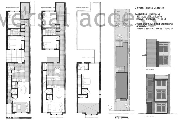
A pair of design presentation boards we did for an urban universal design competition for a neighborhood in Chicago from 2005:


