renaissance house

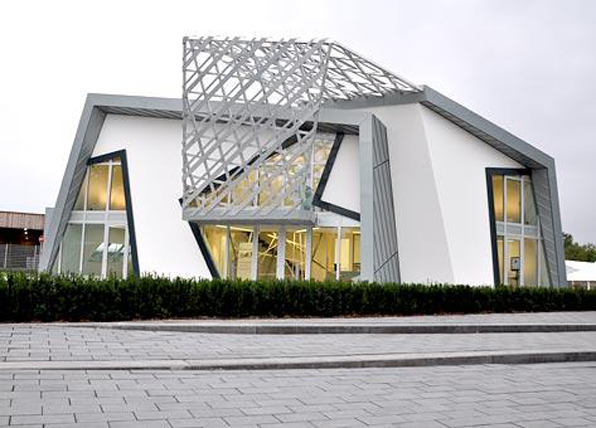
  This house is built on the same site up Sunshine Canyon as a former house lost in the Fourmile Fire of September 2010, just west of Boulder, Colorado.  The house looks out to the south to capture views from Denver to the Indian Peaks creating a syncopated panorama.  The entire structure is design as two large overhanging roof sections, like aspen leaves, sheltering the life within.

Both the Master Bedroom and the open Living/Dining Room have  panoramic views from Denver to the Continental Divide.

June 16th, Bloomsday; in which L. Bloom crosses the city.

Ah, I'm hungry. He entered Davy Byrne's.  Moral pub.  He doesn't chat.  Stands a drink now and then. But in leapyear once in four. Cashed a cheque for me once.

What will I take now? He drew his watch. Let me see now. Shandygraff?

- Hellow, Bloom! Nosey Flynn said from his nook.

- Hello, Flynn

- How's things?

- Tiptop ... let me see.  I'll take a glass of burgundy and ... let me see.

Sardines on the shelves.  Almost taste them by looking. Sandwich? Ham and his descendents mustered and bred there.  Potted meats.  What is home without Plumtree's potted meat? Incomplete. What a stupid ad! Under the obituary notices they stuck it.  All up in a plumtree.  Dignam's potted meat.  Cannibals would with lemon and rice. White missionary too salty.  Like pickled pork. Expect the chef consumes the parts of honour.  Ought to tough from exercise.  His wives in a row to watch the effect. There was a right royal old nigger.  Who ate or something the somethings of the reverend Mr. MacTrigger. With it an abode of bliss.  Lord knows what concoction.  Cauls mouldy tripes windpipes faked and minced up.  Puzzle find the meat.  Kosher. No meat and milk together. Hygiene that was what they call now.  Yom Kippur fast spring cleaning of inside. Peace and war depend on some fellow's digestion.  Religions.  Christmas turkeys and geese.  Slaughter of innocents.  Eat, drink and be merry.  Then casual wards full after.  Heads bandaged.  Cheese digests all but itself.  Mighty cheese.

- Have you a cheese sandwich?

- Yes, sir.

the shining castle

I went down to the San Luis Valley to photograph some of the small village chapels that dot that flat, dusty landscape.  So as I was driving around, I was keeping a keen eye out for any structures, like a steeple, that might pop up out of the surrounding buildings or clusters of wind-ravaged trees. As I approached Antonito, one of the larger towns on the west side of the Valley, a shining, luminous vision sparkled in the morning sunlight above the two-story town.  Upon closer inspection I found what I later learned was Cano's Castle.

Built over decades by Donald "Cano" Espinoza, Native American Vietnam war vet,  it is his temple of thanks for surviving the war.  The photos really do it no justice.  It is made up of thousands of objects, mostly metal, from beer cans to hub caps to ...

Outsider art is fascinating, but outsider architecture - not just building, but really audacious architecture, is heavenly.

what a house should be - part five - or what it's not

First, it is not a product.

Second, it is not a function of the architect's ego.

Third, it is not a function of the bank's commodification

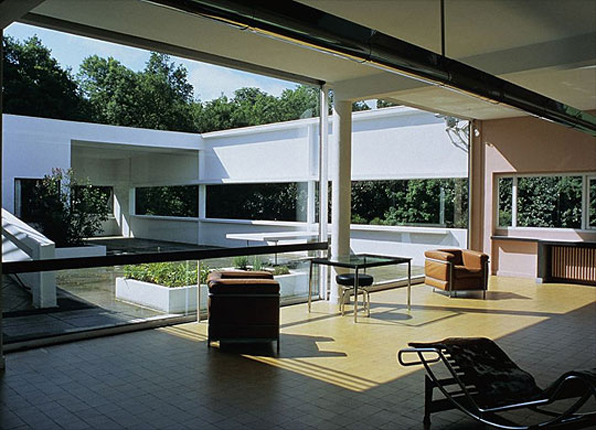
And last, it is not a machine. When LeCorbusier first said "a house is a machine for living", machines and technology were seen as liberating, not the soulless leviathans that they have come to be in popular imagination.  He didn't mean by this that it should look like a machine, even though his early designs certainly had a marine- or machine-like imagery.  He meant that it should be designed to exactly meet its function.  A blast-furnace looks the way it does because it makes steel.  No added flourishes, no anachronistic stylings.  His manifesto was likewise one of liberation, shedding the baggage of so many Victorian drapes and over-wrought iron.   So a house is not a machine, because "machine" has become too loaded a word.  But it should be as liberating and certainly as finely crafted as LeCorbusier's original humanistic vision.

silos, grain elevators: the architect's muse

Ever since LeCorbusier identified them in Toward An Architecture in 1928, grain elevators and silos have been of endless fascination for architects.  Their simple geometric austerity and utilitarian "dumbness" is fascinating, their forms clearly derived from the function of storage and the volumetric efficiencies of a circle extruded.

It is not a coincidence that the chapter in which these photos appear also contains the most famous quote from the tome:

"Architecture is the masterful, correct, and magnificent play of volumes brought together in light."

In the century that followed and the many fractured debates over Modernism, functionalism and formality, the simple structures were either forgotten or too simply parodied in the making of buildings.  Their stark beauty, which so impressed LeCorbusier, was dramatically re-envisioned by Bernd and Hilla Becher in their striking black and white images that exhibited across the United States in the early 1990's.

The Becher's images helped revitalize a dormant humanistic Modernism that had been buried by the sophistries of Deconstruction and French philology that came to dominate the architectural academia.  If nothing else their photos reminded us that after all, architecture is made of buildings, solid and constructed.

Having grown up in Kentucky I certainly saw my share of silos.  And true, they only really became apparent to me after reading LeCorbusier and allowing a new kind of appreciation slowly surface in my awareness of them.

Now it seems I sort of search them out.  They are striking and beautiful - if not in their actual construction then in their mass and verticality and how that contrasts so distinctly from the surrounding fields.

And of course, the geometry is sublime - a magnificent play of light.

the map and the land

On a recent trip to the San Luis Valley, I took along a map, my phone's GPS, and a couple of satellite images.  From that elevated perspective, the Valley is a playground of geometry.  The large circles of center pivot irrigation fields overlays with the strict orthagonal grid of roads creating an ordered and rational allocation of property and access.
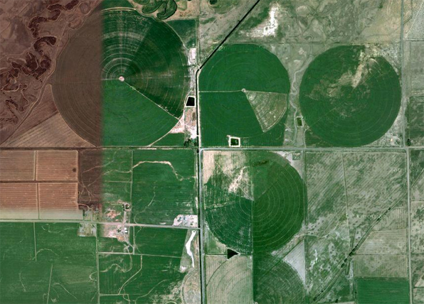
The image above, a satellite image, is split with two different seasons stitched together depicting the color and growth of irrigated fields - late fall on the left, spring on the right.

The map above shows the strict delineation of space in a grid, not unlike a typical city plan.

However, on the ground, things are much different.  It is almost impossible, especially at 65mph, to perceive the circular irrigated fields.  These figures, so dramatic from satellite images, are so large that the foreshortening of perspective makes their perception on the flat plane of the land almost impossible.

The same can be said for the grid of roads.  Driving the dusty gravel roads it is clear that almost every intersection is a four-way, 90 degree construction, but the overall impression of a large grid laid over the landscape is imperceptible.  A hint of this is found in the difference between the road map and the satellite image.  The image below is the same area as the gridded road map above.  So although the grid's east-west and north-south aspect ratio may remain consistent, the nature of the earth changes quite dramatically across the same territory.

It is the very flatness of the land, surrounded by dramatic, snow-covered peaks, that so dominates your vision.  It is true that "map is not the territory" of course, but in this case the satellite image is not the same kind of abstraction as the road map.  The satellite image is a photograph of the reality, but so is the image below.

The map tells us where things are in relation to each other, but not how they are.  The satellite image fills that in a bit, but only a small bit.