On the drawing board: some recent work

BT 03

BT 03

We are really excited to be working on a number of great projects - good clients, interesting sites.

One of projects in the design phase is a new house for a young couple in Pine Brook Hills just west of Boulder.  The very steep site is challenging and our past experience designing and building on this kind of sloping property is definitely being utilized.

BT 02

BT 02

The design as developed so far, has the majority of the house, the main and upper levels, cantilevered out from a much smaller garage and lower level.  This allows us to build as small a foundation as possible on a site that is fragile and where the cost of foundation construction is very expensive.  The sequence of spaces is slowly revealed as you progress vertically from the entry to the main level, alternating foreground views of the near hillside with dramatic panoramic views downhill of the distant mountains and plains - rocks to mountains, trees to forests, land to landscape.

We have quite a lot of County approvals to get through - Transportation, Site Plan Review, Fire Dept, etc.

Stay tuned.

author and illustrator studio addition

JP front 03

JP front 03

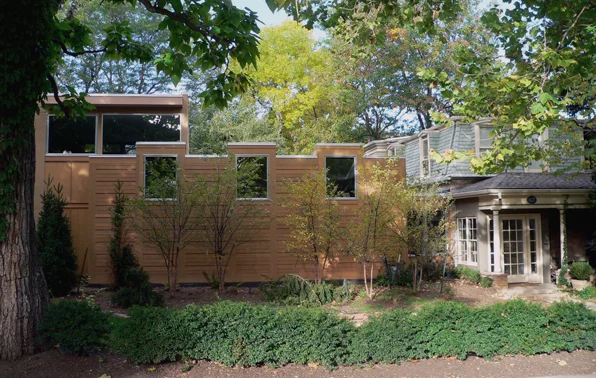
This project was for the replacement of an older studio building that partially obscured the 1890's original house structure in Boulder, Colorado.  Our new design pulls the studio away from the older house by means of a link building, allowing the historic porch to be rebuilt.  High clerestory windows face the street bringing in subdued light and these window dormers echo the second story dormers of the historic house.

JP interior 01

JP interior 01

Inside the studio consists of two interlocking spaces - the main studio and a reading loft.  Their intersection results in a large, soaring space that is open to the rear yard, injecting the natural world into the studio as reflected in the nature-inspired books they create.

JP interior 03

JP interior 03

A raw steel spiral stair rises from the polished concrete floors of the studio to the reading loft by way of cork insert treads.

JP interior 06

JP interior 06

The small link that connects the old house to the studio was cut through the house's 18" thick stone walls, here exposed as "trim".

JP exterior siding detail

JP exterior siding detail

The outside of the house is combination of subtle siding patterns playing off the rhythms of the shingles of the old house.  Clear vertical grain fir siding is given a syncopated spacing and clear fir panels are accentuated with small, grid-like projecting strips.

JP front 01

JP front 01

Architect:  M. Gerwing Architects

Mark Gerwing, Project Architect

Builder:  Cottonwood Custom Builders

Engineering: Gebau, Inc.

Robert Adams, images of the American West

New Tracts, west edge of Denver, Colorado, 1974

New Tracts, west edge of Denver, Colorado, 1974

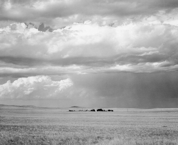
Currently at the Denver Art Museum is an exhibit of the photographic work of Robert Adams.  Robert Adams grew up in Colorado and is best known for his photographs of the New West - the human impacts on the landscape.  Unlike Ansel Adam's stunningly beautiful images of western landscapes, Robert Adam's images are a combination of the joy and beauty of the west alongside its degradation and exploitation.

Many of Adam's most arresting images are those of the new housing encroachments on the landscape throughout the 1960' and 70's.  The stark, high-altitude light of the Front Range puts into sharp focus the stark isolation of the suburban dream contrasted against the expansive emptiness of the western sky.

Colorado Springs, Colorado, 1968

Colorado Springs, Colorado, 1968

I first ran into Adam's work through the many books of photography that he produced.  The New West, Summer Nights and West from the Columbia are but a few of the more than twenty books of thoughtful, sometimes disturbing, but always beautiful  images.

From the South Jetty, Clatsop, County, Oregon

From the South Jetty, Clatsop, County, Oregon

I strongly recommend the exhibit.  It is simply presented and the images are arresting and intriguing in a way that the books can only hint at.

North of Keota, Colorado, 1969

North of Keota, Colorado, 1969

Robert Adams

The Place We Live, A Retrospective Selection of Photographs

Sept 25 - Jan 1, Denver Art Museum

(all photos by Robert Adams, from What Can We Believe Where? )

the most foreign of cities - Venice

Turner Approach to Venice

Turner Approach to Venice

Many years ago I lived in Venice for a time.  I was an enthusiastic architecture student from the rolling hills of central Kentucky and my arrival in Venice still resonates with me.  Not so much the first impression or even the first day or two, but that growing feeling of unease and intrigue upon slowly realizing that I am in a place utterly foreign to me.

My travels in the Third World have been few and brief, and I understand folk's descriptions of those environments and their sense of "foreign-ness" when confronted with those cultures.  My fascination with Venice comes not from that kind of cultural displacement, but rather the uncanny feeling of simultaneous comfort and unease that waterborne Venice seeped into me.

I arrived in Venice from land-locked central Kentucky, with its clear blue skies, rolling bluegrass and crisp buildings.  The hazy atmospheres of hot and humid Cumberland summer afternoons were temporary and seasonal.  When writers describe Venice as the floating city, they don't just mean its position in the middle of the Lagoon and its water courses.  Most of my early mornings in Venice were spent wandering around the labyrinthine city through an air thick and redolent with sea.  This seemed not so much as fog, as the sea itself, still sleepily gathering itself from a night dispersed in the air.

This ambiguity between sea and sky was all the more strange to me for the lack of land that in my experience defined each of the other.  There is no land in Venice, not in the sense of land as I knew it.  You may walk on stones or bricks, but this was not the earth.  The built environment of Venice was not carved out of the wilderness nor did it exist as an antidote to the agricultural fields that make so much of Kentucky.  Venice is built from tiny islands, out of the sea itself, to the point where no notion of those islands exist. It is not of the earth.  For me, that was about as foreign as a place could be.

Venice Looking East from the Guidecca Sunrise

Venice Looking East from the Guidecca Sunrise

Walking around Venice it suddenly occurred to me that all the buildings that I was seeing, the houses and churches, squares and bridges, all of it, was from someplace else.  All of this stone and marble and brick is from another place.  The link between the materiality of buildings and a place didn't exist in this marine world.  I live in Colorado now and unsurprisingly we build with a lot of timber and stone.  The color of the brick in Louisville where I grew up is the same as the local mud on the banks of every stream.  Venice is built out of solid stuff, heavy cut stone and thick courses of brick.  And it sits improbably on the water.  I now know where all these materials came from but you don't feel it as you live and breath in that place.

Turner The Grand Canal

Turner The Grand Canal

I have written quite a bit about my studies in vernacular architecture and how the buildings of a place are influenced by the materials and climate and terrain of that specific locale. But what makes Venice?  You can trace the historical forms of the buildings and research their origins in form and material, but they do not feel natural to that place.  Venice truly is other-worldly in that sense and that may go along way in explaining my love and unease with the place.  In all its peeling stucco and crumbling masonry, it is a perfect jewel - of this world, but apart from it.

preservation paradox

"If we open a quarrel between past and present, we shall find that we have lost the future."Winston Churchill

The City of Boulder's Preservation Guidelines, like those of most municipalities, contains an interesting paradox that is the bane of many a project.  All new construction in historic districts is required to meet two seemingly mutually exclusive thresholds - they are to be compatible with the historical structures of the neighborhood and yet be distinct and clearly architecture "of its own time".  As a member of our local Landmarks Board, I am often in the position of describing this paradox to frustrated architects and owners.  Most often I try to posit this as a spectrum, with complete, accurate mimcry at one end and violent, contrasting opposition at the other.  I think one of the most difficult jobs of the Landmarks Board is to try to find out where along that spectrum any given project should dispose itself within its context and the owner's desires.

spectrum

spectrum

The basic conundrum - distinct, yet compatible - exists in almost every significant preservation ordinance and guideline across the county.  It is an attempt to make sure that new construction does not so slavishly re-create historical styles and details that the new is no longer distinguishable from the old.  That kind of conflation, where the very new and the very old are identical, is thought to make  a mockery of the past, with the new imitating the old, reducing the old to merely a style.  It makes a district and the notion of preservation more about the preference for a specific look rather than a reverence for the past and respect for history.

There are a number of scenarios where this paradox plays itself out as confrontation, usually when an architect or owner is not aware of this funny conundrum and what it means to work along this spectrum.  Owners occasionally put forth designs that "look just like the old houses on the street", either because they want a guarantee that the building will fit in or because they moved to that old neighborhood and want to build a new house that respects that context.  In that case the staff and volunteers of the historic district or planning department have to coax the building away from exacting details and form and toward a possibly simplified, more contemporary reinterpretation of the architecture of the neighborhood.  This is often met with incredulity as owners are flumuxed by what seems like an arbitrary and contradictory regulation.

The other scenario which often arises is usually architect driven, with a proposed design that radically challenges the architecture of the neighborhood with a design that clearly  is "of its time" but not a very nice playmate along the street.  These projects are about standing out of the crowd and making extremely self-conscious decisions about the role of the individual versus the neighborhood.  In these cases, the local review board has to try to nudge the project back toward the historical imitation end of the spectrum by appealing for a design that will respect the scale, size, and massing of the other buildings in the block.

As both an architect and as a member of a preservation committee, I would strongly encourage every architect and building owner to carefully think about this spectrum and the meaning accrued by a building by that project's position on the spectrum.  So many of the conflicts that arise over historic districts and new construction come from the disputing parties impression of this spectrum and a loose association of meanings that are the inevitable baggage of this self-perception.

A Field Guide to Ugly Houses - Style Abuse Disorder (SAD)

SAD 01

SAD 01

It can be hard to decide - this or that, one or two, artisan whole wheat or quinoa spelt (hey, I live in Boulder).  Hopefully there is not a lot riding on those decisions and a mistake can be revisisted or disguised as toast.  A house it not such an easy fix.

I am not an advocate for building in a "style".  Thinking of buildings as simply constructions that you can hang different style clothes on runs counter to my work as an architect.  However, if you don't have an architect or don't want one, maybe the nineteenth century idea of pattern books is a good idea to help you avoid Style Abuse Disorder (SAD).

SAD houses simply can not make up their minds.  Are they Victorian or Craftsman? Ranch or chateau? Let's call it eclectic.

SAD 03

SAD 03

Even if you are finally building your own house, and you've saved your whole life to do it, it is not an opportunity to put into it every design idea that you have ever fallen victim to.  A bit of discipline is a good thing.

Again, I am not advocating some simplistic, reductionist idea of architecture.  I don't think you should be able to walk down the street and easily categorize Victorian, Modernist, Bungalow, etc. like so many products on a shelf.  In my practice we design each project examining its site, its context, the client's desires, etc. to make a building that inevitably has its own style.  Sometimes this is a bit of a mashup, but I hope one that displays its own kind of inner logic and sits comfortably along its peers.

Ugly by SAD

Ugly by SAD

So, go ahead and throw in that Gothic turret, the Victorian porch and Craftsman trim.  But then take another pass through the whole project and let it simmer a while until these flavor meld a bit.  Or, go over the top and add even more to the point of absurdity, a style all its own.