

fortress-of-solitude-superman
I have written a post about evil lairs and wanted to follow that up with some thoughts on the special domains of superheros. Of course we are not talking about real heroes here, but the pop culture protagonists of comic books and movies. My initial impression was that these places were not as interesting as their counterparts evil lairs, as Dante's Inferno is significantly more interesting than Paradiso. However, some repeating themes in these places are quite intriguing.
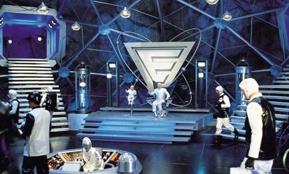
Whereas the villain's evil lair is often a secretive place brimming with technology, the hero complex (?) is most often dominated by the natural environment. It is Nature herself that seems to be the well-spring of the superhero's powers or at least the space created by the natural world becomes both solace and solitude for the world-weary, misunderstood protagonist.

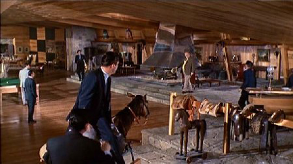
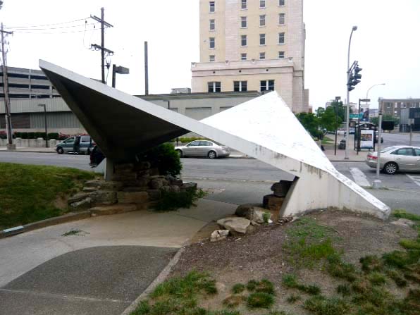
Batcave
Even the Bat Cave, thoroughly techy as it is, is still very much a cave, all dripping stalagtites and gloomy expanses. Like Superman's Fortress of Solitude, it is within the belly of Mother Earth herself, secretive, mysterious and another world away from the evil urbanity of the city.
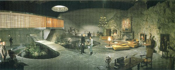
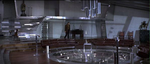
Even the most technological of good guys, Ironman's Tony Stark, lives resplendent in nature, perched atop a stony precipice, tapping into the elemental earth, water and sky.
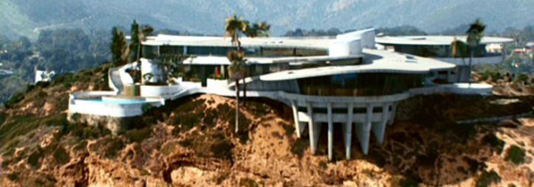
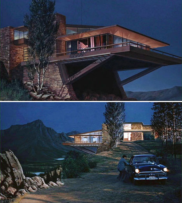
Ironman house
In the latest episode of the Bond franchise we even get a glimpse into 007's maudeline past in a visit, and of course subsequent destruction of, his ancestral home. No London Regency townhouse of course, but an isolated Scottish manse, surrounded by endless moors and made of the stones of the earth.
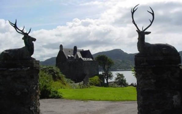
Duntrune Castle Skyfall
These are all maybe uniquely American responses to the heroic genesis problem, positing the natural world in a Romantic American viewpoint. Simon Schama's Landscape and Memory speaks eloquently about these perceptions of nature and the role of the imagination in Western thought. The villainous bad guys resort to weapons and the lying deceits of mankind, but the superhero's ultimate power resides in Nature, stems from its dark, mysterious elements. I will step over the Oedipal Mother Nature aspect of this for a future post.
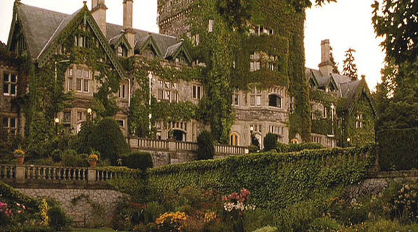
Xavier's mansion
The final photo I have is from X-Men - Xavier's stately mansion set in a typically English park-like setting, maybe the ultimate example of both the fundamental goodness of Nature and a rejection of Modernism, its rationality and anthropocentric dominance. The X-Men afterall are not from outerspace or even some kind of unique genius, rather they are simply genetic modifications of us, a product of the same biology, same DNA, maybe some other stuff thrown in as well, but certainly not "foriegn" or "unnatural".
The hero is a man(usually) of action, he is not at home in the world of men, in fact, he should avoid the domestic sphere as much as possible as traditionally female roles of nurturing, cooking and cleaning are kryptonite to the male superhero. He may be seduced by the sexy villainess, but he fights for everything good, apple pie (as long as someone else makes it) and Mom (but no Mamma's boy).
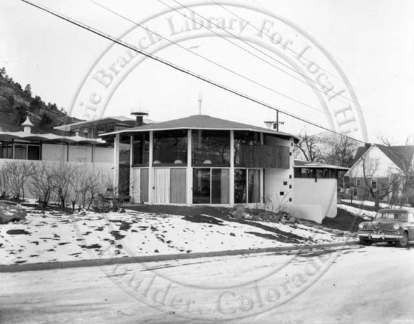
The man-cave trend in recent years has it right - it is not merely a private study, but a den or a cave, ensconced in the earth and the primal forces barely contained within. Where the villain may have a lair of high-tech toys and Modernist hipness, the hero's retreat is associated with nature, part of the Good Earth, unsullied by progress and the creations of mankind.