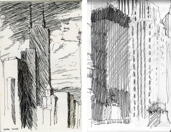
some of the many years of sketchbooks with images of coffee shops and cafes from M. Gerwing Architects
“For the masses that do the city’s work also keep the city’s heart.” -Nelson Algren
A number of years ago, we won a little competition to design a winter-time cover for a large basin-type fountain in a small park in Chicago. The fountain is named after Nelson Algren, the novelist and occasional screenwriter who wrote vivid, sentimental-free stories of the bartenders, prostitutes and gamblers of Chicago. When I lived in Chicago, I lived around the corner from one of his haunts and this fountain is just down the street from my first real experiences in the city.
The project was to be paid for with a combination of funds and like so many of these endeavors it stalled, stumbled and finally died. Or so I thought. It looks like interest has revived and we may be finally giving birth to this little project.
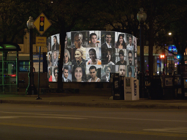
Here are some of the texts and images we produced for the original competition entry:
The Nelson Algren fountain sits in a long overlooked triangle at the center of a rapidly changing neighborhood in Chicago. It is not the Gold Coast or Lincoln Park, it is not Bronzeville or Uptown. It is not even at the heart of Wicker Park or Bucktown. It is overlooked because it sits in-between, because the triangle that it sits in is the result of the streets around it, not designed to be a place of its own.The proposed project is for a seasonal cover for the neglected fountain that makes a claim for that place. It claims this place for the people that work around it and pass through it every day. It is a visual analogue to Algren’s stories, a recording of the lives of the people in the neighborhood around him. Not portraits of the city’s great and powerful, but of the people that do the city’s work. The cover consists of a series of painted steel frames that support lexan panels holding acetate screenprinted portraits of people in the neighborhood. Text from Algren’s work Chicago, City on the Make, rings the base of the panels that extend just beyond the edge of the existing basin surround. Internal backlighting at night creates a beacon, shining through the back of the images and allowing them to keep watch over the triangle. Each year or as required, the images will be replaced. An ad hoc photo booth will be setup and allow anyone to come in and have their portrait taken and added to the panels. Over time the changing face of the neighborhood will be reflected in the panels.
townhouse renovation, Chicago
This project consists of a complete renovation of the interior of a traditional townhouse in Chicago's Lincoln Park neighborhood.
The interior of the house is organized around a large, elliptically curving stair made of craftsman wrought-iron and Brazilian cherry treads. At the center of this stair, at the main house level, an inlaid stone mosaic pattern based on a traditional northern Italian motif dominates the entry hall.
Carefully researched traditional trim and detailing was installed throughout the house including a linked series of stone mosaic floor patterns and designs.
Imported carved stone fireplace surrounds were incorporated with new, wood-burning Rumford style fireplaces in the Living Room, Family Room and Sitting Room.
Design by Mark Gerwing as Senior Associate with Kathryn Quinn Architects, Chicago
Project Architect: Mark Gerwing, AIA
Builder: Blackmore Construction, Rich Green supervisor
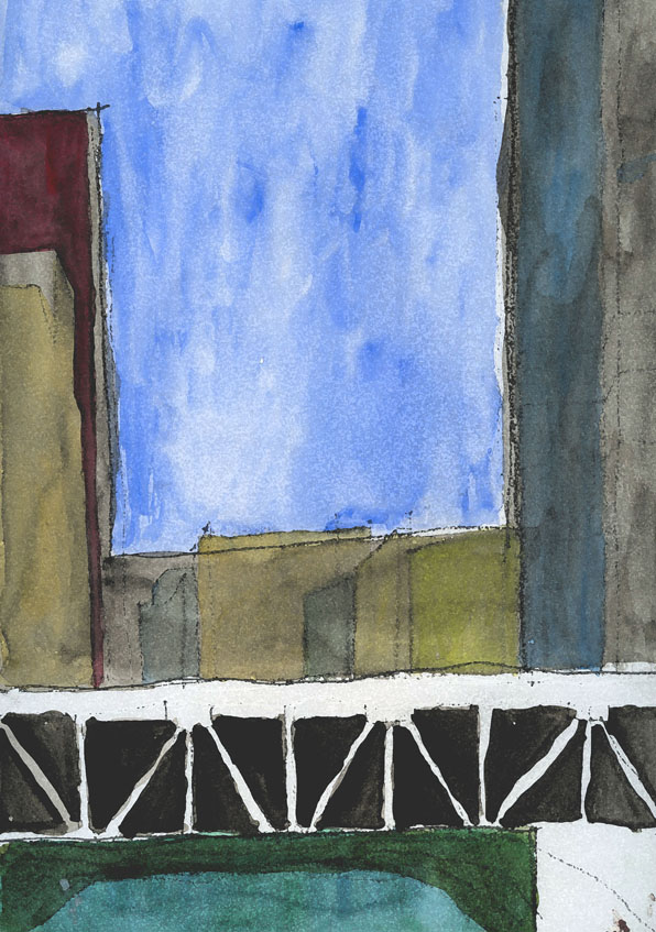
city of steel - Chicago
I was at a jobsite earlier today and was watching one of the tradesman prepare some raw, exposed steel for final finishing.

steel almost always makes me think of Chicago
tough, uncompromising
city of steel, city of the blues
For some reason I have been thinking alot of Chicago as well.
In the Loop, the curbs are occasionally made of steel. Those same curbs are granite in Boston, concrete in New York and most other cities. But in Chicago, especially right out in front of the Inland Steel Building, the curb is steel and the concrete is formed to it. Straight from the rolling mills of Gary to the Loop, Michigan pig iron, forged and fired in the blast furnaces along the shore of the Lake. Earth, Wind, Fire and Water.
brick and sustainability - some places I've lived
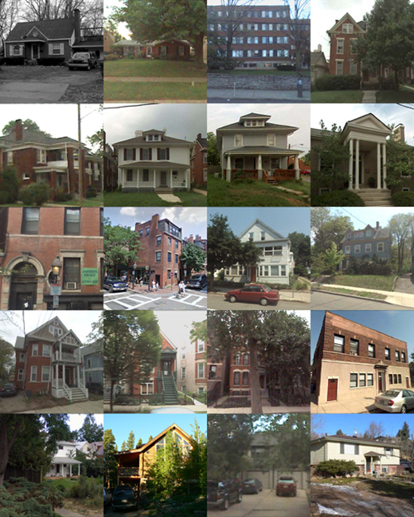
Below is a series of photos of some of the places I have lived. (Thanks to Google streetview for most of these). Not everyplace is there – a house in Louisville when we first moved there, an apartment in Venice, a couple of places in Lexington, Kentucky – are missing. A question came up regarding masonry houses and the West. Most everything built here in Colorado for single-family residential work is wood frame construction with wood siding, even though the environment out here is not kind to wood (too much high-altitude sun and snow). I was wondering how common that was in other places and decided to take an albeit bias survey of a least the places I have lived.
Of the 20 places shown here, there are a couple of brick suburban houses in Louisville, KY; a brick dorm and some brick apartments in Lexington, KY; a couple of brick townhouses in Boston and a couple of brick houses in New Haven; some brick apartments and a converted storefront in Chicago. The lower images are from Colorado: a small frame house in Boulder, a log cabin in the mountains above Boulder, a wood-framed townhouse and then a partial brick suburban house in Boulder.
Maybe because I was obviously drawn to apartments in old, brick houses as a young adult, they’re heavily represented. But overall, I think my experience is probably not that different from many others, moving from suburbs to cities and back to suburbs again. It may be a regional expression or possibly a recognition of the age of building stock, but the paucity of masonry in the West is striking. The number of older, quality buildings in Colorado is pretty thin, but this may not be the region as much as the relative youth of most of the buildings here. I’m afraid in an society with increasing demands to make short-term capital, the idea of creating a building to last generations has simply died away. Even the older, brick suburban houses that I grew up in Louisville have a solidity and permanence that a wood-frame and sided house can not invoke. So I think looking at these images, it is not the region nor the suburban/urban/rural nature of the structure, but rather its date of construction that has most influenced the use of materials. Hopefully with a renewed interest in the environment, we can recognize that the most sustainable building is one that lasts the longest
Universal access and aging-in-place
Maybe it is just a coincidence, but I are finding that I am working on a number of projects that deploy universal access principles as a major part of the design process. If you are not familiar with this term, universal access is an outgrowth of the barrier-free design guidelines that we were all using for public buildings just a few years ago. The idea of universal access however encompasses not just guidelines for wheelchair users, but recognizes that curb cuts aren't just necessary for them, but aide folks with strollers and kids with skateboards. It is an acknowledgement that we all age and designing to accommodate the needs of the many probably benefits us all at some time as individuals.

My father has serious mobility issues and my sister and I have spent an increasing amount of time over the last few years trying to reconfigure and adapt his typical suburban house to his needs. After a broken hip, we quickly realized that the door to the master bath, a door he has used for over 25 years, is now 2" too narrow to allow a walker to slide through. The shower in that same bath is too narrow to allow a seat to easily fit and the handle of the shower door is too easily confused with a grab bar. Same with all the towel bars. The laundry downstairs has been abandoned as has the back entrance, which although it is almost at grade level, has an absurdly slippery deck that no amount of friction tape seems to ameliorate.
These are good lessons for an architect. We are all adept at designing to codes and the guidelines of the Americans With Disabilities Act. But the actual, everyday experience of seeing my father trying to navigate the kitchen has taught me so much more. And rarely have architects applied these universal design principles to single-family houses for aging-in-place prospects. I am currently working on a project that is a father-in-law suite that subtly incorporates universal design principles. It looks clean and simple and elegant and is also going to be a great asset to his daily living. At the same time, we are engaged in the early stages of two projects that directly confront the needs and desires of wheelchairs users. Seeing the house from that point of view, both actual and metaphorical, is a fascinating challenge and it reframes the poetic possibilities of every part of the house that we so easily overlook.
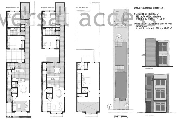
A pair of design presentation boards we did for an urban universal design competition for a neighborhood in Chicago from 2005:


