competition

ReSource Wars!

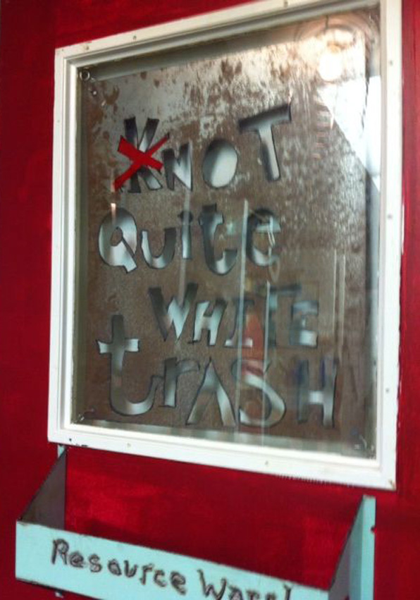
RW NQWT sign

RW NQWT sign

This past weekend we were part of a team that participated in ReSource Wars, a two-day design-build competition in service of the local building materials resource center here in Boulder.  The event was great fun and gave us the opportunity to design and build a quick project with a team of super talented friends and colleagues.

RW elevation

RW elevation

ReSource has been around for quite some time and they recently acquired a new building that needed some work.  The ReSource Wars event singled out 8 locations within the facility and assigned 8 teams to compete to make the most interesting, functional and awesome solution.  The team the we participated with - Not Quite White Trash - designed the Tool Library display wall.

RW bay

RW bay

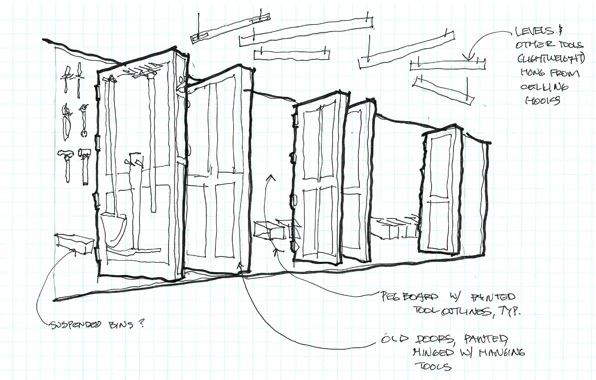
The Tool Library allows residents to peruse from a large selection of common hand tools and power tools and borrow them much like a book from a library.  Challenged with fitting a lot of tools along a wall only 25 feet long, we quickly realized that we would need more wall space.  Using only recycled building materials from the ReSource yard, we created a series of doors that are hinged and project out from the wall adding over 30 feet of more tool hanging space and can be flipped through like pages of a book.

RW screwdriver sign

RW screwdriver sign

All the various hangers for the tools were made from items we found in the yard, from recycled old tools to welded brackets and shelves.  Like Grandpa's old tool shed with the painted outlines of tools on pegboard walls, we utilized the tools themselves, in full 3D form, to hold the tools of the Library.

RW saw rack

RW saw rack

The result we hope is a functional and funky display of the tools and their usage and will serve ReSource well.  However, maybe the greatest success of the two-day event was the forming and working of an amazing team.  The basic plan allowed for everyone to exercise their creative and technical skills and we completed the project with great camaraderie and only a little head-bashing.

RW initial sketch

RW initial sketch

Great and special thanks to ReSource to inviting us and to our SuperHero team mates:

Jim Walker, ACI Design Build, architect and builder

Mitch Levin, artist, metal worker extraordinaire

Aicha Menendez, landscape architect and designer

Brian Laak, furniture design and cabinet-maker

Mark Gelband, artist and builder

Guido Densler, master welder and metal worker

RW award

RW award

“For the masses that do the city’s work also keep the city’s heart.” -Nelson Algren

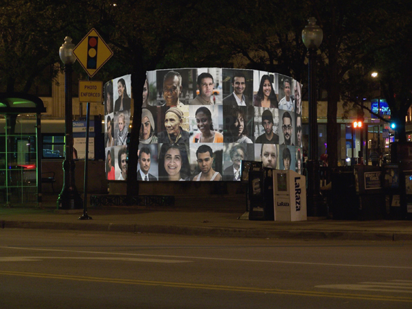
Algren Fountain night

Algren Fountain night

A number of years ago, we won a little competition to design a winter-time cover for a large basin-type fountain in a small park in Chicago.  The fountain is named after Nelson Algren, the novelist and occasional screenwriter who wrote vivid, sentimental-free stories of the bartenders, prostitutes and gamblers of  Chicago.  When I lived in Chicago, I lived around the corner from one of his haunts and this fountain is just down the street from my first real experiences in the city.

Algren Fountain structure

Algren Fountain structure

The project was to be paid for with a combination of funds and like so many of these endeavors it stalled, stumbled and finally died.  Or so I thought.  It looks like interest has revived and we may be finally giving birth to this little project.

Here are some of the texts and images we produced for the original competition entry:

The Nelson Algren fountain sits in a long overlooked triangle at the center of a rapidly changing neighborhood in Chicago. It is not the Gold Coast or Lincoln Park, it is not Bronzeville or Uptown. It is not even at the heart of Wicker Park or Bucktown. It is overlooked because it sits in-between, because the triangle that it sits in is the result of the streets around it, not designed to be a place of its own.The proposed project is for a seasonal cover for the neglected fountain that makes a claim for that place.  It claims this place for the people that work around it and pass through it every day. It is a visual analogue to Algren’s stories, a recording of the lives of the people in the neighborhood around him. Not portraits of the city’s great and powerful, but of the people that do the city’s work. The cover consists of a series of painted steel frames that support lexan panels holding acetate screenprinted portraits of people in the neighborhood. Text from Algren’s work Chicago, City on the Make, rings the base of the panels that extend just beyond the edge of the existing basin surround. Internal backlighting at night creates a beacon, shining through the back of the images and allowing them to keep watch over the triangle. Each year or as required, the images will be replaced. An ad hoc photo booth will be setup and allow anyone to come in and have their portrait taken and added to the panels. Over time the changing face of the neighborhood will be reflected in the panels.

Algren Fountain day

Algren Fountain day

Mine the Gap - Late Entry

The Chicago Architectural Club ran a competition last year to elicit ideas about what to do with the ill-fated Chicago Spire project.  Our entry was never really considered for submission, but has been worked on and off since.

Designed by Santiago Calatrava, the Spire was to be the self-described "most significant residential development in the world". (go to the website to view the over-the-top video and especially the musical track).  It ran afoul of bad economic times and the Anglo Irish bank put a halt to the whole thing after only the gigantic 70' deep, 70' diameter foundation had been excavated alongside Lake Michigan on the eastern most edge of the city.  (in an amazingly myopic moment, Calatrava described his twisting design as an imaginary smoke signal coming from a campfire near the Chicago River lit by indigenous Native Americans.  An incredibly insulting and tone-deaf explanation that negates a couple hundred years of excellent Chicago architecture and is a lame attempt to justify a twisting, spiraling design that Calatrava has experimented with all over the globe.  As if genocide wasn't bad enough, lay off the native Americans already, don't implicate them in this placeless monstrosity.)

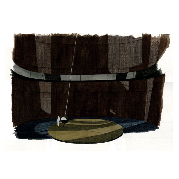
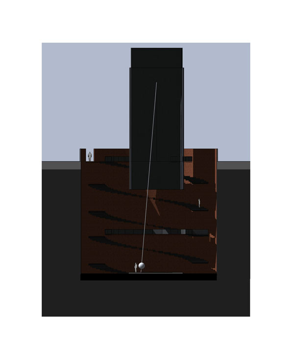
I can't help but see the hole as a grave dug by the recession to bury developer's hubris.  In light of that, our competition entry envisioned a slightly dystopic future for the site as an enormous time-keeper, with a Foucault pendulum slowly swinging away marking the passage of days until the whole reinforced foundation inevitably floods from below from seeping Lake Michigan.

Not a pretty building to cap an ugly incident in the city's history of over-reaching development.  Maybe we could have just filled up the hole with the demolished remains of the Cabrini Green housing project.