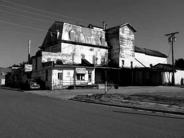
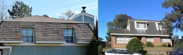
architecture

architect's pet peeve no. 16 - mansard roofs

bad mansard 2

bad mansard 2

It is probably unfair to throw all of these in a single despicable category, but the abuses in the last 40 years are so egregious that only a complete moratorium on all mansard roofs will suffice to still the repulsion of most architects.

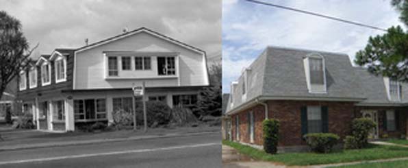
A mansard roof is unusually a full story of a building masquerading as a part of a roof.  It is a gambrel/hip roof hybrid that brings the apparent mass of a building down a story or two by letting the "roof" start much lower down than the interior floor levels would typically indicate.  Handled well they are a pleasing architectural solution to a vexing problem.  Most often however, they are not so deftly deployed and instead of reducing the apparent mass of a building, they increase it with a gargantuan, bulbous forehead. These are not attics with quaint dormers sticking out, but rather  massive toques with eyeholes sitting on top of otherwise rather elegant buildings.  Or maybe not so elegant.

Eisenhower Executive Office Building

Eisenhower Executive Office Building

The term come from French Baroque architecture as often conceived by Francois Mansart, however many of the best examples come from the Second Empire period.  Its popularity may stem from attempts to copy those examples or as a tax/code dodge - many municipalities tax a building based on the size from the ground to the base of the roof.  Building height limitations also occasionally measure to a roof's midpoint.  In both cases, the definition of "roof" is pressed with a mansard, arguing that the sheathing in roof materials meets the requirements.

bad mansard 1

bad mansard 1

The pet peeve stems from the truly horrible examples foisted upon the public in the last few decades.  Mansards are almost always incompatible with more modernist design language and they take a very able hand in any scenario.  So, for the sake of the collective built environment, I am going to advocate for a moratorium on mansards until at least 2020.  By then maybe we will have figured out how to use them to enhance a building, not draw attention to its flaws.

Unless of course, you can make it over-the-top mansard-awesome:
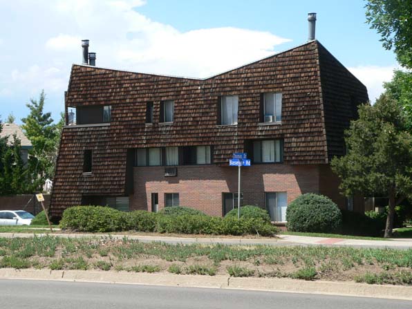
mansard modern

mansard modern

Loveland Feed & Grain, interior

fg01

fg01

I have written in the past about the efforts to save the Loveland Feed and Grain building.Novo Restoration, the group trying to save the building, sponsored some tours inside the building this last weekend and I took the opportunity to climb through this hulk, dragging my kids along for the ride.

The building was used initially as a flour mill and later as a grain storage facility.  Surprisingly, its massive exterior bulk did not hide an equally massive interior space.  The inside of the building is a labyrinthine collection of bins and chutes, vertiginous stairs and rusting augers. The walking space between the bulky wooden beams and bins was minimal as befits a pre-OSHA era building.  The inherently explosive nature of so much dust and milling makes the continued existence of this kind of building a rarity.  There was rudimentary safety system with a series of dead-man pull wires running through the various rooms and process rooms, but the ability to quickly navigate out of the wooden maze in case of emergency makes you think the safety system was there more for the equipment and building than its inhabitants and operators.

fg int 01

fg int 01

All of this is to say that the plans for renovating this building and finding new uses for it will require significant, drastic changes to the interior.  This is also the case with the City of Boulder's Valmont Mill buildings.  Both of these buildings were formed to execute industrial processes that are largely extinct.  Preserving the shell of the building without its inner workings seems like hollowing out its past, leaving only a slight echo of its once vibrant past.  However, a cursory tour of the interior of these places quickly demonstrates their near-incompatibility with anything approaching public uses.  Should we mothball these places, equipment and all and allow only restricted access?  Should our desires to preserve the past include spending public money to save buildings that, if made safe for the public, no longer exhibit the vitality of the place?  Are we preserving what the building looks like or what it is?

Valmont mill 05

Valmont mill 05

I love the idea of making art and exhibit spaces, black box theatres and performance venues in these structures, but to do so may eliminate so much of the buidling's essential inner workings that we ending up preserving the building shell like so many oddities in formaldehyde-laden jars.

Valmont mill 09

Valmont mill 09

Sangre de Cristo chapels

SdC chapels 01

SdC chapels 01

As a bit of a follow up to a post from last year on the small village chapels in the San Luis Valley in southern Colorado, I recently took a trip down to the Sangre de Cristo mountains.  This range is in southern Colorado and makes the eastern edge of the San Luis Valley.  On this most recent trip I ventured to the other side of these mountains to look into the chapels and buildings still existing.

SdC chapels 02

SdC chapels 02

What is most striking is the very clear morphology of these churches along the eastern side of the Sangre de Cristos,  compared with the much wider variety of forms and materials employed in the San Luis Valley.  As you can see, most of these chapels are simple, single-gabled longitudinal structures.  This forms remains fairly consistent even though the building material may vary from stucco-covered adobe to wood framing.  Equally consistent is the appearance of a simple, open-framed steeple and a diamond, usually square, window centered in the end gable.

SdC chapels 04

SdC chapels 04

SdC chapels 03

SdC chapels 03

About half of the chapels I visited were abandoned, in various states of decomposition.

a haptic practice

drafting stuff 02

drafting stuff 02

I spend about one third of my working time in front of a computer.  Another third is spend on various jobsites.  The final third or so is still spent with paper and pens, glue and blades, pencils and scales.  I am a great believer in the use of computer technology in the service of architecture, especially 3D modeling and the access to design tools that were previously so infrequently used.  However, I do miss the haptic aspects of the practice of architecture.

Part of the practice of architecture was about educating your hands.  Along with struggling with learning the basics of designing spaces, a lot of the time spent in architecture school was also devoted to learning how to make things - models and drawings and sketches.  And drafting.

Now I don't miss the endless hours of erasing the graphite and ink while trying not to "polish the mylar" only to redraw the same scheme again when a client changed their minds.  And I love the ability to make 3d computer models and easily work up multiple options and reconfigurations with CAD programs.  But I miss the careful, slow twirl of a lead holder when you draw those long, thin lines.  And the smell of sepia remover drifting through the studio punctuating the high cost of design changes.  And the dusty powder of pounce spilling down shirts and trousers when lunch time rolled around.  The only sounds in the studio now are the incessant clicks of keyboards, not the snap of an adjustable triangle, the snarling whir of lead pointers or the whine of electric erasers.

drafting stuff 01

drafting stuff 01

Does all of this sound like the pitiful nostaglia of an old architect?  Maybe a little, but fundamentally hand drafting took care and concentration and most importantly it was a skill of hand and eye. A deep and sometimes painful knowledge of a whole universe of paper textures and weaves, inks and leads, made us craftsmen of a sort.  We made drawings.  You had to have good hands, a fine touch, that was more than simply analogous to the practice of design itself.  The making of architecture was a haptic practice, design was about making, not merely visualizing and imaging.

I don't use all these drawing and drafting tools very often.  When I do, their familiarity in my hands is striking and melancholic.  I hope the practice and design skills learned with them have not simply vanished, eclipsed by screens and keyboards.  I'm pretty sure that those lessons learned are deeply buried in at least the muscle memory of my hands.

“For the masses that do the city’s work also keep the city’s heart.” -Nelson Algren

Algren Fountain night

Algren Fountain night

A number of years ago, we won a little competition to design a winter-time cover for a large basin-type fountain in a small park in Chicago.  The fountain is named after Nelson Algren, the novelist and occasional screenwriter who wrote vivid, sentimental-free stories of the bartenders, prostitutes and gamblers of  Chicago.  When I lived in Chicago, I lived around the corner from one of his haunts and this fountain is just down the street from my first real experiences in the city.

Algren Fountain structure

Algren Fountain structure

The project was to be paid for with a combination of funds and like so many of these endeavors it stalled, stumbled and finally died.  Or so I thought.  It looks like interest has revived and we may be finally giving birth to this little project.

Here are some of the texts and images we produced for the original competition entry:

The Nelson Algren fountain sits in a long overlooked triangle at the center of a rapidly changing neighborhood in Chicago. It is not the Gold Coast or Lincoln Park, it is not Bronzeville or Uptown. It is not even at the heart of Wicker Park or Bucktown. It is overlooked because it sits in-between, because the triangle that it sits in is the result of the streets around it, not designed to be a place of its own.The proposed project is for a seasonal cover for the neglected fountain that makes a claim for that place.  It claims this place for the people that work around it and pass through it every day. It is a visual analogue to Algren’s stories, a recording of the lives of the people in the neighborhood around him. Not portraits of the city’s great and powerful, but of the people that do the city’s work. The cover consists of a series of painted steel frames that support lexan panels holding acetate screenprinted portraits of people in the neighborhood. Text from Algren’s work Chicago, City on the Make, rings the base of the panels that extend just beyond the edge of the existing basin surround. Internal backlighting at night creates a beacon, shining through the back of the images and allowing them to keep watch over the triangle. Each year or as required, the images will be replaced. An ad hoc photo booth will be setup and allow anyone to come in and have their portrait taken and added to the panels. Over time the changing face of the neighborhood will be reflected in the panels.

Algren Fountain day

Algren Fountain day

Price Tower

Price Tower exterior 01

Price Tower exterior 01

In northeast Oklahoma, just west of the Osage Indian Reservation, lies Bartlesville, home of Phillips Petroleum and Frank Lloyd Wright's only completed "skyscraper" building, the Price Tower.

The history of the Price Tower is long and complex and Frank Lloyd Wright's recycling of an earlier unbuilt tower design is well documented.  It is all worth reading and a little study, but it really does not prepare you for a confrontation with the building itself.  And even though by today's standard the building is not so tall and the motifs a bit dated, the building itself has a magnificent sculptural presence.

Designed for multi-purpose usage, the tower houses offices and residential space on each of its central floors.  From the outside of the building, the horizontal slats and fenestration define the office spaces while the vertical louvers identify the residential portions.  Instead of subdividing the building vertically and stacking one use exclusively upon the other, Wright and his client choose to intermingle the two, with only the base and top-most floors housing a single function.

Price Tower plan

Price Tower plan

It is often easy to forget how ornate Wright's work was when fully executed.  The prairie houses he created had such a streamlined, simple and bold expression, that only actually visiting a work reveals the little carved panels and decorative embellishments.  At the Price Tower, those embellishments take center stage as patterned, aged copper panels dominate the entire building and find smaller, more refined expressions on the interior.

Like so many of Wright's best works, the Price Tower is simultaneously bold and sculptural, refined and almost precious.  It tetters on the edge of gilding the lily with its decorative motifs splashed across so much of the lower levels.  But it is worth remembering the unlike so many of his modernist European contemporaries like Gropius and Mies, Wright believed in a very earthy kind of romantic sensibility and trancendent Beauty.  In that sense, the Price Tower, like Wright himself, is a last echo of the nineteenth century passing through the end of the millenium.  The Price Tower feels like a beautiful mash-up of Craftsman materiality and the Jetsons sci-fi retro-futurism.

Price Tower section

Price Tower section

It's not exactly on the beaten path, but a visit to the building is worthy of a prolonged side trip.  You can have a drink in the roof top bar or even stay in the boutique hotel created within, the Price Company's offices having long since removed themselves.  And in Bartlesville you can get quite excellent chicken-fried steak, so go to it.

(Much of the historical info and imagery here is from The Price Tower, published by Rizzoli, Anthony Alofsin, Editor)