
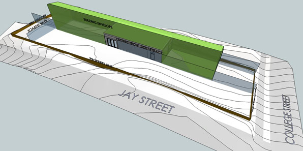
by right envelope with demo
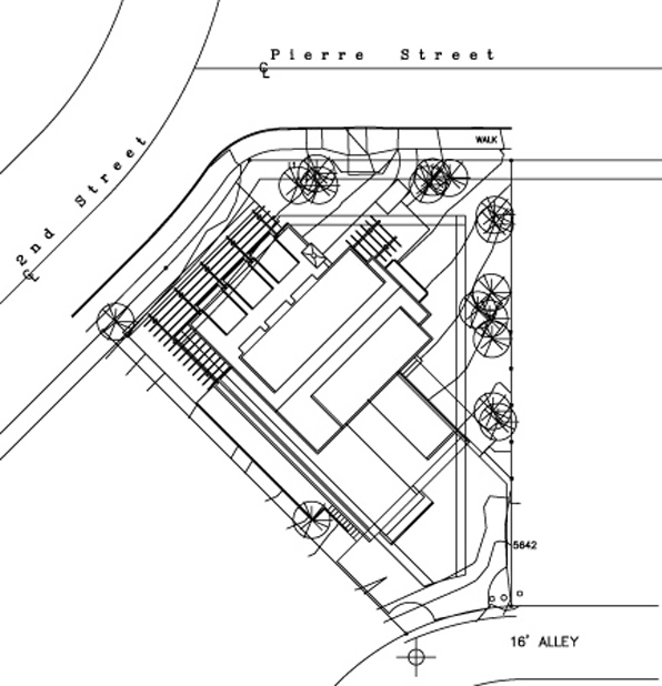
We have been working on a project in Boulder that holds a number of challenges, not the least of which is a long narrow lot with severe building restrictions. My client's property is 50' wide by 188' long, but because of its corner location, both street-facing sides of the lot require a 25' wide setback from the street. That setback along with additional side and rear yard setbacks makes the building envelope 20' wide by 128' long, a 6 1/2 : 1 length to width ratio. A potential upper level is even more restricted by a solar shadow ordinance making the available building envelope up there an amazing 9' wide by 128' long or 14 : 1 ratio.
I have developed some long, narrow projects in the past.
The Cornhouse project was a speculative effort for a long, narrow house nestled within the parallel, seemingly endless rows of corn that one sees in the upper midwest. Driving between where I lived, Chicago, and where I grew up, Kentucky, I would pass through hundreds of miles of Indiana corn fields, their arrow-straight rows creating a pulsing rhythm looking down their long furrows. Fundamental to the design of this house project was its position among the corn and the changing relationship to the horizon that occurred as seasonal corn grew from the damp ground to its late summer height well over the heads of the inhabitants. Equally present in the scheme was also the narrow layout of the house based on the typical 22" module of corn furrows.

Cornhouse 01

Cornhouse 02
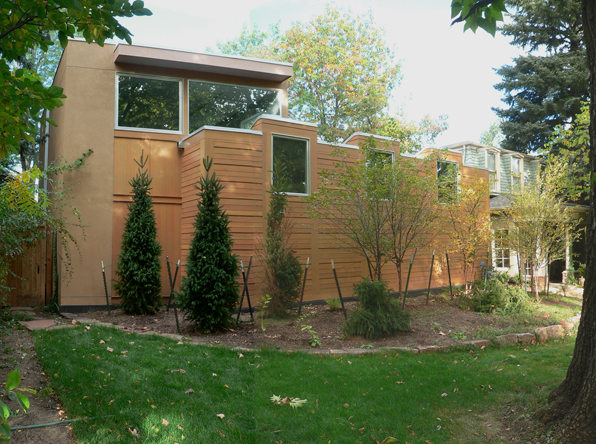
That long narrow Cornhouse has its urban twin in a competition design executed a few years later. Where the cornhouse was long and narrow in an expansive landscape, the layout of the city house was dictated by the long, narrow property lot boundaries of Chicago's Lawndale neighborhood. Designed for a tough, urban setting and for universally accessible use, this long house was internally focused, centering around a courtyard space and incorporating two units, distributed over the building's three levels.
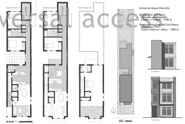
Chicago competition
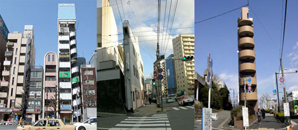
I have written in the past about the unconventional massing of these kind of long and narrow buildings and the jokingly absurd Hyper-Attenuated Building Syndrome. A brief study of the work of Pritzker-prize winning architect Glen Murcutt reveals more than a few quite extraordinary long and narrow building designs. These works, especially the houses, seem to slowly reel themselves out, room after room unfolding as you progress through the house.
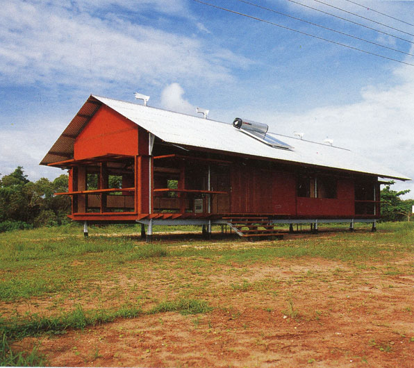
Murcutt 01
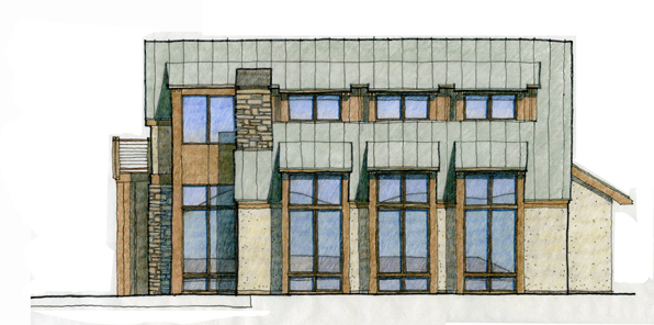
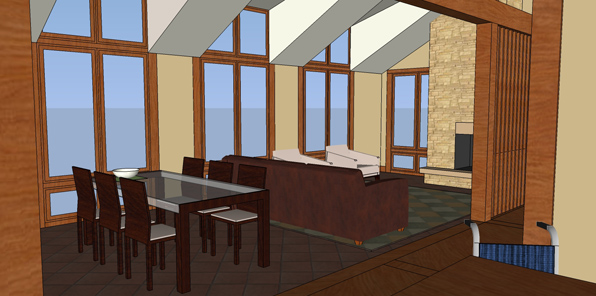
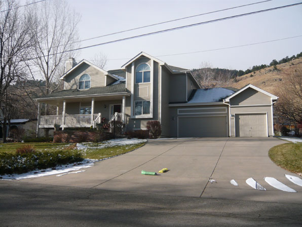
Our current project's history is marked by our initial attempt to make a smaller more compact house that substituted height for length. After an anguished meeting with neighbors stridently objecting to the potential loss of views because of the proposed height, we may be shifting back to the long house. I'm not sure if this kind of elongated house will be more or less opposed by the neighbors, but given the strictures imposed by the setbacks, we have only two ways to go - tall and more compact or the stretched out massing of the long house.