places

Loveland Feed & Grain, interior

fg01

fg01

I have written in the past about the efforts to save the Loveland Feed and Grain building.Novo Restoration, the group trying to save the building, sponsored some tours inside the building this last weekend and I took the opportunity to climb through this hulk, dragging my kids along for the ride.

The building was used initially as a flour mill and later as a grain storage facility.  Surprisingly, its massive exterior bulk did not hide an equally massive interior space.  The inside of the building is a labyrinthine collection of bins and chutes, vertiginous stairs and rusting augers. The walking space between the bulky wooden beams and bins was minimal as befits a pre-OSHA era building.  The inherently explosive nature of so much dust and milling makes the continued existence of this kind of building a rarity.  There was rudimentary safety system with a series of dead-man pull wires running through the various rooms and process rooms, but the ability to quickly navigate out of the wooden maze in case of emergency makes you think the safety system was there more for the equipment and building than its inhabitants and operators.

fg int 01

fg int 01

All of this is to say that the plans for renovating this building and finding new uses for it will require significant, drastic changes to the interior.  This is also the case with the City of Boulder's Valmont Mill buildings.  Both of these buildings were formed to execute industrial processes that are largely extinct.  Preserving the shell of the building without its inner workings seems like hollowing out its past, leaving only a slight echo of its once vibrant past.  However, a cursory tour of the interior of these places quickly demonstrates their near-incompatibility with anything approaching public uses.  Should we mothball these places, equipment and all and allow only restricted access?  Should our desires to preserve the past include spending public money to save buildings that, if made safe for the public, no longer exhibit the vitality of the place?  Are we preserving what the building looks like or what it is?

Valmont mill 05

Valmont mill 05

I love the idea of making art and exhibit spaces, black box theatres and performance venues in these structures, but to do so may eliminate so much of the buidling's essential inner workings that we ending up preserving the building shell like so many oddities in formaldehyde-laden jars.

Valmont mill 09

Valmont mill 09

city signs

height sign

height sign

In Colorado and much of the Rocky Mountain West, the welcoming signs at the arrival of every town proudly or perhaps matter-of-factly, announce the most important attribute of the settlement:  its height above sea level.

In the midwest and, at least in my recollection, most towns across the nation,  the introductory boundary sign of a place contains the city's name along with the size of the population.

population sign

population sign

So why the difference?  Most cities are proud to announce their size and status as reflected in a hopefully growing population.  I guess in the thin air of the Rocky Mountains, that kind of boastful achievement declaration is reserved not for size but altitude.  Our cities and towns may be small, but we're up there pretty high.

Sangre de Cristo chapels

SdC chapels 01

SdC chapels 01

As a bit of a follow up to a post from last year on the small village chapels in the San Luis Valley in southern Colorado, I recently took a trip down to the Sangre de Cristo mountains.  This range is in southern Colorado and makes the eastern edge of the San Luis Valley.  On this most recent trip I ventured to the other side of these mountains to look into the chapels and buildings still existing.

SdC chapels 02

SdC chapels 02

What is most striking is the very clear morphology of these churches along the eastern side of the Sangre de Cristos,  compared with the much wider variety of forms and materials employed in the San Luis Valley.  As you can see, most of these chapels are simple, single-gabled longitudinal structures.  This forms remains fairly consistent even though the building material may vary from stucco-covered adobe to wood framing.  Equally consistent is the appearance of a simple, open-framed steeple and a diamond, usually square, window centered in the end gable.

SdC chapels 04

SdC chapels 04

SdC chapels 03

SdC chapels 03

About half of the chapels I visited were abandoned, in various states of decomposition.

for the love of bridges

I have written a number of times about bridges, their simple beauty and the increasingly rare appearance of steel arched types. This bridge, in central Kansas, crosses a small river not far from the original path of the Oregon Trail.  On this day it was dripping from a recent rain and the sky was an eerily-threatening monotone of gray.

ks bridge 02

ks bridge 02

ks bridge 04

ks bridge 04

ks bridge 06

ks bridge 06

ks bridge 07

ks bridge 07

These were shot on a medium format late 1950's Zeiss Ikon Nettar folding camera recently given to me by my uncle.

Thanks Pete.

“For the masses that do the city’s work also keep the city’s heart.” -Nelson Algren

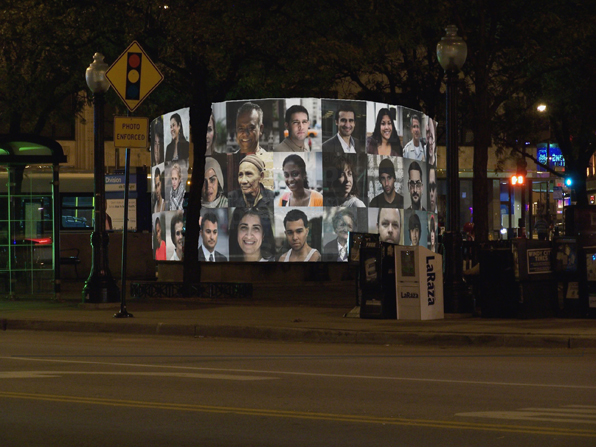
Algren Fountain night

Algren Fountain night

A number of years ago, we won a little competition to design a winter-time cover for a large basin-type fountain in a small park in Chicago.  The fountain is named after Nelson Algren, the novelist and occasional screenwriter who wrote vivid, sentimental-free stories of the bartenders, prostitutes and gamblers of  Chicago.  When I lived in Chicago, I lived around the corner from one of his haunts and this fountain is just down the street from my first real experiences in the city.

Algren Fountain structure

Algren Fountain structure

The project was to be paid for with a combination of funds and like so many of these endeavors it stalled, stumbled and finally died.  Or so I thought.  It looks like interest has revived and we may be finally giving birth to this little project.

Here are some of the texts and images we produced for the original competition entry:

The Nelson Algren fountain sits in a long overlooked triangle at the center of a rapidly changing neighborhood in Chicago. It is not the Gold Coast or Lincoln Park, it is not Bronzeville or Uptown. It is not even at the heart of Wicker Park or Bucktown. It is overlooked because it sits in-between, because the triangle that it sits in is the result of the streets around it, not designed to be a place of its own.The proposed project is for a seasonal cover for the neglected fountain that makes a claim for that place.  It claims this place for the people that work around it and pass through it every day. It is a visual analogue to Algren’s stories, a recording of the lives of the people in the neighborhood around him. Not portraits of the city’s great and powerful, but of the people that do the city’s work. The cover consists of a series of painted steel frames that support lexan panels holding acetate screenprinted portraits of people in the neighborhood. Text from Algren’s work Chicago, City on the Make, rings the base of the panels that extend just beyond the edge of the existing basin surround. Internal backlighting at night creates a beacon, shining through the back of the images and allowing them to keep watch over the triangle. Each year or as required, the images will be replaced. An ad hoc photo booth will be setup and allow anyone to come in and have their portrait taken and added to the panels. Over time the changing face of the neighborhood will be reflected in the panels.

Algren Fountain day

Algren Fountain day