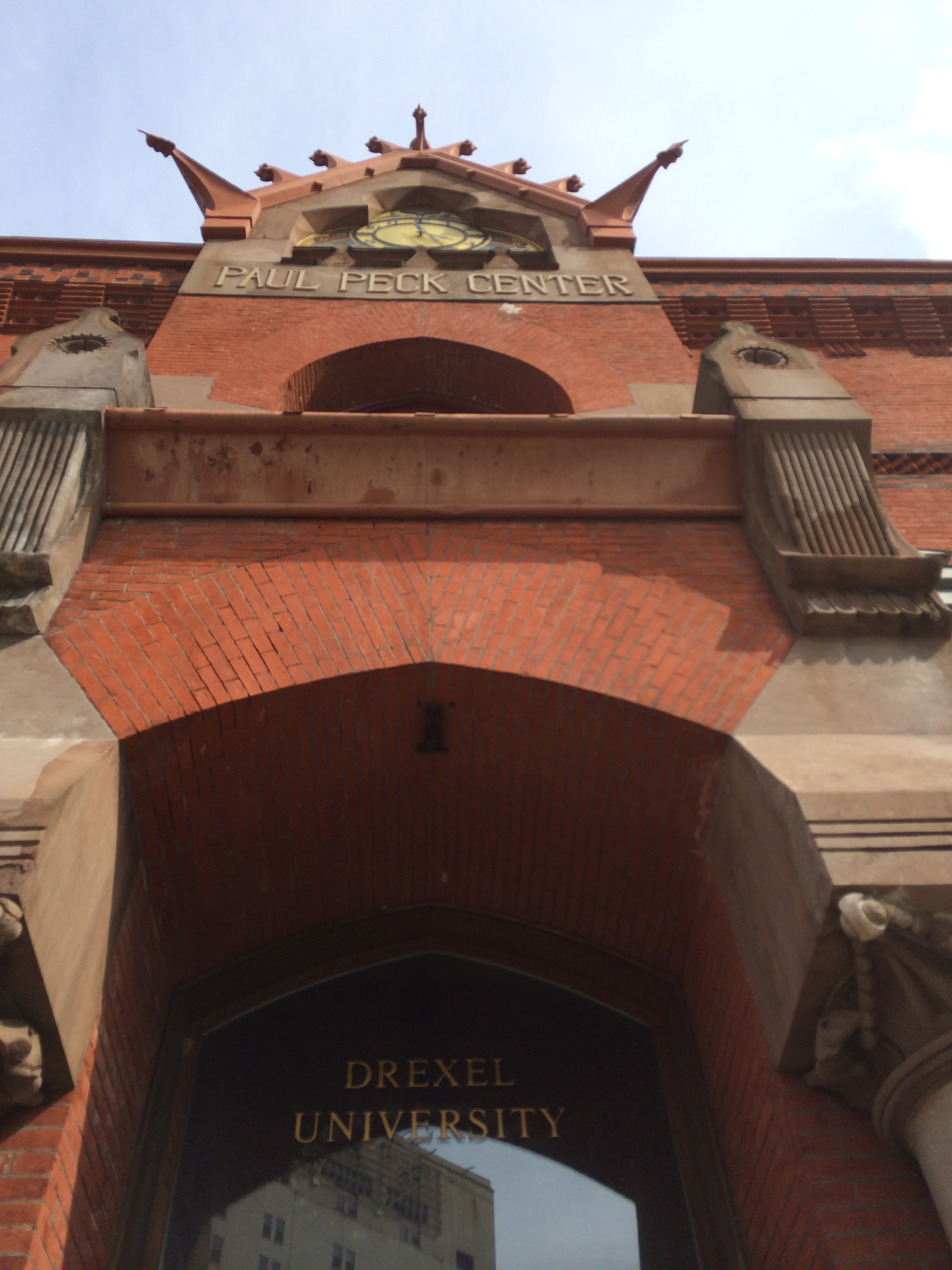
So much of our understanding of what makes a building beautiful is based on a notion of discovering or uncovering the perfectly pleasing proportions of an architectural space or facade.
Project updates, October 2014 version
It has been a very busy and productive number of months at M. Gerwing Architects and ACI and we have shamelessly neglected the blog in lieu of actually getting projects done. We have a number of projects that are nearing completion, including renovation projects in both North Boulder and South Boulder
April is National Poetry Month - Baudelaire
Colfax Avenue, signs of western journey
Boulder Modern - talk by Mark Gerwing, local architect
I am giving a public talk on February 19th on a brief history of Modern Architecture in Boulder at the public library Canyon Theater. I have given a version of this talk in the past, with emphasis on preservation of the recent past. This time around I have rewritten the focus of the talk to present the work of some of Boulder earliest Modernist architects as a harbinger of the growth of a regionalist style.
Kenneth Frampton presciently set forth the idea of a type of critical regionalism that he felt would become one of the dominant paradigms for architecture as far back as the early 1980's. I am certainly no academic scholar, but it is abundantly clear to me that a majority of the most interesting architecture produced over the last three decades in this country has come out of far-flung offices that embody Frampton's notion of Critical Regionalism. Even a very cursory glance at the work of Will Bruder and Rick Joy down the southwest or Clark and Menefee and the late Sam Mockbee in the South reveals architectural practices that have extended the lessons of classic Modernism and have imbued them with the local vernacular architecture as well as very particular regional concerns. In fact, most regions of the country have developed just this kind of very place specific architecture that consistently produce the most interesting work, albeit not the most breathlessly praised trends of the architectural press.
However, all that being said, it has seemed curious to me that the Rocky Mountain West does not seemed to have produced similarly informed, critical practices that have coalesced into a critical mass that could be seen as a regionalist style or approach. At least not in the present tense.
Boulder, Colorado, nestled against the Front Range, was a sleepy little college town with its founding based in mining and agriculture. It was not that dissimilar from many similarly situated little cities, from Missoula, Montana to Ft. Collins and Colorado Springs, Colorado, south to Albuquerque. From 1950 to 1970 however, radical transforms in population, transportation, local technology and an unprecendented growth building spree, allowed for a flourishing architectural culture that I believe was the avant garde of a nascent Mountain West critical regional style.
All of that is a very long introduction to what I hope will be a more brief, and certainly more entertaining talk. Of particular interest to me is trying to place some remarkable buildings within their cultural context, from sox hops to the sexual revolution, in this time of great national and international upheaval - changes both frightening and thrilling. If nothing else, I will be showing some pictures of some really cool buildings.
tile, pattern, geometry
As I have probably spoken about in previous posts, we draw no real distinction between architecture and interiors. They are all a part of crafting a series of spaces that are made of various materials that make up a building. To that extent, we spend as much time, and often considerably more, choosing interior materials.
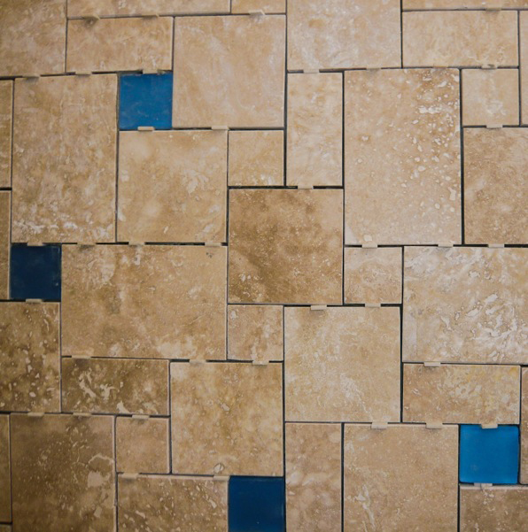
Of particular pleasure for an architect may be the selection of tile materials, colors and patterns, as those selections are inherently tied up with geometry. Overall the selection of materials and colors in a space need to balance and most frequently this can result in creating fairly simple floor patterns with tile run in a conventional grid arrangement. However, I think it is a missed opportunity if we can not select a type of tile and a specific pattern of its installation that can reinforce the spatial and geometric ideas that are playing out in the rest of the space.
The photos here are all from a recent project of ours in Boulder, Colorado, that was almost entirely an interiors-only project. As a renovation of a conventional builder-type house, we avoided the costs of removing and changing a lot of interior walls by re-imagining the existing rooms and selecting materials and colors that would reinforce the nicer aspects of each space and draw one's attention away from the less-desirable parts. Floor tile patterns were crucial to this strategy and became a theme in the newly envisioned house.
I have written about my theory of the relative levels of abstraction of natural materials from their sources. More than consistent color or theme or pattern, I think this is the most intriguing way of creating harmony within a series of spaces without resorting to a slavish consistency or patronizing "style". Although the types and colors of the tiles used on the project were quite varied, they work together as a whole and are specific to each use and room to be functional and add to the overall feel of the house.
This project will conclude in the next few weeks and we will see the final results of the play of color and geometry to bring resolution to a house much in need of some character and order.


