restaurant design - some basics

We have all been to plenty of places with good food but somehow dining there just isn't particularly fun or relaxing. The experience of eating at a restaurant is such a simple, singular affair that even the smallest, most subtle oddity can easily tilt the whole moment out of kilter.  Tables a little too close, or a little too far apart, lighting with a bit too much glare or that uneasy floating quality of a table sitting without an anchor in the room - all of these quickly turn even the best food into an experience not worth repeating.

Even though every project, every concept is different, there are some basic design considerations that need to be heeded in every restaurant design problem.  I'm going to lay out some of the most basic:

Work flow:  this is something that is of paramount importance to the restaurant owners but virtually invisible to patrons and most architect/designers.  A restaurant is humming - food, drinks and orders are moving in multiple directions and most likely converging on one or two critical points.  It may be a corner around a wait station or a little area around the slide (more about that later), but there are usually one or two hotspots of activity that need careful attention in the design.  I am not talking about the aesthetics of design, but rather the function and utility of rapidly moving people and plates in a very small place.  It is the most crucial of tasks to properly identify where these hotspots will occur and to make sure the clearances, sight lines and circulation all work together. Do not allow the desires of a cool design and the ego of the aesthetics get in the way of solving this most important task.

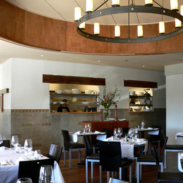
The slide - most restaurants have a slide, a simple pass through where orders come out to either expediters or wait staff.  This can be a large, generous opening that allows diners to see into the kitchen and witness the creation or a simple pass-thru to reduce the chances that restaurant goers will here all the sometimes dreadful stuff that is said and done in the kitchen.  In either case, careful consideration has to go into where and how the slide operates and what the movement flow around it will be.  The opposite is also true - how do bused plates and glasses come back into the kitchen and to the dish machine.

I'm not going to talk at all about the kitchen itself.  Every owner, every menu has a different set up.  There are salad units or not, fryers or not, grill stations or not, etc.  There is almost always a bunch of stuff that has to fit under the hood and as that hood is just about the most expensive piece of equipment, its placement is of utmost importance.  You are not going to move it.  Same goes for the dish machine.  Most municipalities also require some kind of hood or vent from dish machines, so accommodating this ductwork is the other large placement consideration.  Every owner and chef will have so many opinions about exactly how a kitchen should run that finding some perfect formula is a fool's errand.

Out front of the restaurant there are the obvious concerns of hostess stations and reservations systems (if required).  What is often overlooked is some place where stemware can be polished.  This is usually done by wait staff but should not be too close to any sink in a wait station as the splashing water will just render all the polishing mute.

Now that we have identified the critical functional task, we can address the look and feel of the place.  Obviously this runs the gamut from the quiet intimacy of  fine dining to the buzz and vibrancy of a club/restaurant.  In fact, this look and feel is the easy part.  The concept and idea of the place is reflected in the choice of materials, the crafting of the spaces and hopefully is reflected in the food, menu and every detail.  The critical role of the architect/designer is to be sufficiently removed from the day-to-day operation of the proposed restaurant to have some perspective on the design/concept.  The Owners are usually too overwhelmed to see past some little functional problem that is frankly easily solved with some patience and perseverance from the designer/architect.

Lighting - not so simple and worthy of a separate post, forthcoming.

Sound - probably the number one complaint of most diners is the noise of the restaurant. However, it is often the quality of the sound, not the quantity that is the root of the problem.  This is also a fairly lengthy discussion that is going to be covered in another post.

Finally, I will say a quick word or two about table placement.  Once again this is something that every owner habors different opinions about and that includes the nuances of table size as well.  The best advice on this I can give is to have the owner layout a double (a deuce in the parlance of the trade) including all the napkins, side plates, plates, stemware, water glasses, table cloth, etc. as soon as possible.  It may seem like a small thing compared to trying to comes to grips with designing the whole restaurant, but this little landscape of the table is the diner's most lasting impression and one that should start the conversation about the whole design problem.

And throw is some banquettes and/or booths.  Everybody loves booths.

Venice, place and memory

It's been over twenty years since I was in Venice.  That sounds inconceivable to me as that wonderful and awful city sits in such a dominant and insistent place in my memory.  I haven't visited except in the dozens of drawings in now faded sketchbooks and hundreds of film negatives tucked safely away.

Of the many photos I took over the course of  many months in Venice, very few have ever been printed.  In that student year I took not individual rolls of film, but one long roll of 400' of black and white film that I rolled into canisters as I needed it.  What came out is also many hundred feet of negatives, cut into single shooting days, as grainy and occasionally damaged as my self-processing would allow.  But as avid a photographer as I was and still continue to be, it is the hand drawings that evoke not just the place, but the weather - mostly the damp and cold of a Venetian winter and spring.

Not to sound too cliche', but I drank up Venice.  Its sights and sounds, smells and textures.  No place has ever insinuated itself in me more nor does any place reside so strongly in my memory.  I'm sure in some latent way that waterborne city makes its way into every building I design.  Living now in the arid American West, damp and slimy Venice seems even more of a dream than ever.  Even its name, La Serenissima, is the stuff of late night imaginings, not so much a city as a place/memory, equal parts fairytale and nightmare.  I have never doubted that I will go back there, that its sharp canal smell and filtered light will once again be the stuff of sense and not of memory.

(These sketches, now a bit faded, are from a twenty year old sketchbook -the first sketchbook I carried in Venice and the beginning of a drawing habit.  Some decades later I see these clumsy early drawings with some affection as the first sketches in the first sketchbook in a collection that now has over fifty sketchbooks and folios. )

Stair as theatre- part three

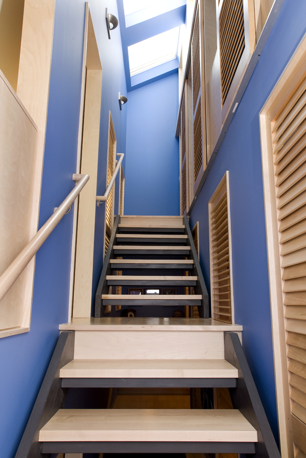
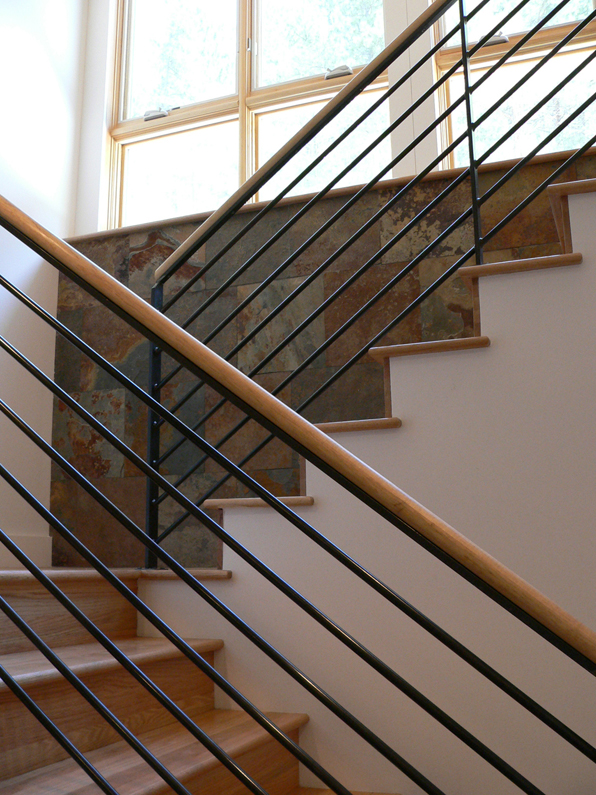
In the previous posts I have remarked on the drama of stairs.  That drama is certainly reinforced by the actual design of the stair - its details and materials, certainly its shape and how sharp or relaxed the descent or ascent.  Unfortunately, as architects love stairs, we can get a bit carried away with this sense of drama and go a bit overboard.

The drama here may have a lot more to do with the probability of  falling and ending up as a bloody heap at the bottom of the beautiful stairs.  Architects complain all the time about building codes.  However, some might make a bit of sense.  Like providing a handrail.  Or maybe guardrails.  Or treads that you won't slip on.  Or all of the above.

This stuff is known in the industry as "stair porn".  It looks a bit shocking and bit amazing and not very good for you.  This kind of visual drama misses the point entirely as far as I'm concerned.  The drama of a stair is the potential and very real moment of moving up or down it.  The stair literally transcends, breaks you free from the surface of the earth or at the very least it is Scarlett sweeping down to Rhett.  If the stair itself requires so much attention to the careful placement of every foot and hand, then maybe that heightens the tension of the transition but only in the most negative and frankly childish sort of way.  These glossy stairs that work so hard in their minimalism and lightness to defy gravity all seem to flee from the real potential of a stair - engaging gravity itself, pulling yourself up or plunging down.

Stair as theatre - part two

In the last stair post I talked about private stairs of a type.  This post continues that same theme but extends it out to the public realm. There are certainly a lot of nightclubs and restaurants that have taken great advantage of a descending stair entry.  Watching someone enter, survey the crowd, and then slowly make their way down is the stuff of high drama.  I worked on a project like that in downtown Boston where we were converting three underground movie theatres into a nightclub.  The entrance consisted of a large, winding stair that progressed downward while also circling the perimeter of the club.  Not built unfortunately so no photos.

Above and below are images of the Paris Opera House by Charles Garnier.  You can see the ornate stair that brings patrons from the street up to their seats with a multitude of little platforms to watch the drama of entrances.  I have been fascinated by the section drawing of the opera since I first saw it because of this dual quality of  "theatre".  You can see from the section below that the area given to entry and the associated promenade is at least as great if not more so than the interior space of the performance hall itself.  The photo above clearly demonstrates that the people walking in are on stage with all the little folks on the stair watching them including even some "opera boxes" of the little projecting balconies.

As in previous posts on the drama of movie stairs, here the association is also direct and intentional.  Clearly people watching is as engaging as any play and the stair is landscape for that drama.

If you have any thoughts or other examples of this kind of explicitly theatrical stair, please send it along.  The next post may step away from this more public realm into the drama of the household stair with a slight detour through English manor houses and their notoriously segregated main and service stairs.

Stair as theatre - part one

Stairs are inherently dramatic.  As the transition from one level to the next, they break the plane of the ceiling or floor and immediately engage the psychological territory that Gaston Bachelard so elegantly describes in The Poetics of Space.  Going up is to climb toward the sky, going down is to delve into the earth.  Hierarchy is more than simply implied, it is thrust upon us.  This post is going to be the first of a series in examining stairs and their architectural expressions and meanings as well as their technological parameters and code-driven outcomes.  As they are also about the most-expensive-per-square-foot item in a single-family house, a thoughtful approach to their design in each project, beyond purely visual aesthetics, should be warranted if not cherished. In a residence, stairs also often mark the transition from public to private space.  In a traditionally organized, multi-level house, private bedrooms are most often found on the upper levels and the more public rooms of the house - living room, dining room, etc. - are most often on the main or ground level.  (This  is only very general and the exceptions, like piano noble plans, can be all the more dramatic by comparison).  Moving up or down the stairs is often the most profound transition between realms.  The stair itself can ignore this transition but doing so clearly wastes an opportunity to bring richness and depth to a project.

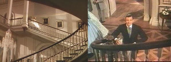
The most dramatic example I can think of in the use of the stair as a piece of private-public theatre is the large, sweeping formal stairs of large houses like the southern mansions mentioned in the last post.  The best visual evidence of this is actually from the theatre, the two stairs in Gone With The Wind - the Twelve Oaks sweeping double stair and the massive Tara stair.  Actually there are a tremendous number of shots in the movie that use the stair as a device, both deserve best-supporting awards.

Rhett waiting for Scarlett at the bottom of the stair is a great piece of sexual tension as she descends from the innocence of her childhood bedroom down to the world and all its desires and dangers. (Maybe more like a spider descending upon its prey however.)  I especially like the following still:

Here the stair is clearly not only the separation between private and public, but also defines the roles of men and women.  Scarlett carefully choosing which tread is close enough but not too far is maybe the best descriptor of how a stair can work to both join and separate both the physical and psychological areas of the house.

and so we begin...

sz011

sz011

A number of months ago, immediately on the heels of the Fourmile Fire, I was hired by a couple who just lost their house to design another.  It has been a great process even in the face of that tragedy, with clients who reaffirm why I do residential design.  Their thoughtfulness and commitment to the project has no parallel in any other building type.

Today, at noon, we received our Building Permit from Boulder County.  True to their word, they greatly expedited the process, cutting it down from 6-8 weeks to about one.  My heartfelt thanks go out to the Land Use and Building Department staff, especially Kim Sanchez, Gary Sanfancon and Michelle Huebner who have made a painful process considerably less so.

sz012

sz012

So we begin.  Construction will ramp up here in a few days and I will be posting updates as we progress from excavation through foundations, framing, roofing, etc.  Additional special thanks goes out to Jeff Hindman, Kim Neill and the crew at Cottonwood Custom Builders who were brought on early in the design process and have helped guide the project and its budget to a success launch.

SZ southeast

SZ southeast