Clifford Still Museum, some thoughts by Boulder architects M. Gerwing Architects

cs7

cs7

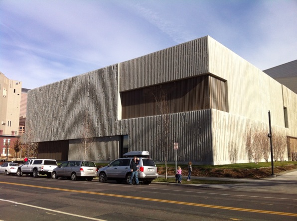
Siting quietly amongst its more noisome arts neighbors, the relatively new Clifford Still Museum in Denver is a wholly different kind of museum. Designed by Allied Works Architecture, the museum was designed to house explicitly the work the abstract expressionist painter.  Instead of the generic and changeable nature of the galleries of a typical museum, the architects have crafted a design that directly responds to the work of the artist.

cs1

cs1

The entire first floor houses the administrative and educational functions as well as the main entrance located along the side of the building facing a small park space. The entry sequence this sets up - street to park to entry to lobby, up stairs to galleries - creates a pleasing rhythm from outdoor sunshine to darkened lobby to top-lit galleries.  Along the way, the predominantly horizontal emphasis of the overall building gives way to a pronounced vertical articulation in the materials and detailing.

cs3

cs3

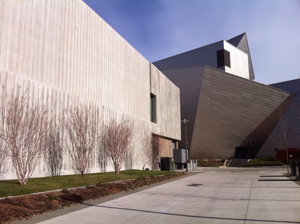
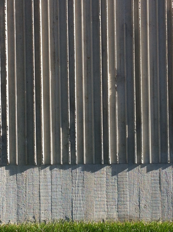
This vertical emphasis, found in the interior rails and details as well as the vertically-ribbed concrete, echoes the vertical lines found in so many of Still's paintings.  This synthesis of building elements with the specific artworks is the sensitive study of an architect taking full advantage of designing for a specific artist and is a far cry from the more generic gallery space of most museums.

cs5

cs5

However, what is most striking about the gallery space is the slightly labyrinthine arrangement of spaces with wide diagonal views between rooms.  As the galleries offer a roughly chronological procession through Still's career, these openings allow you to view each period in the context of the preceding and future work.  This lends an overall dynamic spatial quality to what might be an otherwise boring, unilateral maze-like march.

cs4

cs4

The top-galleries pull this assembly all together and clearly concentrate the viewer on the works of art rather than the museum itself, a not-so-familiar trend in cultural institutions these days.

I highly recommend a visit, both for the artwork and the museum, a paired ensemble that like any great performance, makes it look easy.

by Boulder architects M. Gerwing Architects

The Writer's Desk

"I look at these photographs with a prurient interest, the way that I might look at the beds of notorious courtesans." John Updike, in the Introduction to Jill Kementz's The Writer's Desk

JD

JD

 Joan Didion

We have worked on a number of rooms that are creative work spaces.  Some of these have been as "home offices" located within a house or condo, and some have been stand-alone studios or buildings.  In each case, we hope to find something intriguing about the nature of the work that can help inform the design beyond the simple functional requirements of light and space.

IBS

IBS

 Isaac Bashevis Singer

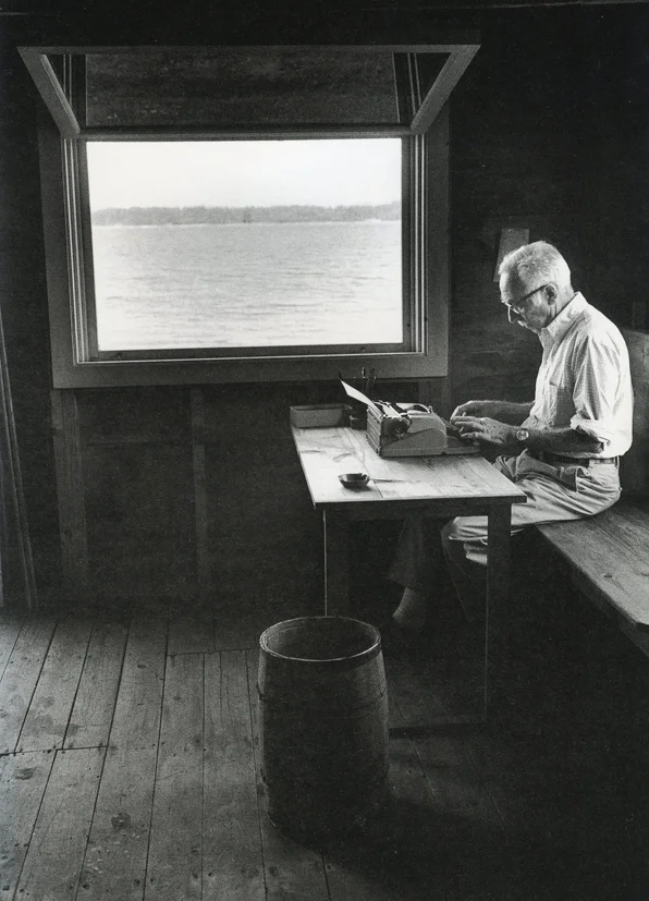
The Writer's Desk, by Jill Krementz,  is a series of brief glimpses into the natural working habitat of a number of noted writers.  Each entry contains a single photo of the writer at their respective work spaces along with a short comment from the authors on their writing spaces or process.

RPW

RPW

 Robert Penn Warren

As someone who designs these spaces for creatives, these are fascinating insights.  I think you have to avoid the too-easy temptation to analyze the rooms and contents, the arrangement of furniture and objects, as some kind of treasure map to the author's meaning and muse.  Working with clients over the years has shown that these spaces are far more complex in their relationship to the work than a brief visual survey reveals.  However, in the quotation above from Updike reveals, our fascination is not easily assuaged.

EBW

EBW

 E. B. White

I have to also admit that I have spent time changing, altering and modifying my studio space far more than any other room I have occupied in a lifetime of houses and condos and cabins and apartments.  It is true that you can create almost anywhere - so many designs have  come to life on my dining room table between the saucers and plates.  But you can only push aside your drawings at dinner time so many times before your  need for that other space, that small creative retreat, becomes a necessity.

by Boulder architects M. Gerwing Architects

Lebbeus Woods, 1940 - 2012

LW04

LW04

Lebbeus Woods passed away last week.  It is almost impossible to overemphasize the impact that this "paper" architect has had on the world of architecture.  A long-time professor at Cooper Union, he directly influenced generations of students at one of the most important schools in the world, during its most profoundly influential period.  But it was his publications with their hauntingly beautiful images that have become some of the most seminal works in post-Modernist era.

His drawings of re-imagined urban landscapes are stunningly beautiful even in their dark, vaguely dystopian vision. His most widely read work, Anarchitecture: Architecture is a Political Act, is so visually striking that its message is easily lost amidst the revery of the drawings and models on display.  But make no mistake, Woods' work was not just so-much eye-candy.

Crucial question - what is an inconsistent pattern? The cities of an experimental culture will be formed on inconsistent patterns, and will produce them. These will be their chief products, the result of a way of living driven by the need for clarity on shifting landscapes of the ephemeral.

LW 02

LW 02

I attended undergraduate and graduate schools of architecture during the height (or maybe bottomless, self-flagellating, pit) of post-structuralist architectural theory.  Architects, insecure in their creation of forms, looked under every academic, esoteric rock to find some secure impetus to justify the nature of the work - imposing forms upon others.  I won't go on about the absurdity and idiocy of the near-abandonment of 3,000 years of architectural history and practice for the tawdry attractions of French philology.  It happened, I witnessed it, even dipped a toe in it.

"Politics of construction: who designs, who builds, who owns, who inhabits?"

LW 03

LW 03

Woods' work shattered it.  He, among others, placed architecture back in the realm of buildings, the act of building, and the meaning of actually making buildings.  And the images he produced cemented that argument with an outrageous glorification of forms, color, plasticity and imagination.  Though his vision of shattered cities and expropriated spaces were often dire and almost always devoid of people, what comes through is the joy and beauty of making.  That may sound contradictory to what I said above, but it is not.  Great architectural ideas have never been planted so firmly as when they are not merely texts or images, but the synergistic amalgam of both, like LeCorbusier's Toward an Architecture and Robert Venturi's Complexity and Contradiction in Architecture.

I would avidly place Woods' Anarchitecture in that lofty neighborhood.  He was the most important and influential unbuilt architecture of the last century.  Not too bold a statement I think, and not befitting enough of his animating vision.

by Boulder architects M. Gerwing Architects
Container House Taking Shape, by Boulder architects M. Gerwing Architects
Container setting 02

Container setting 02

The shipping container house that we have been working on for quite a while has finally started to take shape.  The first box was delivered on Wednesday, lifted high above the neighborhood and swung into place on the second story.

Another container will be set in a few months immediate to the north of this one, making a long line with a small terrace between.  A very challenging building site, hemmed in with zoning requirements to a maximum building envelope of 20' wide by 145'  long, suggested the use of these long, narrow boxes.  The homeowner's desire for a eco-conscious house, including these re-purposed containers, drove the much of the design as well.  The restrictive solar shadow ordinance here in Boulder allowed us to build up to only 10' wide on the second level.

GB 06

GB 06

The final outcome will be sustainable design that incorporates the owner's solar panel array and stretches north to south over 140'.

Container setting 01

Container setting 01

The lifting and setting of the first box was quite an event, bringing out curious, and somewhat concerned neighbors.

The amazing views from this new second level will reveal Boulder's famous flatirons to the south and the city dropping off to the northeast.  The neighborhood of two- and three-story homes will be joined by this construction, long and narrow, of shipping containers anchored in their new port.

Container setting 03

Container setting 03

505 College 02

505 College 02

by Boulder architects M. Gerwing Architects

Las Mesitas, southern Colorado, photos by Boulder architects M. Gerwing Architects
Las Mesitas 04a

Las Mesitas 04a

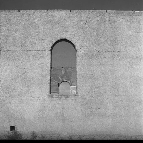
These are images from a roofless church in Las Mesitas, in southern Colorado on the western edge of the San Luis Valley.  I have been going there over a few years now and I am hopelessly fascinated by the stark simplicity of the place and its robust, stoic presence.

Las Mesitas 03a

Las Mesitas 03a

Las Mesitas 01a

Las Mesitas 01a

Las Mesitas 08a

Las Mesitas 08a

Las Mesitas 07a

Las Mesitas 07a

Las Mesitas 05a

Las Mesitas 05a

Las Mesitas 02a

Las Mesitas 02a

Photos by Boulder architects M. Gerwing Architects