Skylight Sundials

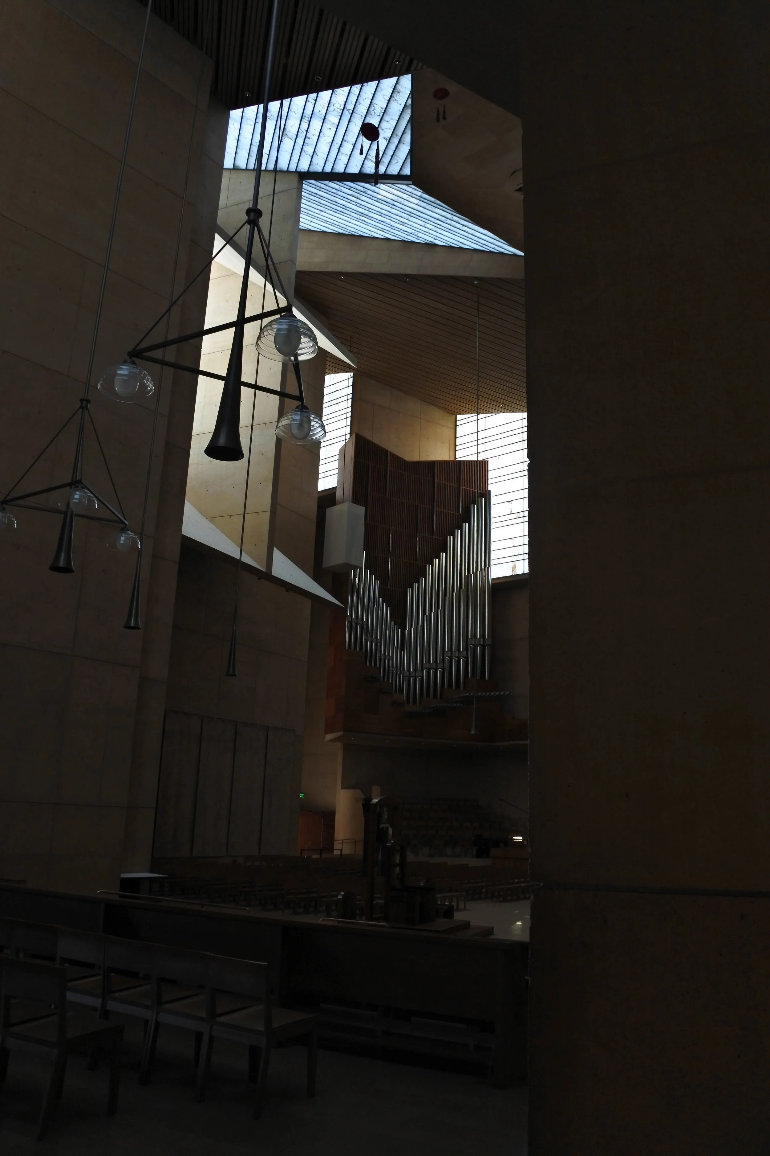
Video - skylights as sundials

An all weather construction time-lapse camera is our newest office toy!  We have grand plans to capture some outstanding construction progress videos in the future.  But to get our feet wet with this new tech, we chose to record the peaceful progression of sunlight through the loft at our Upper Vassar Residence.

Yale Art Gallery

Louis Kahn, Yale Art Gallery

I was in New Haven last Fall and in an unusual fit of nostalgia, visited a number of buildings that were in my heavy rotation viewing in grad school.  Louis Kahn's Yale Art Gallery was right across the street from my school and I viewed it so often that I realize now I took its deft expression for granted.

Yale Art Gallery, stair

Kahn's first major commission, the Yale Art Gallery was designed in 1951 as an extension to the collegiate Gothic gallery and was to contain a number of different uses.  Kahn responded by making a flexible space spanned with a tetrahedral waffle slab ceiling.  The strict geometry of that construction not only allowed for changing uses, but established the taut, graceful and, planar expression that evokes a kind of timelessness in its simplicity.

Yale Art Gallery

The building's organization is straight-forward and deceptively simple - clustered service spaces supporting hierarchically dominant galleries and workspaces.  Kahn's desire to instill a quiet monumentality is largely achieved in his explicit contrast of stark, windowless walls sitting adjacent to the fussiness of the faux Gothic campus.


Yale Art Gallery, ceiling
Yale Art Gallery, Kahn plaque
Yale Art Gallery, stair elevation

At the end of his career, Kahn designed the magnificent British Art Center directly across the street from the Yale Art Gallery.  The British Art Center is an architectural masterpiece, understated in its order and simplicity, form and materials.  It further develops and resolves the same questions posed by the Yale Art Gallery twenty years beforehand.  Perhaps the British Art Center's mastery led me to discount Kahn's work of years earlier.  Perhaps at the time, familiarity breed complacency on my appreciation of the Art Gallery.  I'm so very glad to have seen this building again after so many years and maybe I can now see it for its own grace and presence.  Perhaps it took twenty or so years of my own architectural practice to really appreciate the power of what appears so simple and complete.

thank you, Mr. Kahn

thank you, Mr. Kahn

Frank Lloyd Wright in California, 1920s

Frank Lloyd Wright in California

I recently returned from a trip to Los Angeles and when I was there I took the opportunity to visit a number of Wright buildings.  Of particular interest to me were the textile block houses of the early 1920s - the Freeman, Storer, Ennis and Millard houses.

Ennis House, 1923

Ennis House, 1923

Wright's first major work in California is the Hollyhock house, an explicitly Mayan Revival style fantasy, looking down on the city from its perch on Olive Hill.  It is a strange design for an unusual client and maybe represents Wright's first attempts to shed the Prairie Style compositions of hovering roofs and dominantly horizontal planes.  It is a volumetric construction and the large, blocky, overlapping masses foreshadow the more sophisticated and refined textile block houses that were to follow.

Hollyhock, 1919

Hollyhock, 1919

The textile block houses are all designed and executed in the same year, 1923, and represent an amazing body of work for an architect testing new materials on challenging and unfamiliar topography.  These houses gradually abandon the explicitly formal aspects of the Mayan Revival style but maintain the surface patterning and volumetric expressions.


Freeman House, 1923

Freeman House, 1923

Each of these houses sit on incredibly steeply sloping sites among the foothills and mountains north of the LA basin.  It is easy to imagine that the choice of building materials - custom patterned, but standardized concrete blocks - was influenced by the technological and logistical challenge of building on significantly vertical terrain.  The use of concrete blocks drive the houses to express themselves in large, muscular volumes, eschewing conventional windows and doors in lieu of glazed openings between masonry masses.


Storer House, 1923

Storer House, 1923

The textile blocks are fascinating and much has been written about their patterns and motifs. My interest lies more with the overall building massing and how these buildings differ so dramatically from the light, seemingly weightless glass and panel construction that we associate with California Modern - the work of Neutra and Lautner, Eames and Eichler.


Ennis House sketch

Ennis House sketch

Wright's architecture extends the rough hillocks of the landscape and acts more like piled up boulders than built constructions.  The textile block houses are masonry constructions, blocks added to yet more blocks, stepping up the hillside and creating sheltered spaces between.

The later work of the California Modernists, so light and airy, sit lightly on the landscape but are clearly not natural extensions of the terrain.  Lautner's Chemosphere is so divorced from its immediate site to only barely touch it at one point.

John Lautner's Chemosphere - image credit: UCLA Humanities

John Lautner's Chemosphere - image credit: UCLA Humanities

Wright's use of massive, masonry forms in large expressive volumes might be a result of his own internal design process and his progression as a creative architect.  However, I can't help but think that it is also a reaction of a Midwestern architect to the vertiginous building sites, perching on shaking, near-cliffsides sitting on the edge of the continent.  Later architects reacted to these sloping sites by building ever-lighter constructions, buildings softly dropped down from the sky on uncertain earth.  Wright characteristically built his projects from the bottom up, the earth rising up into blocks, inherently and "naturally" tied to their hillsides.

Storer House sketch

Storer House sketch

Project updates, March 2017

As Spring approaches with its usual companions of high winds and tantalizing warm days, we are busy ushering a number of projects to the building permit process.  Land prices are so expensive here in Boulder, that the majority of our projects are renovations and additions, not new construction.

South Boulder renovation image

One of the major challenges of many of these projects is to integrate the new addition with the existing building.  This is particularly complicated when the existing building is a smaller, simple ranch house that does not easily accommodate additional volume.


West Arapahoe project shadow plan

For older houses, a simple addition can be added to the rear or side of the existing structure and a small linking structure can knit the two together.  This sets up a nice dialogue between new and old, street and yard, public and private spaces.


Martin Acres renovation front elevation

Some projects add such large additions, more than doubling the size of the existing building, that establishing a new-old dialogue is almost impossible and we try to find a new language for the entire property.


Hillsdale Way front elevation

Hidden beneath, and within, these new designs are the vestiges of the typical 1960s builders suburban models - ranches, bi-levels and the dreaded tri-level.  Refining and enlarging these structures for use for another 50 years usually means fine-tuning them for specific views and being significantly more precise regading the use of spaces within the house. 


Vassar Drive project skylights

Carrying those ideas of refinement and craft through the construction makes each building unique for its site and owners.  Construction details are smaller manifestations of the initial big design moves.


traditional trim profiles sketch

adobe, churches and some thoughts on walls

adobe, churches and some thoughts on walls

I recently took a brief trip down to Taos and Santa Fe, New Mexico and drove along the scenic High Road to Taos.  Of course, along the way, in addition to stopping off to admire the vast chaparral landscape, I stopped at a number of the old adobe churches that are some of the oldest still-standing buildings in North America.  


Las Truces, New Mexico

The dominant building material here is adobe - mud and straw bricks, left to dry in the sun.  As you can see in the photo above, the adobe walls are usually coated with another clay/mud layer that helps to protect the exterior surface and renders the entire building into a massive, monolithic volume.


Rancho del Taos, New Mexico

Further accentuating the bulging masses, the height of the unsupported adobe walls required buttresses, not unlike classic North European cathedrals, to keep the walls vaguely vertical.  In the case of many of the churches, these buttresses at the front and corners of the building, were integrated into the wall planes of the church.  The overall effect is one of a gigantic lump of clay, albeit hollowed out for occupation.


adobe chapel sketch

These massive structures dominate the landscape, and although they do not in any way try to meld sympathetically with the immediate topography, the consistency of color and form of the slathered adobe, makes them clearly native to their environment.


adobe chapel

These are sacred spaces, but also buildings of oppression, often severe.  In most cases, they are the only building over 1 story high and clearly the pride of their communities.  They dominate the landscape and it would seem, at least at one time, the lives of the villages they inhabit.  Their impressive stature lies not in their ornament or even craftsmanship, but their bulk, unyielding and stoic, baking in the landscape.