architecture

Stair as theatre- part three

In the previous posts I have remarked on the drama of stairs.  That drama is certainly reinforced by the actual design of the stair - its details and materials, certainly its shape and how sharp or relaxed the descent or ascent.  Unfortunately, as architects love stairs, we can get a bit carried away with this sense of drama and go a bit overboard.

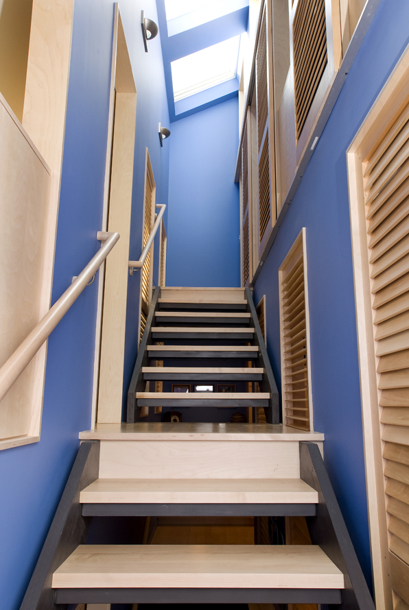
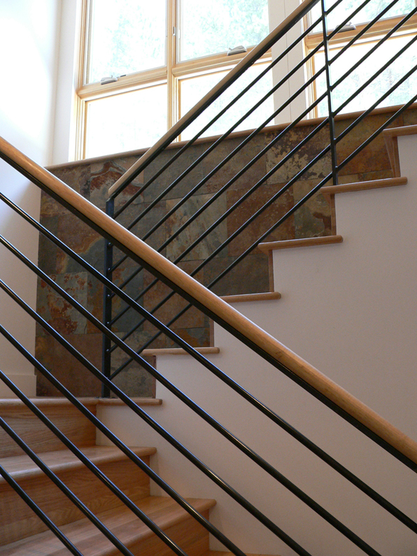
The drama here may have a lot more to do with the probability of  falling and ending up as a bloody heap at the bottom of the beautiful stairs.  Architects complain all the time about building codes.  However, some might make a bit of sense.  Like providing a handrail.  Or maybe guardrails.  Or treads that you won't slip on.  Or all of the above.

This stuff is known in the industry as "stair porn".  It looks a bit shocking and bit amazing and not very good for you.  This kind of visual drama misses the point entirely as far as I'm concerned.  The drama of a stair is the potential and very real moment of moving up or down it.  The stair literally transcends, breaks you free from the surface of the earth or at the very least it is Scarlett sweeping down to Rhett.  If the stair itself requires so much attention to the careful placement of every foot and hand, then maybe that heightens the tension of the transition but only in the most negative and frankly childish sort of way.  These glossy stairs that work so hard in their minimalism and lightness to defy gravity all seem to flee from the real potential of a stair - engaging gravity itself, pulling yourself up or plunging down.

Stair as theatre - part two

In the last stair post I talked about private stairs of a type.  This post continues that same theme but extends it out to the public realm. There are certainly a lot of nightclubs and restaurants that have taken great advantage of a descending stair entry.  Watching someone enter, survey the crowd, and then slowly make their way down is the stuff of high drama.  I worked on a project like that in downtown Boston where we were converting three underground movie theatres into a nightclub.  The entrance consisted of a large, winding stair that progressed downward while also circling the perimeter of the club.  Not built unfortunately so no photos.

Above and below are images of the Paris Opera House by Charles Garnier.  You can see the ornate stair that brings patrons from the street up to their seats with a multitude of little platforms to watch the drama of entrances.  I have been fascinated by the section drawing of the opera since I first saw it because of this dual quality of  "theatre".  You can see from the section below that the area given to entry and the associated promenade is at least as great if not more so than the interior space of the performance hall itself.  The photo above clearly demonstrates that the people walking in are on stage with all the little folks on the stair watching them including even some "opera boxes" of the little projecting balconies.

As in previous posts on the drama of movie stairs, here the association is also direct and intentional.  Clearly people watching is as engaging as any play and the stair is landscape for that drama.

If you have any thoughts or other examples of this kind of explicitly theatrical stair, please send it along.  The next post may step away from this more public realm into the drama of the household stair with a slight detour through English manor houses and their notoriously segregated main and service stairs.

Stair as theatre - part one

Stairs are inherently dramatic.  As the transition from one level to the next, they break the plane of the ceiling or floor and immediately engage the psychological territory that Gaston Bachelard so elegantly describes in The Poetics of Space.  Going up is to climb toward the sky, going down is to delve into the earth.  Hierarchy is more than simply implied, it is thrust upon us.  This post is going to be the first of a series in examining stairs and their architectural expressions and meanings as well as their technological parameters and code-driven outcomes.  As they are also about the most-expensive-per-square-foot item in a single-family house, a thoughtful approach to their design in each project, beyond purely visual aesthetics, should be warranted if not cherished. In a residence, stairs also often mark the transition from public to private space.  In a traditionally organized, multi-level house, private bedrooms are most often found on the upper levels and the more public rooms of the house - living room, dining room, etc. - are most often on the main or ground level.  (This  is only very general and the exceptions, like piano noble plans, can be all the more dramatic by comparison).  Moving up or down the stairs is often the most profound transition between realms.  The stair itself can ignore this transition but doing so clearly wastes an opportunity to bring richness and depth to a project.

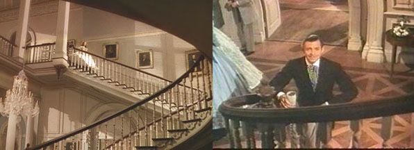
The most dramatic example I can think of in the use of the stair as a piece of private-public theatre is the large, sweeping formal stairs of large houses like the southern mansions mentioned in the last post.  The best visual evidence of this is actually from the theatre, the two stairs in Gone With The Wind - the Twelve Oaks sweeping double stair and the massive Tara stair.  Actually there are a tremendous number of shots in the movie that use the stair as a device, both deserve best-supporting awards.

Rhett waiting for Scarlett at the bottom of the stair is a great piece of sexual tension as she descends from the innocence of her childhood bedroom down to the world and all its desires and dangers. (Maybe more like a spider descending upon its prey however.)  I especially like the following still:

Here the stair is clearly not only the separation between private and public, but also defines the roles of men and women.  Scarlett carefully choosing which tread is close enough but not too far is maybe the best descriptor of how a stair can work to both join and separate both the physical and psychological areas of the house.

and so we begin...

sz011

sz011

A number of months ago, immediately on the heels of the Fourmile Fire, I was hired by a couple who just lost their house to design another.  It has been a great process even in the face of that tragedy, with clients who reaffirm why I do residential design.  Their thoughtfulness and commitment to the project has no parallel in any other building type.

Today, at noon, we received our Building Permit from Boulder County.  True to their word, they greatly expedited the process, cutting it down from 6-8 weeks to about one.  My heartfelt thanks go out to the Land Use and Building Department staff, especially Kim Sanchez, Gary Sanfancon and Michelle Huebner who have made a painful process considerably less so.

sz012

sz012

So we begin.  Construction will ramp up here in a few days and I will be posting updates as we progress from excavation through foundations, framing, roofing, etc.  Additional special thanks goes out to Jeff Hindman, Kim Neill and the crew at Cottonwood Custom Builders who were brought on early in the design process and have helped guide the project and its budget to a success launch.

SZ southeast

SZ southeast

architecture - climate and region; some thoughts on southern mansions

I have been thinking  a lot lately about vernacular architecture and indigenous responses to local climate.  By that I mean how a building and design practice, over time, has found architectural solutions to solve some of the problems posed by heat and cold, sunlight and shadow, aridity and humidity.  Reading through some older posts on my delving into the possibility of trying to define a Colorado vernacular, it strikes me that very few of those examples I identified tackled the issues of heat and solar gain.  That might sound like a recent concern, more one of energy use and sustainability, but a few quick glances at traditional southern architecture reveals design/technological solutions that we have largely forgotten in the age of air-conditioning.

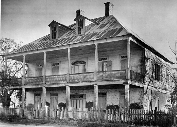
These are images of traditional southern plantation houses in Louisiana from the book Ghosts Along The Mississippi by Clarence John Laughlin.  The book's oddities aside, it is a great document of these traditional houses many of whom are no longer standing.

The large wrapping porches and porticos of all these houses block the direct sun from hitting windows and exterior walls and create  a deeply shadowed interstitial space between interior and exterior.  The "technology" of the deep overhang results in a new kind of spatial experience, partly interior, partly exterior, which radically breaks down the stark privacy of the Georgian forms from which these models take much of their architectural character. It is maybe tragically ironic that these houses where slaves were an essential part of the culture and economy have in a sense a more casual relationship between public and private than their English precedents where servants were equally present but interior and exterior were sharply delineated.

Of course some of these houses owe more of their architectural lineage to Greek antecedents, but in ancient Greece's equally slave-owning culture, emphasis is directed inward to courtyards, not outward as in these southern Tara-like mansions.  Certainly the veranda was a convenient place for a plantation owner to survey his fields and from which to greet visitors, but the impetus for the porches was more climate-driven than programmatic.

More than echoing their Georgian and ancient Greek architectural origins, maybe these southern mansions, with their large, single roof forms owe more to that other model of agricultural manor house, the Palladian villa.  Although those villas of central Italy and the Veneto do not sport large, overhanging  porticos, like their southern mansion  cousins, they are singular buildings in the landscape, dominating the perspective in a single large architectural form.

The southern mansion prototype has become such a stark visual cliche that it is difficult to look beyond the ridiculous bad copies that it has inspired and look a little more carefully at the architecture.  And of course its association with slavery forever banishes the southern traditional mansion into a dusty drawer of architectural history.  However, a closer examination of its form and materials in response to climate and its adaptation and transformation of formal architectural modes grafted onto vernacular practice is a worthwhile study.  I am not suggesting that we adopt the form and replicate, South Fork ranch-like, a hybridized bastard McMansion morphology, but let's not throw the architectural baby out with the cultural bathwater.

(images by Clarence John Laughlin from Ghosts Along The Mississippi)

why are so many modern houses such bad neighbors?

In the last few days, I have received, along with the usual breathless announcements from the architectural press, images of a number of new, modern houses that share a disturbing characteristic.  What so many of these houses have in common is their disdain or outright contempt for their more mundane neighbors.

I am a strong believer that contemporary buildings should reflect contemporary times.  That doesn't always mean that I design "modernist" buildings, but certainly the language of modernism - spatial as much as material - is always at play in my work.  I am also almost daily fending off criticisms of modernism by non-architects.  There are a number of reasons I think that most folks dislike modernist designs, some of them a bit knee-jerk, many of them based on only having experience with bad modernist designs, but some of them very well deserved.

Why are so many modern houses such bad neighbors?  Modernism owes much of its appeal to its boldness and often stark articulation.  When placed is what is otherwise a fairly traditional neighborhood, this is often strikingly harsh and confrontational.  Let me try to outline why I think this has come to pass:

1. First, modernism is born in the crucible of individual liberty and an outright denial and contempt for previous historical forms.   A modernist building is a work of art and is often likewise as non-contextual.  It doesn't matter who or what your neighboring buildings might look like, the architect is genius and the work is a masterpiece and owes no debt to its philistine neighbors.

2.  Second, traditional houses were proud manifestations of the homeowners wealth and status and most importantly, their public role as citizens.  Windows were not only to let in light and air, they were also a part of the forthright facade of the building, looking out at their fellow neighbors and asserting a public role.  Modernism's championing of functionalism over formalism has in a sense reduced the window into a technological device for the passage of sunlight and possibly the movement of air.  Windows are placed based on views and light and privacy, not as the public face of the private life of the homeowners.  This is symptomatic of,

3.  Traditional houses were public buildings of a sort.  Even though the private lives of the residents might roil within, the house was the public face of that family and projected their status, taste and prejudices out to the neighborhood and the city beyond.  By contrast, most homes over the last 50 years or so, are not built to project out in to the world, but rather to be a retreat from it.  Homeowners consistently respond that they view their house as a refuge, oasis or retreat from the world.  Modernism responds in kind - functionalism demands that if the house is to be a retreat, then privacy trumps any public role that a house might display.  Our ambivalence or outright fear of the world at large directs us to make houses that turn their backs on the street, hiding and protecting the inhabitants.  This is maybe not that different from medieval towns who faced the outside world with large defensive walls, not the light and airy facades of Enlightenment villas.

It is my practice to always study the context of a building with as much care and rigor as the program of the building.  In my mind, the "function" of the neighborhood, its faces on the street, the proximity of other buildings, the rythym of the openings along the street, are all as much a part of the problem of the project as the location of a kitchen or the drama of a stair.  For buildings in remote, rural settings the shape of the land and the context of trees and native plants along with the seasonal variations of light and views, make up the "neighborhood" of the building.  However, in a more densely populated suburban or urban situation, the design of the building should reflect and respect some aspects of the scale, size, proportion and "openness" of the surrounding buildings.  This does not mean that we typically mimic the style of the buildings around us, rather we look to some aspects of these buildings to see if there are some elements that might both reinforce the internal functions of the house as well as help relate the house to its context.  That may mean we reflect the relative amount of window-to-wall proportion of the neighborhood or the base-shaft-capital vertical arrangement of a set of facades.  Even when the new building is significantly larger than its older and more traditional neighbors, we make efforts to mitigate this scale contrast by various means - entering the building on a lower level, downplaying the colors and material, breaking down the scale of the new to reduce its visual scale.

So where do so many architects get off complaining that the public just doesn't get it and that anyone who doesn't like modernism is a dolt?  When architects finally stop making bad corporate shit-box buildings and masterpieces to their own ego (and sometimes those of their clients) instead of recognizing the value of being a participating part of a larger whole then maybe modernism can regain its claims to humanism.  Until then, if you want to design a masterpiece unhindered by neighbors and their mundane houses, feel free to buy a large chunk of land up in the mountains or out on the plains and let's go for it.  But if you want to live in a neighborhood, then be a good neighbor.