design build

tile, pattern, geometry

nocce travertine, brick coursed

nocce travertine, brick coursed

As I have probably spoken about in previous posts, we draw no real distinction between architecture and interiors.  They are all a part of crafting a series of spaces that are made of various materials that make up a building.  To that extent, we spend as much time, and often considerably more, choosing interior materials.

emperador marble, nocce and durango travertine, 3D cube pattern

emperador marble, nocce and durango travertine, 3D cube pattern

Of particular pleasure for an architect may be the selection of tile materials, colors and patterns, as those selections are inherently tied up with geometry.  Overall the selection of materials and colors in a space need to balance and most frequently this can result in creating fairly simple floor patterns with tile run in a conventional grid arrangement.  However, I think it is a missed opportunity if we can not select a type of tile and a specific pattern of its installation that can reinforce the spatial and geometric ideas that are playing out in the rest of the space.

KL tile 01

KL tile 01

The photos here are all from a recent project of ours in Boulder, Colorado, that was almost entirely an interiors-only project.  As a renovation of a conventional builder-type house, we avoided the costs of removing and changing a lot of interior walls by re-imagining the existing rooms and selecting materials and colors that would reinforce the nicer aspects of each space and draw one's attention away from the less-desirable parts.  Floor tile patterns were crucial to this strategy and became a theme in the newly envisioned house.

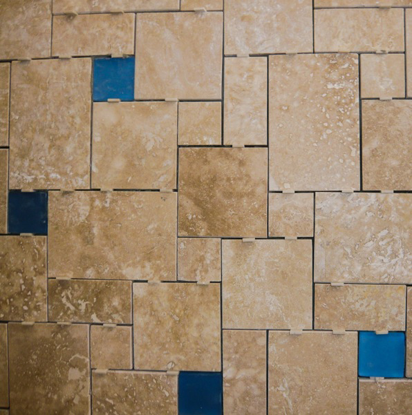
durango travertine and blue glass tiles, ashlar pattern, tile spacers still in place

durango travertine and blue glass tiles, ashlar pattern, tile spacers still in place

I have written about my theory of the relative levels of abstraction of natural materials from their sources.  More than consistent color or theme or pattern, I think this is the most intriguing way of creating harmony within a series of spaces without resorting to a slavish consistency or patronizing "style".  Although the types and colors of the tiles used on the project were quite varied, they work together as a whole and are specific to each use and room to be functional and add to the overall feel of the house.

This project will conclude in the next few weeks and we will see the final results of the play of color and geometry to bring resolution to a house much in need of some character and order.

ReSource Wars!

RW NQWT sign

RW NQWT sign

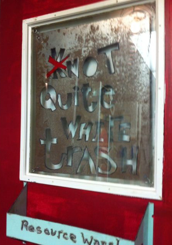
This past weekend we were part of a team that participated in ReSource Wars, a two-day design-build competition in service of the local building materials resource center here in Boulder.  The event was great fun and gave us the opportunity to design and build a quick project with a team of super talented friends and colleagues.

RW elevation

RW elevation

ReSource has been around for quite some time and they recently acquired a new building that needed some work.  The ReSource Wars event singled out 8 locations within the facility and assigned 8 teams to compete to make the most interesting, functional and awesome solution.  The team the we participated with - Not Quite White Trash - designed the Tool Library display wall.

RW bay

RW bay

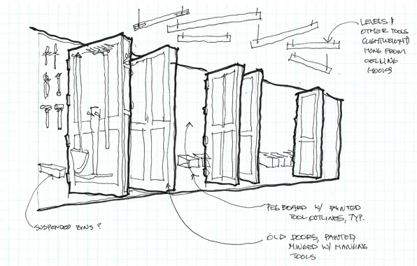
The Tool Library allows residents to peruse from a large selection of common hand tools and power tools and borrow them much like a book from a library.  Challenged with fitting a lot of tools along a wall only 25 feet long, we quickly realized that we would need more wall space.  Using only recycled building materials from the ReSource yard, we created a series of doors that are hinged and project out from the wall adding over 30 feet of more tool hanging space and can be flipped through like pages of a book.

RW screwdriver sign

RW screwdriver sign

All the various hangers for the tools were made from items we found in the yard, from recycled old tools to welded brackets and shelves.  Like Grandpa's old tool shed with the painted outlines of tools on pegboard walls, we utilized the tools themselves, in full 3D form, to hold the tools of the Library.

RW saw rack

RW saw rack

The result we hope is a functional and funky display of the tools and their usage and will serve ReSource well.  However, maybe the greatest success of the two-day event was the forming and working of an amazing team.  The basic plan allowed for everyone to exercise their creative and technical skills and we completed the project with great camaraderie and only a little head-bashing.

RW initial sketch

RW initial sketch

Great and special thanks to ReSource to inviting us and to our SuperHero team mates:

Jim Walker, ACI Design Build, architect and builder

Mitch Levin, artist, metal worker extraordinaire

Aicha Menendez, landscape architect and designer

Brian Laak, furniture design and cabinet-maker

Mark Gelband, artist and builder

Guido Densler, master welder and metal worker

RW award

RW award

Hunting Lodge, construction process, ACI and M. Gerwing Architects

HLF great room 01

HLF great room 01

Construction is in a full court press on a hunting lodge project in rural southwest Minnesota designed by M. Gerwing Architects and ACI.

The crews are working double time to try to complete the building for the September 21st Opening Day of the local hunting season and the arrival of the club's anxious members.  This building replaces a much older, distressed building that had been added on to over the decades and was suffering a number of structural and life-safety issues.  In lieu of an expensive and time-consuming renovation and addition, the club members hired ACI and M. Gerwing Architects to design a fully-functional, low-maintenance facility that will serve them well into the future.

HLF model 01

HLF model 01

With just a few weeks left for construction, the local crews are busily hanging drywall and finishing floors, putting in an extraordinary effort working nights and weekends.  The ACI team will be heading down there next week to finalize details and help unpack furniture and mementos for installation.  ACI and M. Gerwing Architects have really executed a full design and management process for this project including choosing and ordering furniture, wall coverings, tableware, etc. down to the last knife and fork.

HLF fireplace 01

HLF fireplace 01

As you can see in the image above, the fireplace is under construction using local field stone gathered by the mason from the surrounding properties - truly locally sourced.

enter ACI - architecture, construction, integration

We haven't added new blog posts in quite a while as we have been more than ordinarily busy with a new joint venture - ACI design/build. Jim Walker and I have been friends since our Chicago-days, now almost 16 years ago.  Jim is also an architect and he has spent many years with New York architecture firms doing design/build work as the on-site architect and construction manager.  In the same capacity, he and I have done a number of projects over the years both here in Colorado as well as in Chicago.  Now our occasional collaboration is a full-time occupation embodied in ACI.  While M. Gerwing Architects still exists and works with a number of excellent local contractors, some of our projects will be joint ventures with ACI as both design and construction professionals.

The design/build process offers some unique advantages over the traditional architect-and-contractor process.  The communication and coordination is certainly streamlined as is the process of designing, detailing and documenting a project.  This realizes significant savings for our clients and makes the process much more rewarding for ourselves, being able to spend more time on design and less on paperwork.

For as interesting as design/build is, there are limitations.  Very large or significantly complex projects benefit from the long experience and solid focus of an experienced general contractor.  And, for my part, I have learned so much from general contractors over the years that I would never give up using that more traditional process for many of my projects.

We spend a lot of time custom designing a project for clients.  We avidly search through the project to find the unique aspects of the client and the site to highlight these issues and create tailored projects.  However, we don't often adjust our process to the needs of our clients.  We are the experts at that process and we often bend each client and project into that form.  I think now, with the addition of ACI, we have options we can present to our clients for not just the design of the project, but the process to get there as well.