info for home-making

Construction progress - up the canyon, July edition

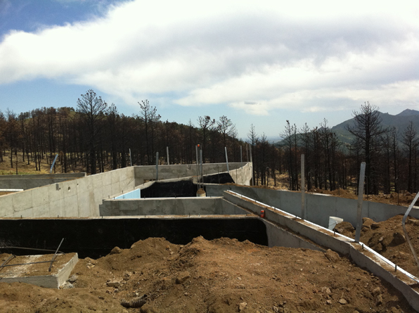
The beginning of every construction project starts with destruction.  We demolish or excavate before we build.  The first signs of progress are large piles of deconstructed lumber or mountains of dirt that have to get trucked off or re-used in some way.  Foundations are poured and drilled, some framing is done, but nothing really strikes you as 'beginning' like the erection of the first walls of the project.
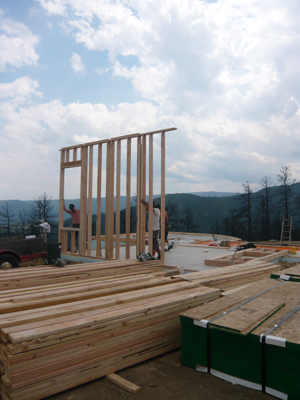
Slowly, over a number of days and weeks, walls are framed, tilted up into place and secured, gradually forming the spaces of the building.  The syncopation of the studs, the clear expression of the structure becomes apparent.  Often the building framed looks better than anything else that is to come.

When enough walls are finally put into place, you can begin to feel the space for the first time.  Architecture is as much or more about that enclosure of space - its proportions and energy - than it is about what the building looks like.  At this early stage, with all the studs exposed, the building often feels smaller than its finished descendant.

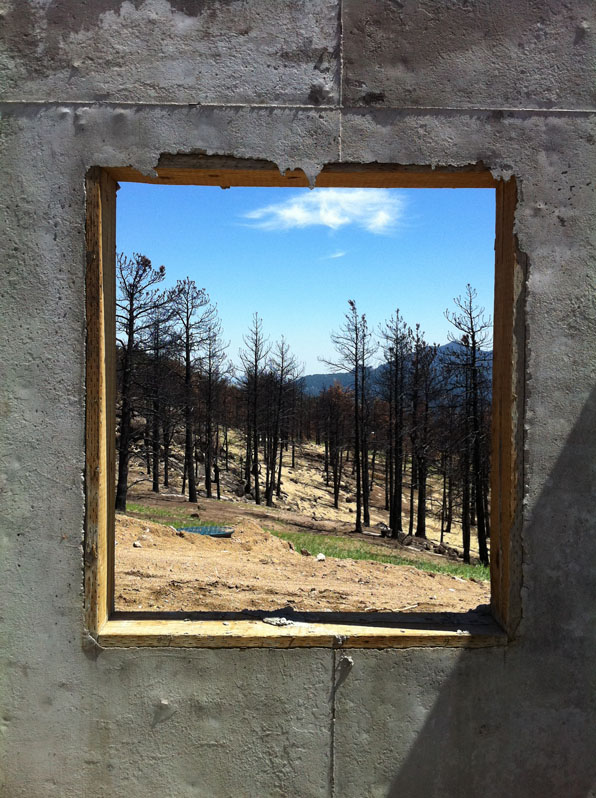
And of course, the views from the rooms are framed.  Before windows, before sashes and glazing, frames and thresholds, there is the pure framing of the view that is revealed in the simple structural frame of the house.

Construction progress - up the canyon

One of my ongoing projects is the construction of a new house up Sunshine Canyon just west of Boulder, Colorado.  My clients, long-time residents, lost their house in the Fourmile Fire last Fall and we are trying to replace the spirit and energy of that house while making a new design that is better suited to aging in place concepts.

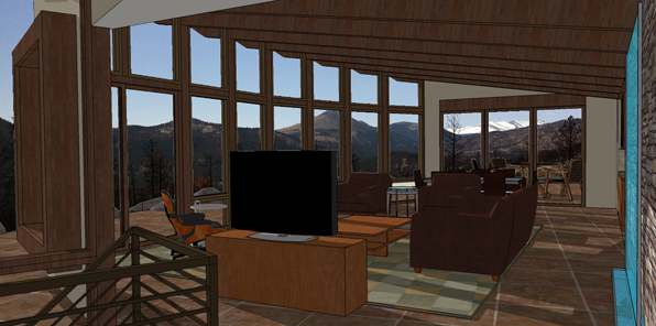
With most of the home's spaces located on the main level, the spaces flow into each other and connect the interior and exterior in a seamless panorama.

I will be posting construction photos as we progress over the next year and add some thoughts about the design process and the techniques involved in building in such a fire-prone area.

Architecture:  M. Gerwing Architects, Mark Gerwing project architect

Construction: Cottonwood Custom Builders, Marc Anderson project manager

Structural Engineering:  Gebau, Inc.

what a house should be - part five - or what it's not

First, it is not a product.

Second, it is not a function of the architect's ego.

Third, it is not a function of the bank's commodification

And last, it is not a machine. When LeCorbusier first said "a house is a machine for living", machines and technology were seen as liberating, not the soulless leviathans that they have come to be in popular imagination.  He didn't mean by this that it should look like a machine, even though his early designs certainly had a marine- or machine-like imagery.  He meant that it should be designed to exactly meet its function.  A blast-furnace looks the way it does because it makes steel.  No added flourishes, no anachronistic stylings.  His manifesto was likewise one of liberation, shedding the baggage of so many Victorian drapes and over-wrought iron.   So a house is not a machine, because "machine" has become too loaded a word.  But it should be as liberating and certainly as finely crafted as LeCorbusier's original humanistic vision.

what a house should be - part four - it should be fun

Architecture is serious business.  Not only because architect's take themselves painfully serious, but because for folks who choose to go down the path of designing and building a custom house, it is probably the most money they will ever spend.  Tends to be a bit sobering.

A house is the daily landscape of your life.  You wake up to the walls and ceilings, floors and doors, that are your house.  You go to sleep under the stars, but under that ceiling as well.  Your house ought to be fun.  I don't mean funhouse fun, although that can be done.  I mean that as much as we often endeavor to create a house that is a safe refuge in the world, it should also be a place of joy.  We don't have a lot of tools in our belts to pull this off as architects - the sun streaming in a window, the smell of blooming trees wafting through a kitchen, the solid satisfaction of a door closing.

A house can be whimsical.  We have all seen those crazy structures, hobbled together by some singular, driven, local wacko made of license plates or aluminum cans or auto tires.  But that ephemeral whimsy can be made of simpler stuff - a series of little ledges that hold glistening snow or scuppers that cascade the occasional shower.

A house made of only those things would be tiresome in short.  But without these little moments, designed lightly, a house is not much more than a big motel room without even the magnificently awful painting over the bed.

what your house should be - part three - it should be beautiful

This may seem obvious, but often people think they have to compromise between function and beauty.  They do not.  Any architect should be able to design a project that lives comfortable in that slippery neighborhood of "beautiful".  It may be that this is hopefully subjective, but many aspects of a kind of architectural aesthetics are not so elusive.

For most folks, the beauty of a building is what it looks like.  For most architects it is also what the building is.  Part of what makes a building beautiful is that it makes sense - the building is something, not simply an assembly of windows and doors, roofs and foundations.  For Modernist architects, the exterior of the building should reflect the uses of the interior - a kind of truthful transparency.  For more traditional architects, the exterior facades of the building don't necessarily have anything to do with the interior function, but they should be artfully composed.  In all cases, a kind of thoughtfulness comes through.  We may not all like a given building, but any well-designed building should be able to be appreciated as such.

Your house should be beautiful.  Maybe not cover-of-magazine spectacular, but it should be what architects call "resolved".  The proportions of  door and window openings should relate to each other, the masses of the building should work together, the trim and casing should reinforce the proportions of the openings.  This is not to say that every window or door is the same size.  That kind of consistency is boring and frankly lazy.  But every house ought to have been on hard enough and long enough to bring the design to a place where the building is something, not a pastiche of different styles or a thoughtless amalgam of parts. None of this is limited by budget.  Ever.  These things are the basics that every architect should be able to bring to bear on a project.  If they can't or aren't for some reason, find another.

Sunshine Canyon A-frames

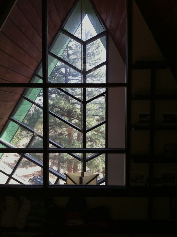
I am working on a remodel and addition to an odd A-frame hybrid house at the base of Sunshine Canyon, just west of Boulder.  The original house, built in 1964, was designed by architect Richard Brown.  Brown designed a number of these modified A-frame houses, mostly around Boulder, before he later took that form and proceeded to design churches.

After a little research, I found an article in the Sunday Denver Post from May 10th, 1964, that shows another of these houses.  The article goes on to talk about the number of steeply-sloping building sites that were being constructed on in Boulder.  In an interesting and prescient harbinger of a kind of critical regionalism, the article, written by Ellen Bull, goes on to say,

"...in nine cases out of ten, Boulder house designers actually are determined by the terrain."

"among the assets which builders and architects emphasize are the many days of sunshine, both summer and winter, the mountain views, and the fact that the mountains are close enough to use and enjoy."

"As each builder or architect finds the answers to these questions, in his own individual way, he develops a building not quite like any other anywhere.  The very difficulties he faces stimulate his imagination and ingenuity."

Well said.  In 1964.  It is a shame more of the subsequent building in and around Boulder did not heed that advice as we have more than our share of suburban McMansion boxes awkwardly grafted onto steep mountain sites.

(window mullions reflecting the shape of the pine trees beyond)

Our work will be removing some of the interesting features of the house, but as the whole house is in such bad shape, we will see what can be saved and what we can echo in the new construction.