Walnut Creek residences, Boulder

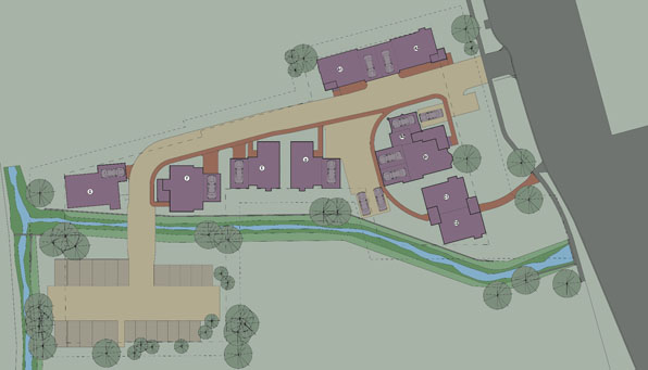
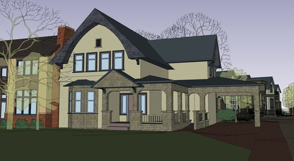
This is an urban infill project located near downtown Boulder, Colorado.  The existing site was dominated by a well-preserved 1890's house with a wrapping porch and porch cochere.  The new design consists of renovating that old house and adding two duplex units at the street and four small single-family houses in the site's large south side.

The old house has been renovated into two separate condo units, one up and one down, while maintaining the essential historic character of the building.  The new duplex units on each side are located to fill in the large gap between houses on Walnut Street, filling in the "gap tooth" appearance of the street while maintaining the historic scale of the neighborhood.

Each of the south single-family houses consists of two levels with an attached garage and large deck above.  These four houses sit along an arm of Boulder Creek and are oriented to take advantage of the water's sound and presence.

Designed by M. Gerwing Architects with Arcadea, Inc.

Mark Gerwing, Project Architect

Currently under construction

Builder:  Coburn Development

Landscape Architect:  Hidelly Kane

Structural Engineer: Nicols & Associates and Gebau, Inc.

A Field Guide to Ugly Houses - Gilding the Lily (GTL)

I'm hesitant to even include this category because it seems so mean-spirited.  Gilding the Lily is house-proud gone awry from too much love.  It is  simple said, too much of a good thing.  When I look at these houses I want to go up to them and just snap a few things off, a corbel here, a festooned column capital there.

This a nice house but it careens into the too-cute ditch.  Not to be scrooge, but the holiday wreaths even add to the impression of a house that is a bit too charming for its own good.  A few years from now, if the shingles are allowed to weather to a soft gray, this house may be great.  Right now it's too shiny and new and earnest to feel like a made thing.


This is also a really charming house, a probably late nineteenth century Second Empire building that is a bit too encrusted with multi-painted corbels and trim to allow the original beauty of the house to shine through.  Its not ugly, its just too much.  If you think of a design as a balance between tension and repose, this house is overly caffeinated and is trying too hard to be your friend.

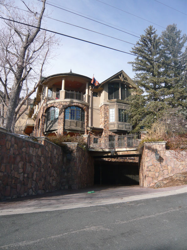
"Old World Charm" is fine enough thing, but it can go too far.  Again the tension/repose balance has been tipped into the overly romantic.  The house seems like it has been staged, not designed and built.  The subterranean drive only conjures up images of tortured visitors sequestered away in the dank dungeon.  "A man's house is his castle" is a a metaphor, not a commandment.

As I said, I feel a little guilty even including this category as each of these homeowners have probably spent considerably time and money on trying to make the best house they possible can.  Who am I to criticize.  But it is a lesson worth remembering, that too-much-of-a-good-thing is an attractive seductress to be avoided.

Loveland Feed & Grain

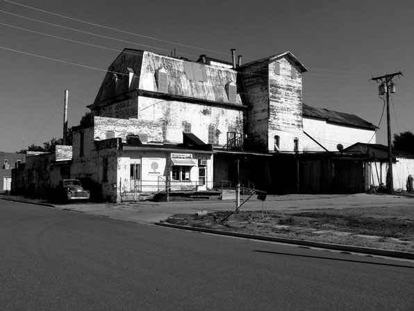
Just off downtown Loveland, Colorado  is the ancient and intriguing Loveland Feed & Grain building.  A many-year preservation and restoration effort has been taking place to find new uses for this magnificent building, expertly documented and researched in Christopher Th0rp's report and headed up by a non-profit and Novo Restoration.

I believe that we should all take extra efforts to try to find ways to save these agricultural buildings from the nineteenth century.  Loveland's thriving arts community has taken a kind of stewardship of this building and there are plans afoot to transform it into an arts complex with adjacent live/work artist's housing next door.


I have written quite a bit about trying to find a Colorado vernacular and folding this in to the making of a kind of critical regionalism for the Front Range.  I can think of no better example of a building to start with and a potential to fulfill.  A semi-public Request for Qualifications went out for the making of the live/work residences and we passionately submitted our team and hope to be involved.  Stay tuned.

(all photos by Mark Gerwing)


A Field Guide to Ugly Houses - Ugly by Design

Of the many types of ugly that inflict the American house, Ugly by Design, although not the most pervasive, it is certainly the most offensive.  These houses clearly fall into the "what were they thinking" category of a design idea gone wrong. Sometimes Ugly by Design is the result of a once-interesting and innovative design idea that has past its shelf-date.

In a lot of ways this is a nice house, but the roof form is forever associated, at least by me, with Pizza Hut.  That's not the architect's fault or the owners, but the result of a very dominant, unique roof form that has been hijacked by bad, commercial work to the point of making it iconic.

Often Ugly by Design is the outcome of a renovation gone wrong.  "It seemed like a good idea at the time", "we really hated the siding", "but I like bunkers!"

Maybe the worse examples of Ugly by Design are the houses that have a strong intention that somehow seems to get sidetracked.  The house below has an amazing southern view of the mountains, but situated on a very public corner the double height wall of glass makes a painful fish-bowl exposing everything inside to public scrutiny not to mention the blazing sun. In a different context this house is maybe not ugly at all, but in this location, I feel like I am window-shopping on someone's life.  It makes me feel guilty for looking.

The house below has a kind of grand public face of three gabled pediments that rise two stories announcing the house to the street.  It seems all the more odd then that the color and lack of windows on the other hand are trying desperately to be quiet and hide behind the trees.

About the below, I don't know what to say,

except, as a kid, it would be cool to say "yeah, I live in the super-wedge down the street."

post-script:

as a late entry to Ugly by Design, a fellow reader presents the following:

wow.

Valmont Mill

The City of Boulder owns a significant portion of Valmont Butte, east of town, including the abandonded gold and fluorspar mill.  The entire property is in the County and as part of a intergovernmental agreement, the City has been asked to grant landmark status to portions of the mill and associated buildings.

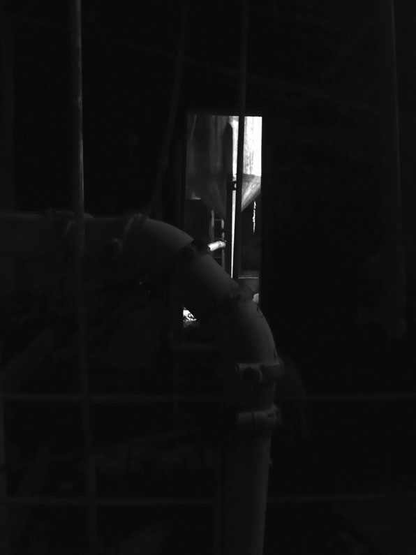
The City conducted a tour of the facility for Landmark Board members and we got a brief glance into the history of the place.  Walking through the building was fascinating and frightening as only dark, abandoned buildings can be.  Even in the middle of the day in the company of others, this place, with its obscure machinery, broken glass and menacingly dark corners is daunting and a bit thrilling.

Once a Landmark, what will happen with the mill?  To clean it up and secure it for public tours will rob it of its mystery and power.  It is decidedly too dangerous in its current condition to allow access.  Every passage holds dangling wires, shards of glass and rusty metal flanges ready to pounce on the unwary visitor.  The roof is coming off in sections and the entire place is probably a heavy metal contamination nightmare.  To leave it as is, mothballed but beautiful in its decay and abandonment, would shut it off from the citizens who now own it.  Any thoughts on what to do with these monuments to both an industrial past and the notion of the past in itself?


Construction progress - up the canyon, August edition, part 1

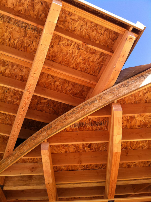
The majority of the heavy framing is done on the new house construction on our project up Sunshine Canyon.

As every architect knows, the project, while decidedly unfinished, may never look so good again.  When a building is no more than its simple framing, the rafters, joist, beams and posts artlessly revealed, it displays a purity and clarity that is only sullied as the construction progress further.  To leave it like this would be a kind of beautiful testament, but would result in a folly, not a house.

And of course, at this stage, the house is still becoming.  It is slowly transforming from some lines on paper and a vision in the architect's head, to a thing of weight and heft.  The wood studs and rafters smell of the material's origins, most likely the forests of Canada.  The beams are still a bit rough, not yet sanded and finished they are are much still the product of a tree as a part of a house.

With each passing day, the structure rises and the spaces take shape.  Each new element lends scale to the house - a window opening, a door threshold that will become the portal of so many comings and goings.

From the ashes of their beloved house, the new house slowly comes into being, one piece at a time. Down in an instant of fire, the house will take about a year to build anew.