a brief look at the roof and its use a design element in architecture, its disappearance with modernism and then reappearance over the last few years
ReSource Wars!
This past weekend we were part of a team that participated in ReSource Wars, a two-day design-build competition in service of the local building materials resource center here in Boulder. The event was great fun and gave us the opportunity to design and build a quick project with a team of super talented friends and colleagues.
ReSource has been around for quite some time and they recently acquired a new building that needed some work. The ReSource Wars event singled out 8 locations within the facility and assigned 8 teams to compete to make the most interesting, functional and awesome solution. The team the we participated with - Not Quite White Trash - designed the Tool Library display wall.
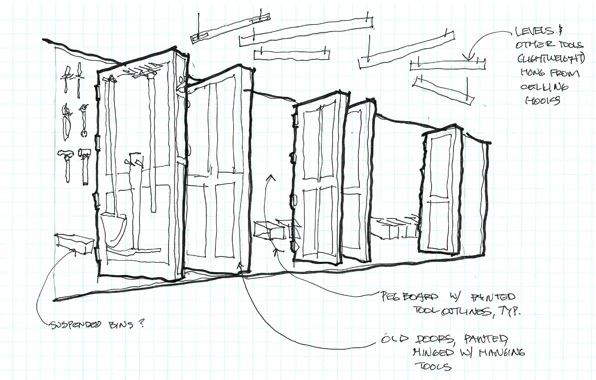
The Tool Library allows residents to peruse from a large selection of common hand tools and power tools and borrow them much like a book from a library. Challenged with fitting a lot of tools along a wall only 25 feet long, we quickly realized that we would need more wall space. Using only recycled building materials from the ReSource yard, we created a series of doors that are hinged and project out from the wall adding over 30 feet of more tool hanging space and can be flipped through like pages of a book.
All the various hangers for the tools were made from items we found in the yard, from recycled old tools to welded brackets and shelves. Like Grandpa's old tool shed with the painted outlines of tools on pegboard walls, we utilized the tools themselves, in full 3D form, to hold the tools of the Library.
The result we hope is a functional and funky display of the tools and their usage and will serve ReSource well. However, maybe the greatest success of the two-day event was the forming and working of an amazing team. The basic plan allowed for everyone to exercise their creative and technical skills and we completed the project with great camaraderie and only a little head-bashing.
Great and special thanks to ReSource to inviting us and to our SuperHero team mates:
Jim Walker, ACI Design Build, architect and builder
Mitch Levin, artist, metal worker extraordinaire
Aicha Menendez, landscape architect and designer
Brian Laak, furniture design and cabinet-maker
Mark Gelband, artist and builder
Guido Densler, master welder and metal worker
Colorado floods, North Boulder
after almost a week of unprecendented rains, flooding has surged all over the Front Range in Colorado. In a usually dry season, we have had more than 14 inches of rain in 2 days (that is about 2 years worth of rain here in the arid West).
Most Front Range communities sit on the edge of the fold where the relatively flat plains abruptly tilt up to start the Rocky Mountains. And, of course, these settlements founded themselves at water sources - snow-fed creeks that stream down from the mountains, gathering a reverse delta of little feeder streams, into a single, larger stream of river that spills out on to the plains. As we get very little rain out here, these streams are most active in May when the high mountain snow melt is most rapid. Little riverlets that are dry for most of the year swell to raging courses. As this happens every Spring and snow fall amounts don't vary all that much year to year, small flood plains or open areas surround these streams as they run through town. Once in a great while a particularly large snow melt will break the banks and cause some flooding and erosion.
The urban form that has built up around these little streams was in no way prepared for the onslaught of 14" of rain in September. Houses and businesses within a block or two of each of these water courses were overwhelmed with rapidly flowing mud and water. The debris flow was made worse by the recent wildfires, denuding the landscape and making topsoil up in the mountains even more fragile to erosion. The small branch that runs near my place is usually dry in September and the underpass is there more for pedestrian and bike access than to act as a floodway.
I write this as I am sitting in my office looking north, watching yet more rain soak the city. The worse is probably over according to the weather experts. The town is full of pickup trucks carting off soaked carpet and ruined furniture. The radio is announcing yet another flash flood warning for much of the Front Range.
Of course we can design buildings and landscapes to minimize the impacts of flooding. The City's website has always had very good information on the locations of flood prone areas - the 100-year flood zone, the conveyance zone, etc. But none of these maps imagined so much rain that flowed so quickly down every slope that even houses on the edge of mesas, far above flood zones, were heavily impacted by downhill debris flows and more water than sump pits and drain tile can handle.
So what to do next? Design for the worst-case? Certainly that should be the direction for the houses along isolated creeks and steep canyons west of town where the loss of life is at stake. But down here in the city, do we trade off some occasional water damage to basements against the chance of frequency of 100-year events?
I wrote some posts a couple of years ago about the risks of wildfire in the arid West. And now we are not so arid for at least a week or so. And the same topography that makes fires so dangerous - the steepness and remoteness of roads, the deep folds between peaks and valleys - creates as much threat for flood as fire.
We design houses to resist falling, burning embers drifting down from the sky. We design houses to resist storm-driven debris flows and water seeping up from below. We live in the fragile middle.
Hunting Lodge, construction process, ACI and M. Gerwing Architects
Construction is in a full court press on a hunting lodge project in rural southwest Minnesota designed by M. Gerwing Architects and ACI.
The crews are working double time to try to complete the building for the September 21st Opening Day of the local hunting season and the arrival of the club's anxious members. This building replaces a much older, distressed building that had been added on to over the decades and was suffering a number of structural and life-safety issues. In lieu of an expensive and time-consuming renovation and addition, the club members hired ACI and M. Gerwing Architects to design a fully-functional, low-maintenance facility that will serve them well into the future.
With just a few weeks left for construction, the local crews are busily hanging drywall and finishing floors, putting in an extraordinary effort working nights and weekends. The ACI team will be heading down there next week to finalize details and help unpack furniture and mementos for installation. ACI and M. Gerwing Architects have really executed a full design and management process for this project including choosing and ordering furniture, wall coverings, tableware, etc. down to the last knife and fork.
As you can see in the image above, the fireplace is under construction using local field stone gathered by the mason from the surrounding properties - truly locally sourced.
the architecture of heros - Goodness, Nature and Vengeance
I have written a post about evil lairs and wanted to follow that up with some thoughts on the special domains of superheros. Of course we are not talking about real heroes here, but the pop culture protagonists of comic books and movies. My initial impression was that these places were not as interesting as their counterparts evil lairs, as Dante's Inferno is significantly more interesting than Paradiso. However, some repeating themes in these places are quite intriguing.
Whereas the villain's evil lair is often a secretive place brimming with technology, the hero complex (?) is most often dominated by the natural environment. It is Nature herself that seems to be the well-spring of the superhero's powers or at least the space created by the natural world becomes both solace and solitude for the world-weary, misunderstood protagonist.
Even the Bat Cave, thoroughly techy as it is, is still very much a cave, all dripping stalagtites and gloomy expanses. Like Superman's Fortress of Solitude, it is within the belly of Mother Earth herself, secretive, mysterious and another world away from the evil urbanity of the city.
Even the most technological of good guys, Ironman's Tony Stark, lives resplendent in nature, perched atop a stony precipice, tapping into the elemental earth, water and sky.
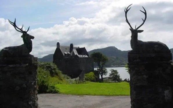
In the latest episode of the Bond franchise we even get a glimpse into 007's maudeline past in a visit, and of course subsequent destruction of, his ancestral home. No London Regency townhouse of course, but an isolated Scottish manse, surrounded by endless moors and made of the stones of the earth.
These are all maybe uniquely American responses to the heroic genesis problem, positing the natural world in a Romantic American viewpoint. Simon Schama's Landscape and Memory speaks eloquently about these perceptions of nature and the role of the imagination in Western thought. The villainous bad guys resort to weapons and the lying deceits of mankind, but the superhero's ultimate power resides in Nature, stems from its dark, mysterious elements. I will step over the Oedipal Mother Nature aspect of this for a future post.
The final photo I have is from X-Men - Xavier's stately mansion set in a typically English park-like setting, maybe the ultimate example of both the fundamental goodness of Nature and a rejection of Modernism, its rationality and anthropocentric dominance. The X-Men afterall are not from outerspace or even some kind of unique genius, rather they are simply genetic modifications of us, a product of the same biology, same DNA, maybe some other stuff thrown in as well, but certainly not "foriegn" or "unnatural".
The hero is a man(usually) of action, he is not at home in the world of men, in fact, he should avoid the domestic sphere as much as possible as traditionally female roles of nurturing, cooking and cleaning are kryptonite to the male superhero. He may be seduced by the sexy villainess, but he fights for everything good, apple pie (as long as someone else makes it) and Mom (but no Mamma's boy).
The man-cave trend in recent years has it right - it is not merely a private study, but a den or a cave, ensconced in the earth and the primal forces barely contained within. Where the villain may have a lair of high-tech toys and Modernist hipness, the hero's retreat is associated with nature, part of the Good Earth, unsullied by progress and the creations of mankind.
Boulder Modernists - Tician Papachristou
Another in a series of posts of some of the remarkable architects that were working in Boulder, Colorado in the 1960s. This was a particularly fruitful time for questioning the basis for especially residential design and Boulder's building boom allowed some of the more talented local architects to experiment with new forms, materials and most notably, new sets of relationships between the house and landscape.
Tician Papachristou briefly taught at the University of Colorado, but his first experiences in Boulder were as a draughtsman for the prolific local architect James Hunter. As Papachristou eventually opened his own office, his work became increasingly sculptural and his early collaborations with another young Boulder architect, Charles Haertling, were to be greatly influential on the latter's remarkable later career.
There are a pair of houses by Papachristou in the Hill neighborhood just west of the University that were designed as a duet. The Sirotkin house sits higher to the west and looks out beyond the Jesser house. The Sirotkin House is a fairly rigorous geometric design that features a series of curving landscape walls that run into the house, joining the interior and exterior. Unlike the Palm Springs modernist houses which seamlessly flowed interior space with the exterior environment, here in Boulder the weather, although sunny, is quite cold and snowy in the winter. The melding of architecture and landscape by Papachristou is accomplished by creating walls that start out as landscape retaining walls and at some point turning into house walls.
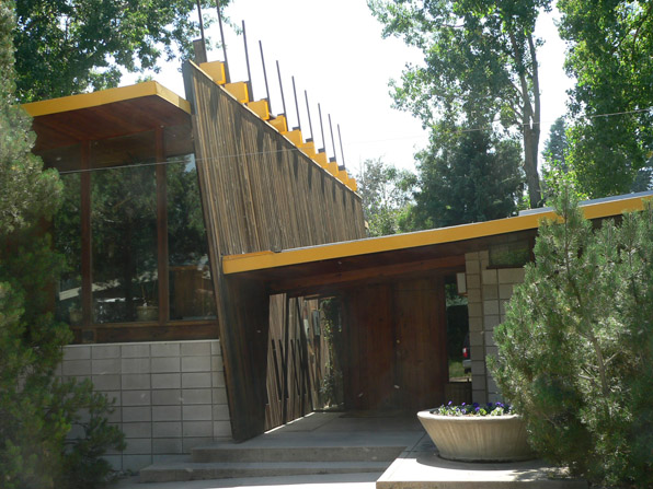
The curvilinear forms of the Jesser House are in stark contrast to the strict orthagonal geometry of the Sampson House designed by Papachristou in 1958. This long, low house shares the same strategies for integration between landscape and building as the paired Jesser and Sirotkin houses - walls freely move from within the house to across the landscape. In this case these walls are severely straight, setting up a marked hierarchy with the tilted entry plane that cuts through the house. The roof forms are all executed as planes and their liminal extension is emphasized by extended rafters and the oddly projecting posts of the tilted wall plane. This house strikes me as still freshly modern, maybe more so than the previous two houses.
A final biographical note about Papachristou: he was the local architect consulted when the various site locations for the NCAR labs were proposed. His suggestion of locating them atop the mesa served as the inspiration to the architect of the project, I.M. Pei. It is hard to imagine that these buildings would have been at all successful but for their dramatic setting. Pei was suitable impressed with Papachristou and recommended him to the famous Modernist architect Marcel Breuer in New York. Papachristou went to work for Breuer, leaving Colorado behind - a good move for him albeit a loss for Boulder.


