info for home-making

Stair as theatre - part one

Stairs are inherently dramatic.  As the transition from one level to the next, they break the plane of the ceiling or floor and immediately engage the psychological territory that Gaston Bachelard so elegantly describes in The Poetics of Space.  Going up is to climb toward the sky, going down is to delve into the earth.  Hierarchy is more than simply implied, it is thrust upon us.  This post is going to be the first of a series in examining stairs and their architectural expressions and meanings as well as their technological parameters and code-driven outcomes.  As they are also about the most-expensive-per-square-foot item in a single-family house, a thoughtful approach to their design in each project, beyond purely visual aesthetics, should be warranted if not cherished. In a residence, stairs also often mark the transition from public to private space.  In a traditionally organized, multi-level house, private bedrooms are most often found on the upper levels and the more public rooms of the house - living room, dining room, etc. - are most often on the main or ground level.  (This  is only very general and the exceptions, like piano noble plans, can be all the more dramatic by comparison).  Moving up or down the stairs is often the most profound transition between realms.  The stair itself can ignore this transition but doing so clearly wastes an opportunity to bring richness and depth to a project.

The most dramatic example I can think of in the use of the stair as a piece of private-public theatre is the large, sweeping formal stairs of large houses like the southern mansions mentioned in the last post.  The best visual evidence of this is actually from the theatre, the two stairs in Gone With The Wind - the Twelve Oaks sweeping double stair and the massive Tara stair.  Actually there are a tremendous number of shots in the movie that use the stair as a device, both deserve best-supporting awards.
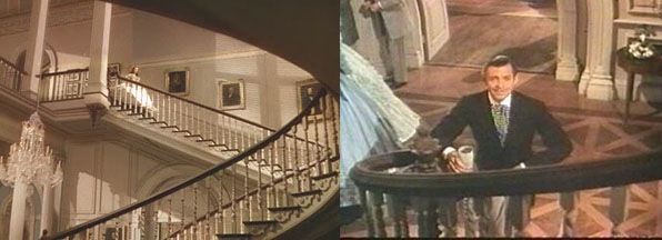
Rhett waiting for Scarlett at the bottom of the stair is a great piece of sexual tension as she descends from the innocence of her childhood bedroom down to the world and all its desires and dangers. (Maybe more like a spider descending upon its prey however.)  I especially like the following still:

Here the stair is clearly not only the separation between private and public, but also defines the roles of men and women.  Scarlett carefully choosing which tread is close enough but not too far is maybe the best descriptor of how a stair can work to both join and separate both the physical and psychological areas of the house.

and so we begin...

sz011

sz011

A number of months ago, immediately on the heels of the Fourmile Fire, I was hired by a couple who just lost their house to design another.  It has been a great process even in the face of that tragedy, with clients who reaffirm why I do residential design.  Their thoughtfulness and commitment to the project has no parallel in any other building type.

Today, at noon, we received our Building Permit from Boulder County.  True to their word, they greatly expedited the process, cutting it down from 6-8 weeks to about one.  My heartfelt thanks go out to the Land Use and Building Department staff, especially Kim Sanchez, Gary Sanfancon and Michelle Huebner who have made a painful process considerably less so.

sz012

sz012

So we begin.  Construction will ramp up here in a few days and I will be posting updates as we progress from excavation through foundations, framing, roofing, etc.  Additional special thanks goes out to Jeff Hindman, Kim Neill and the crew at Cottonwood Custom Builders who were brought on early in the design process and have helped guide the project and its budget to a success launch.

SZ southeast

SZ southeast

architecture - climate and region; some thoughts on southern mansions

I have been thinking  a lot lately about vernacular architecture and indigenous responses to local climate.  By that I mean how a building and design practice, over time, has found architectural solutions to solve some of the problems posed by heat and cold, sunlight and shadow, aridity and humidity.  Reading through some older posts on my delving into the possibility of trying to define a Colorado vernacular, it strikes me that very few of those examples I identified tackled the issues of heat and solar gain.  That might sound like a recent concern, more one of energy use and sustainability, but a few quick glances at traditional southern architecture reveals design/technological solutions that we have largely forgotten in the age of air-conditioning.

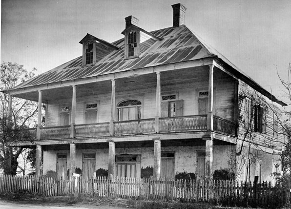
These are images of traditional southern plantation houses in Louisiana from the book Ghosts Along The Mississippi by Clarence John Laughlin.  The book's oddities aside, it is a great document of these traditional houses many of whom are no longer standing.

The large wrapping porches and porticos of all these houses block the direct sun from hitting windows and exterior walls and create  a deeply shadowed interstitial space between interior and exterior.  The "technology" of the deep overhang results in a new kind of spatial experience, partly interior, partly exterior, which radically breaks down the stark privacy of the Georgian forms from which these models take much of their architectural character. It is maybe tragically ironic that these houses where slaves were an essential part of the culture and economy have in a sense a more casual relationship between public and private than their English precedents where servants were equally present but interior and exterior were sharply delineated.

Of course some of these houses owe more of their architectural lineage to Greek antecedents, but in ancient Greece's equally slave-owning culture, emphasis is directed inward to courtyards, not outward as in these southern Tara-like mansions.  Certainly the veranda was a convenient place for a plantation owner to survey his fields and from which to greet visitors, but the impetus for the porches was more climate-driven than programmatic.

More than echoing their Georgian and ancient Greek architectural origins, maybe these southern mansions, with their large, single roof forms owe more to that other model of agricultural manor house, the Palladian villa.  Although those villas of central Italy and the Veneto do not sport large, overhanging  porticos, like their southern mansion  cousins, they are singular buildings in the landscape, dominating the perspective in a single large architectural form.

The southern mansion prototype has become such a stark visual cliche that it is difficult to look beyond the ridiculous bad copies that it has inspired and look a little more carefully at the architecture.  And of course its association with slavery forever banishes the southern traditional mansion into a dusty drawer of architectural history.  However, a closer examination of its form and materials in response to climate and its adaptation and transformation of formal architectural modes grafted onto vernacular practice is a worthwhile study.  I am not suggesting that we adopt the form and replicate, South Fork ranch-like, a hybridized bastard McMansion morphology, but let's not throw the architectural baby out with the cultural bathwater.

(images by Clarence John Laughlin from Ghosts Along The Mississippi)

on the boards, February 2011

Our workload has started off with a bang compared to the last couple of  years.  We are working on a number of really great projects - a couple of new houses, a couple of renovation/additions, a couple of master plans and a few other things.

As I mentioned in a previous post, a number of our new projects incorporate universal design principals for clients who are either current wheelchair users or anticipate reduced mobility over the next decade or so.

In light of the massive downturn in architectural services that we have all experienced over the last few years, it is thrilling to have the office full of drawings and models of ongoing work.  Along with our office picking up the pace, a number of previously unemployed architect-friends of mine are working again and contractors are no longer singing the blues as fervently as in past months.

It is quite a luxury to be selective about projects again, to engage in projects that are interesting and challenging and not necessarily all about paying the bills and keeping busy.  The recent upswing in inquiries has focused my desire to choose projects based on the site and the client, not the size or cost.  We'll see how they develop ... stay tuned.

Universal access and aging-in-place

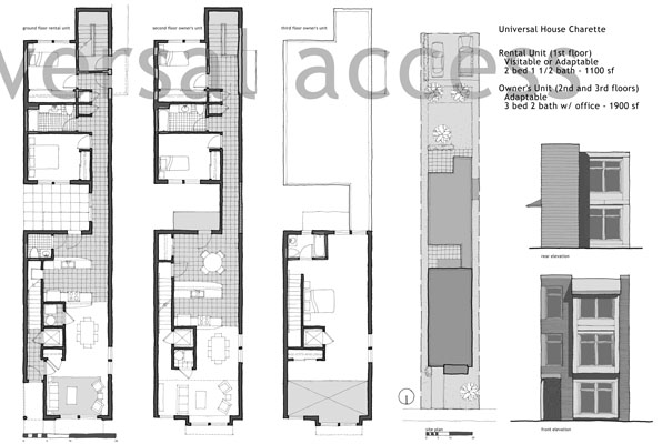
Maybe it is just a coincidence, but I are finding that I am working on a number of projects that deploy universal access principles as a major part of the design process.  If you are not familiar with this term, universal access is an outgrowth of the barrier-free design guidelines that we were all using for public buildings just a few years ago.  The idea of universal access however encompasses not just guidelines for wheelchair users, but recognizes that curb cuts aren't just necessary for them, but aide folks with strollers and kids with skateboards.  It is an acknowledgement that we all age and designing to accommodate the needs of the many probably  benefits us all at some time as individuals.

My father has serious mobility issues and my sister and I have spent an increasing amount of time over the last few years trying to reconfigure and adapt his typical suburban house to his needs.  After a broken hip, we quickly realized that the door to the master bath, a door he has used for over 25 years, is now 2" too narrow to allow a walker to slide through.  The shower in that same bath is too narrow to allow a seat to easily fit and the handle of the shower door is too easily confused with a grab bar.  Same with all the towel bars.  The laundry downstairs has been abandoned as has the back entrance, which although it is almost at grade level, has an absurdly slippery deck that no amount of friction tape seems to ameliorate.

These are good lessons for an architect.  We are all adept at designing to codes and the guidelines of the Americans With Disabilities Act.  But the actual, everyday experience of seeing my father trying to navigate the kitchen has taught me so much more.  And rarely have architects applied these universal design principles to single-family houses for aging-in-place prospects.  I am currently working on a project that is a father-in-law suite that subtly incorporates universal design principles.  It looks clean and simple and elegant and is also going to be a great asset to his daily living.  At the same time, we are engaged in the early stages of two projects that directly confront the needs and desires of wheelchairs users.  Seeing the house from that point of view, both actual and metaphorical, is a fascinating challenge and it reframes the poetic possibilities of every part of the house that we so easily overlook.

A pair of design presentation boards we did for an urban universal design competition for a neighborhood in Chicago from 2005:

live – work

In the past few years I have had the opportunity to work on a number of projects that fully incorporated a live-work dynamic as a fundamental part of the house.  More than simply a home office, a fully-utilized live-work program creates a kind of tension of use and privacy that most homes in the last one hundred years or so have not encountered.

Most of the projects like this that we have worked on included a single large office or studio.  And the variety of work has differed greatly but all with one similar aspect - the ability, via computers and the internet, to communicate visually, verbally and to a great degree of satisfaction - with a remote office or clients.  Rarely do these home offices or studios include a separate entry for clients or employees because the work in question does not require it.  More often, my clients work at home and take the drive to the airport on a regular and frequent schedule to meet with their clients and co-workers.

So what is the nature then of these home offices?  They are not the 19th century gentlemen's study, a place of retreat and contemplation.  They are wired and connected not just functionally, but also culturally, to distant places and all to the landscape that is the internet.  More trips are taken to Google than the local coffee shop.  What is the nature of "privacy" in a space in your house that is open to so much of the world with the only "threshold" of a keyboard and/of mouse?

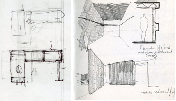
In looking at these projects and working on some current live-work projects, what occurs to me is that in each project we have tried to ritualize the passage in the house from the working space back and forth to the rest of the house.  In the images above, for a condo renovation, the office was on a half-level between the main level living spaces and the upper floor master bedroom.  We focused effort on the stair and tried to create a unique space, with light streaming down from skylights, to set this passage off from the more conventionally proportioned rooms.  In addition, we installed a series of semi-transparent resin panels on both sides of the stair to modulate the sound and views from the office to the rest of the house.  The public-private dialogue that takes place across this stair makes a kind of liminal threshold that makes the mental shift to and from "working".

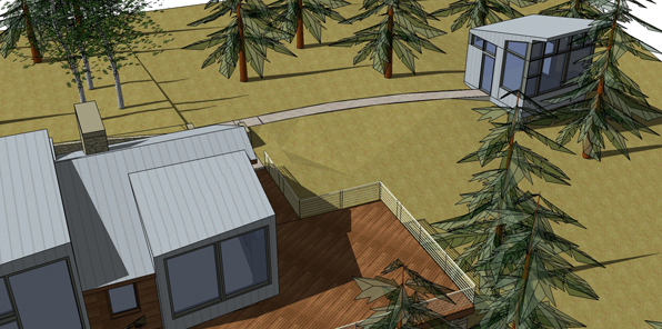
In the project above, we designed a simple writer's shack as an additional outbuilding to a cabin renovation in rural Colorado.  The shifted geometry of the writer's shack reverberates back through the cabin as series of new dormers, inserting the "working" within the "living".  And again, the path between the buildings, a simple path through the woods, is designed as a careful separation - just far apart for a sense of separation, but not too isolating.  That ritual of walking between the two, with a cup of coffee in hand, boots on but not laced up, the pupils adjusting to and from the bright, Colorado high-alpine sunshine, makes each building a distinct place, the occupation intentional.

The image above is a home office we designed, very warm and internalized, that looks out to a mountain vista.  This is a built analogue of the relationship of the home-based office, secure and private, looking out via the internet, to the rest of the electronic world.

I'm not sure how the issues of the private office and the public connectivity play out for a project - that relationship varies with each client and each space.  I do know however that just putting a desk in an unused bedroom does not really address the live-work issue and forsakes a potentially rich landscape of ideas and use that is architecture.